
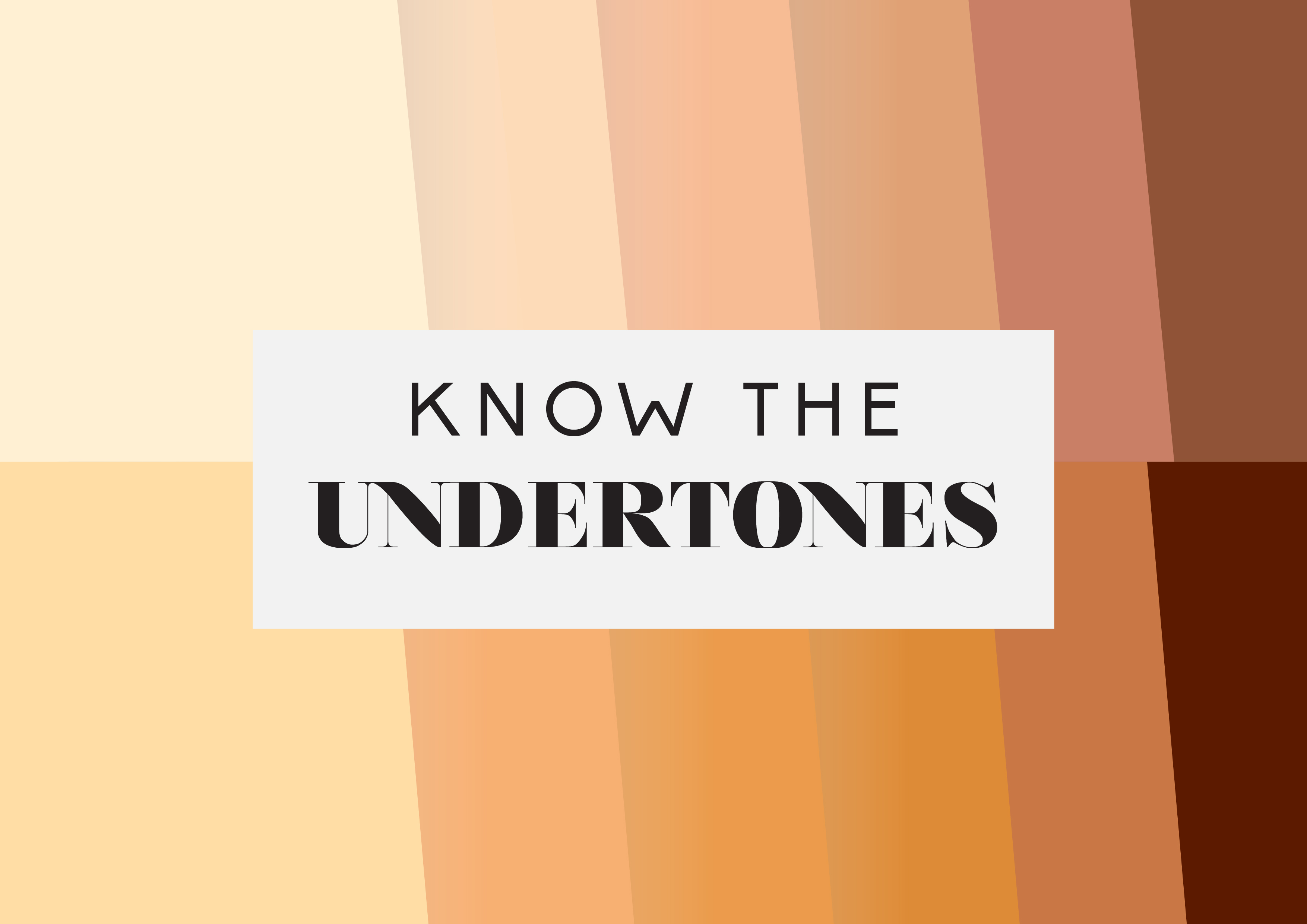
In a spectrum of colors, they vary from shades, tints, hues as well as families. But it’s good to know that when it comes to colors, what is underneath them also counts. In color theory, it is called color undertones. For a hint on the latter, what we know about complexion isn’t all about light and dark; skin colors will vary according to its tint be it pinkish, peachy and even neutral.
Down below, gain insight on the fundamentals of color and inspire your creative eye with our list of designs and mediums that incorporate the color undertones. You may also go through our list of colorful backgrounds that you may use across any design projects and for future references.
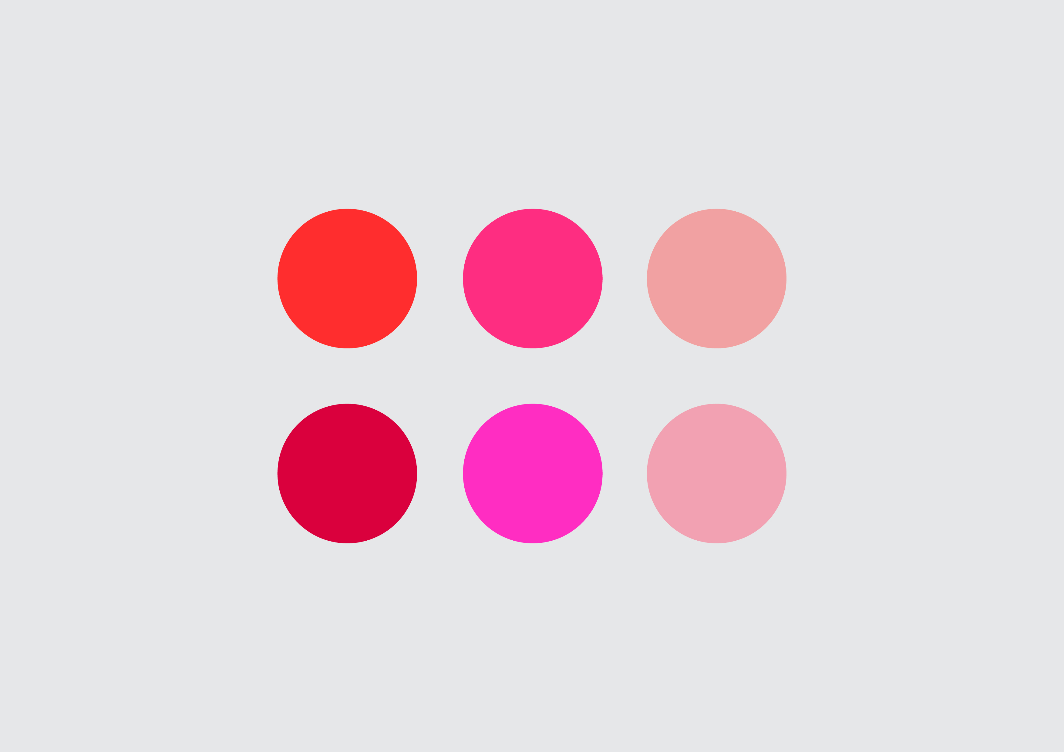
Photo Courtesy of Cloise Abordo
The benefits of Color Undertones.
As one of the starting topics for color theory, the core benefit of color undertones paves a way to comprehension of the utilization of the spectrum of colors.
Painting. Whether it be portraits, paintings in an interior or outdoor locale, landscapes and so on, applying the color undertones on your painting creates a huge impact in terms of emotion, perspective, depth and overall direction.
One greatest example is Van Gogh’s earlier painting, The Potato Eaters. It depicts the harsh reality of country life and has painted the subjects in earth colors similar to a dusty and unpeeled potato. This painting received numerous criticism due to the use of dark colors as well as technical imperfection in terms of the figures. But we have to take in mind the use of undertones which makes the setting appear dark and small.
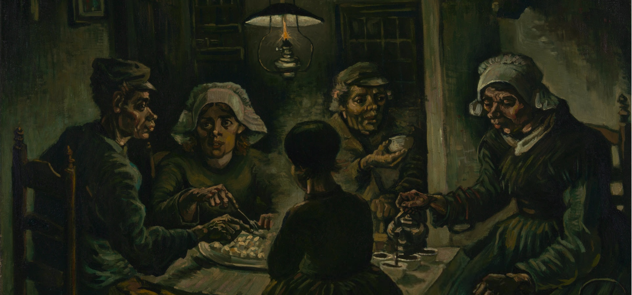
The Potato Eater, Nuenen, April – May 1885. Oil on canvas, 82cm x114 cm.
Painting courtesty of vangoghmuseum.nl
Swatches is an important tool for interior design and graphic design. Utilizing swatches during the given projects applies accuracy in application. Understanding and incorporating undertones on swatches offer designers and interior designers a wide selection on color options.
Interior Design. Application of the color undertones in interior creates an impact in perspective. Using paints with a yellowish tint mixed in creates an interior that appears to be closer in terms of visual plane. When using blues or the color green, interiors appear to be further away.
Scroll down below to gain more insight regarding advancing and receding colors.
Design. In graphic design, incorporating color undertones showcases the artistic direction it is set out for. Imagine a design theme that needs to evoke a emotional setting, the use of blue could be appropriate and so on.
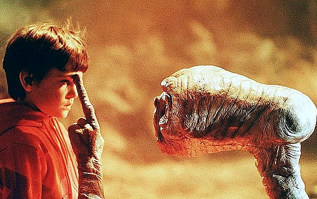
Movies. Color undertones are applied as color grading in movies which gives the audiences a visual picture of the setting and situation. A warm filter might give an impression of a sunny setting or a cool toned filter demonstrates a natural light and so on. A movie color grading, for example, the movie E.T.
Fashion. The color options offered by the fashion industry stretches across to give customers and specific target audiences an extensive selection on clothes to purchase. As well as color undertones has been a helpful tool in incorporating colors to fit the theme, fashion segments as well as direction in aesthetics.
Photography. Color undertones help in giving a setting or a theme an emotion whether it be outdoors or conceptual shoots. For example:
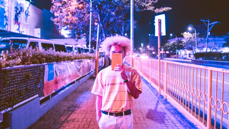
Photo courtesy of Em-em Ybanez / Money Can’t Buy Style Photo Series.
Beauty. In terms of beauty, color undertones play a big part in crafting packaging designs as well as in selecting preferred cosmetics. When it comes to packaging, color undertones can help demonstrate a certain personality and characteristic that will form a connection towards the target audience.
For cosmetics, knowing your skin undertones will help you get by in selecting your makeup as well complement your skin complexion.
Color Theory.
For the introduction of the beauty of color undertones, one must be familiar of the color behavior namely advancing and receding colors. To get a hold on such topic, look at the example directly below and observe the following colors and its effects.

Photo Courtesy of Cloise Abordo
For this example, the orange color appears to be closer in the visual plane and while on the other hand, the blue seems to recede in composition.
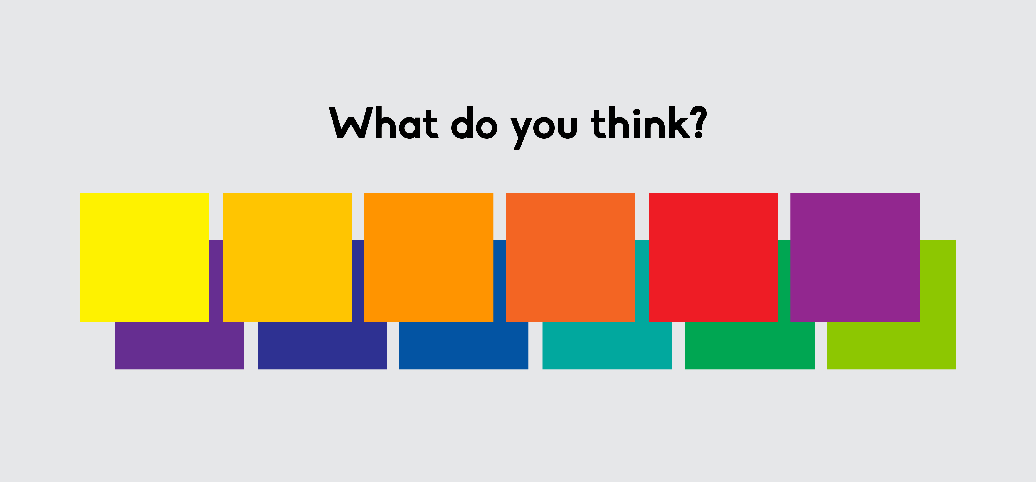
Photo Courtesy of Cloise Abordo
Another example is laying down bright colors against cool colors. The line up of bright colors tends to advance in the viewer’s direction and the cool colors seems to recede. The reason for such warm and bright colors gives the illusion that they appear closer within a composition. Cool colors such as the ranges of blues, greens and violet appear to be far away.
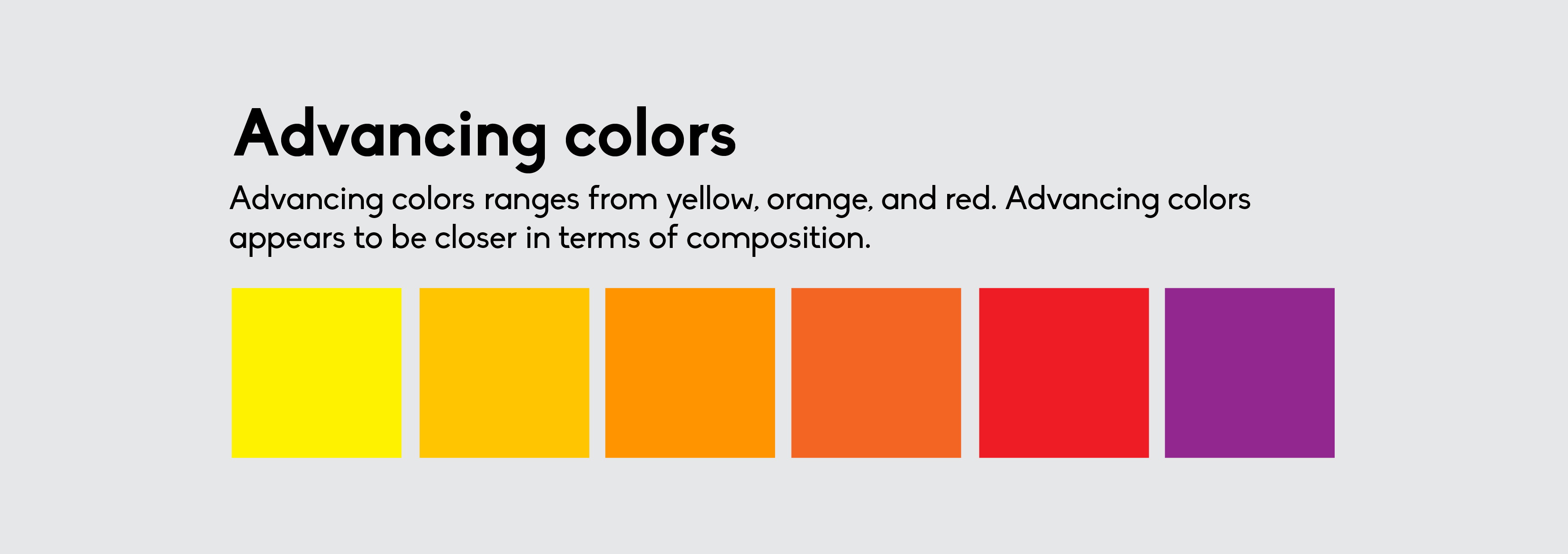
Photo Courtesy of Cloise Abordo
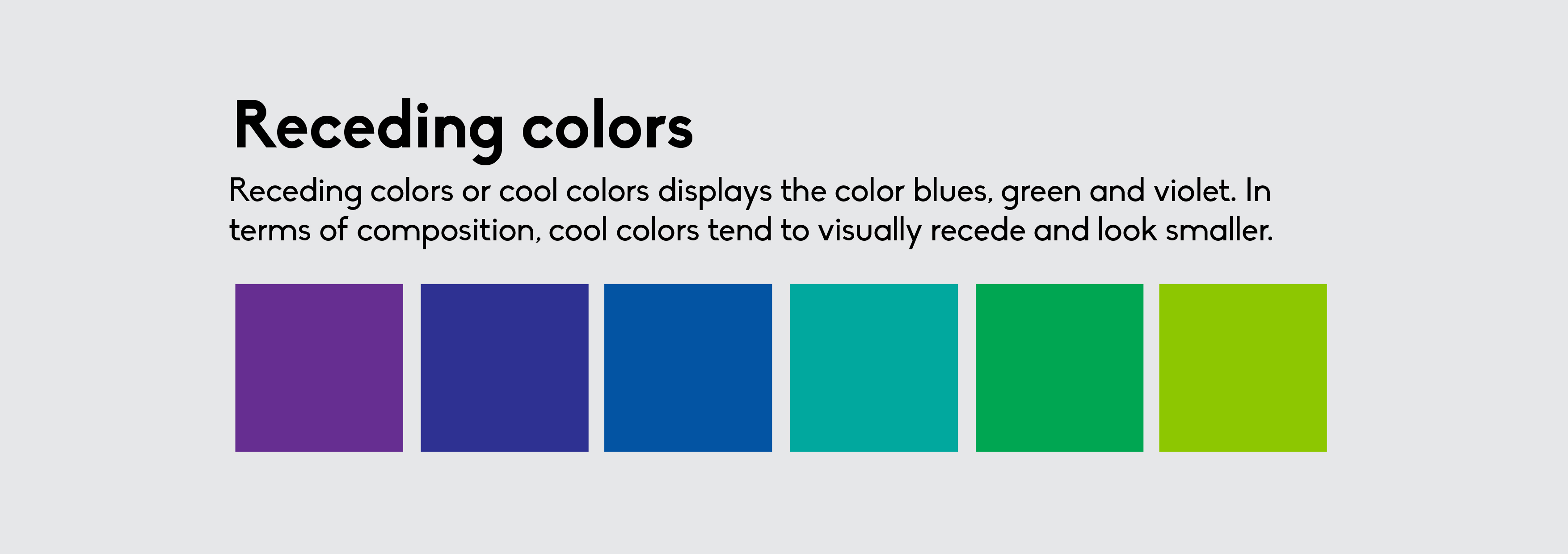
Photo Courtesy of Cloise Abordo
All About Skin Undertones.
In terms of traditional fine arts, beauty, and fashion, it is necessary to know one of the basics of color theory which is the color undertones. You could draw inspiration as well as accuracy when applying color undertones on various mediums.
Let us focus on skin complexions for now and how they vary.
Know Your Undertone.
There are two basic ways in determining one’s color undertone. You may try a vein test as well as a jewelry test. Let us break down these two ways one by one starting with the vein test.
Vein Test
In determining the color undertones in terms of skin complexion, do a vein test. Look at your wrist in bright light and study the color of your veins. Is it blue in color?
Is it blue in color? If so, you have a cool undertone. On the flip side, if the color of your veins is green, then you have a warm undertone. If you believe that the color is in a blue green color, then you’re one lucky individual to be having a neutral undertone.
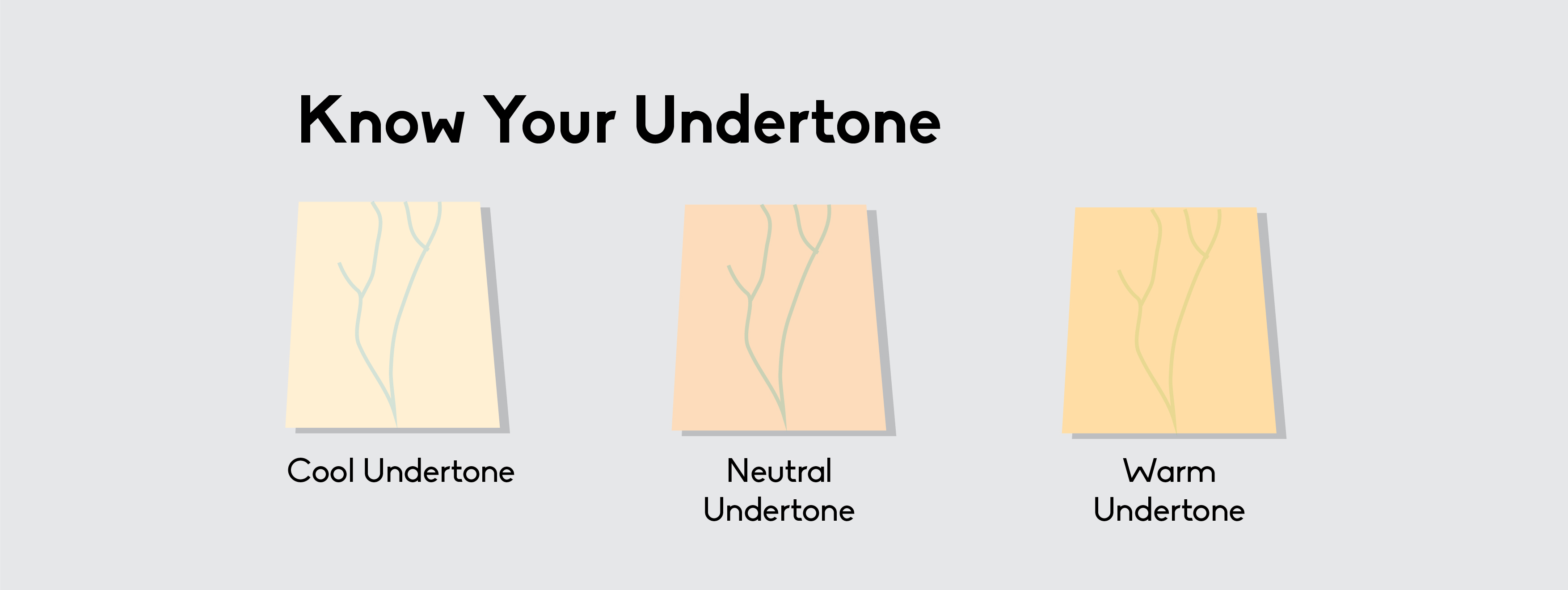
Photo Courtesy of Cloise Abordo
Jewelry Test.
If you aren’t sure what your color undertone is, don’t fret, you could always try the jewelry test. This should be an objective determining factor to base your color undertone. You will need a silver and gold jewelry at hand for this test.
Once you’ve tested out the silver jewelry and figured it complements your skin complexion, then you definitely have a cool undertone. On the other hand, then you have a warm undertone.
Understanding more on Color Undertones.
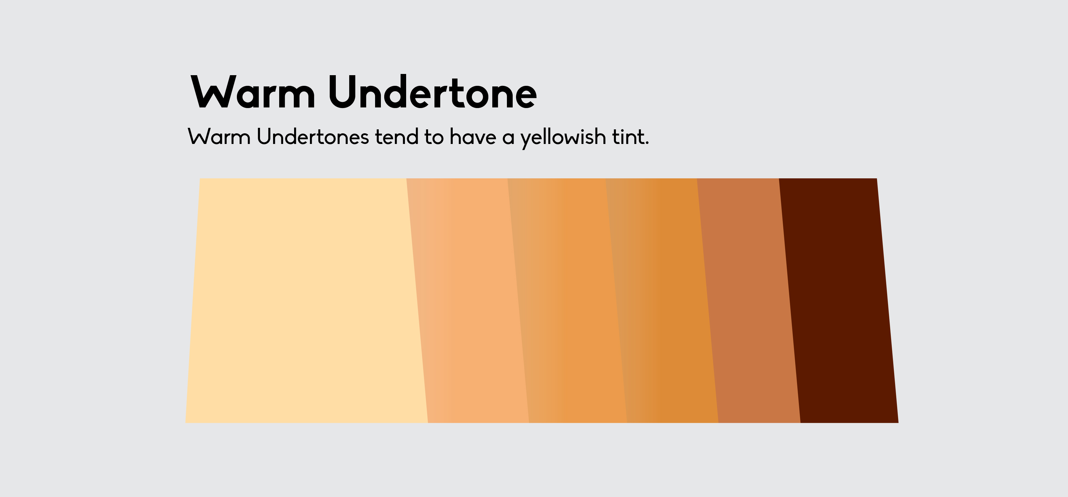
Photo Courtesy of Cloise Abordo
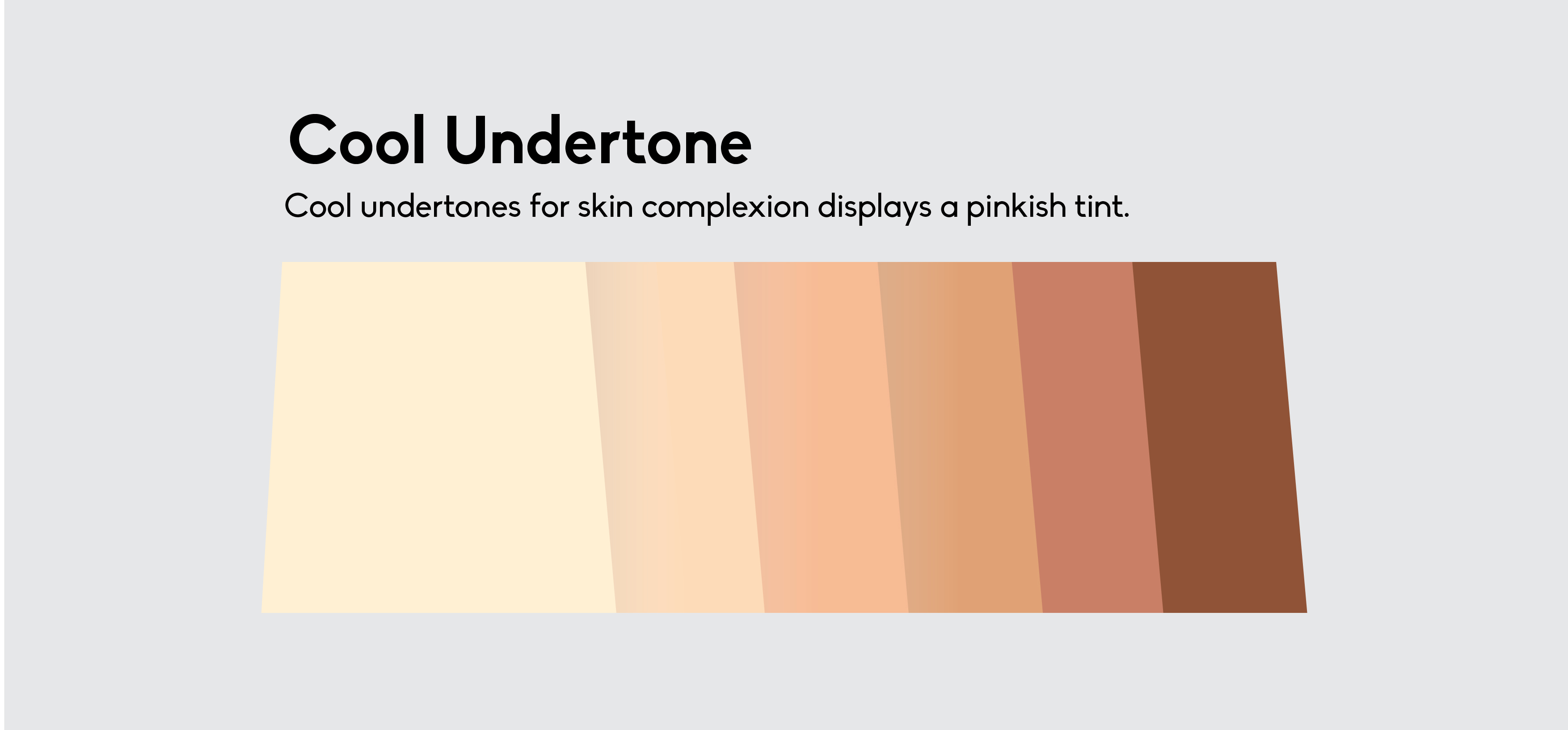
Photo Courtesy of Cloise Abordo
Photo Courtesy of Cloise Abordo
Tell me more!
At first glance of a color, not all unique features of such will be visible on the first look unless you look deeper. What you see in the initial viewing is what you call the mass tone and underneath such color and what is less obvious is the color’s undertone. Colors both have the mass tone as well as an undertone.
Mass tone is the color you immediately see. For example, a true orange will have a mass tone and a similar hue which is the undertone. There is difficulty when it comes with less pure colors. The more complex a color is it would be hard to determine its undertone.
Understanding more on undertones. You might have experienced a situation where a color scheme didn’t work in terms of mixture. Probably, the undertones were off rather than the colors itself. The designated colors may have undertones that weren’t working together in crafting a harmonious color scheme. If there are clashing of colors, we can say that there is clashing of undertones.
To help you get by in detecting color undertones, start by comparing your designated color alongside other colors within the same range or family. A CMYK red, for example, is set beside both warm and cool toned reds to identify the differences in undertones. The warm toned red displays a orange shade while the cool toned red demonstrates near pink color with shades of purple.
Photo Courtesy of Cloise Abordo
Neutral Undertones. Neutrals are tricky to recognize their undertones but don’t fret you can compare neutrals next to warm and cool colors to determine their undertones. One by one, place your neutral swatch beside a pure red, yellow, blue, orange, green and violet. Study your swatch and by observation, if your swatch has a green undertone, placing it next to red will complement its undertone. The same goes with other neutrals and colors. If the swatch has a blue undertone, place it next to a yellow color and so on.
Colors are dynamic and they bring such energy and personality on any designated mediums. It can be fascinating but at the same time frustrating. But having to grasp on the fundamentals as well as color theories to help us get by in crafting design projects. It might seem to be intimidating at first view but most philosophies in life – experiment and practice as much and have fun while doing all those.
Related Posts
FREE 17+ Background Patterns in PSD | Vector EPS | AI
FREE 19+ Halloween Patterns in PSD | Vector EPS
FREE 27+ Magazine Cover Page Designs Templates in PSD
FREE 230+ High Quality Geometric Polygon Backgrounds in PSD | AI
FREE 21+ Christmas Clip arts in Vector EPS | AI
FREE 15+ Christmas Greeting Cards in PSD | AI
FREE 14+ Recruitment Flyer Templates in MS Word | PSD | Vector EPS | InDesign | Pages | Publisher | AI
Top 8 Benefits of Branding Your Business
FREE 34+ Elegant Event Flyer Designs in MS Word | PSD | Vector EPS | AI | InDesign | Pages | Publisher
FREE 15+ Abstract Art Paintings in PSD | Vector EPS
FREE 9+ Profile Icons in SVG | PNG
FREE 52+ PSD Party Flyer Designs in Word | AI | Publisher | Vector EPS | Pages | InDesign
FREE 12+ PSD Greeting Card Mockups in PSD | InDesign | AI
FREE Fonts : Sources to Find Your Type
FREE 15+ Power Point Presentations in PPTX