
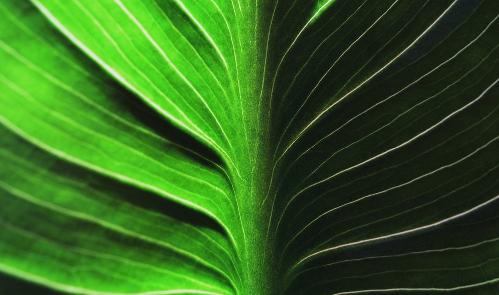
These days, we could get caught up living in a fast-paced environment. Every individual is getting ahead with their responsibilities and daily itineraries that a sight of natural elements helps invigorate one’s well-being. With that being said Pantone, a color-matching system, introduces its color of the year 2017: Greenery. It takes inspiration from nature that surrounds us, with its zesty attribute that translates a life from affirming shade and vitality.
Pairing Greenery
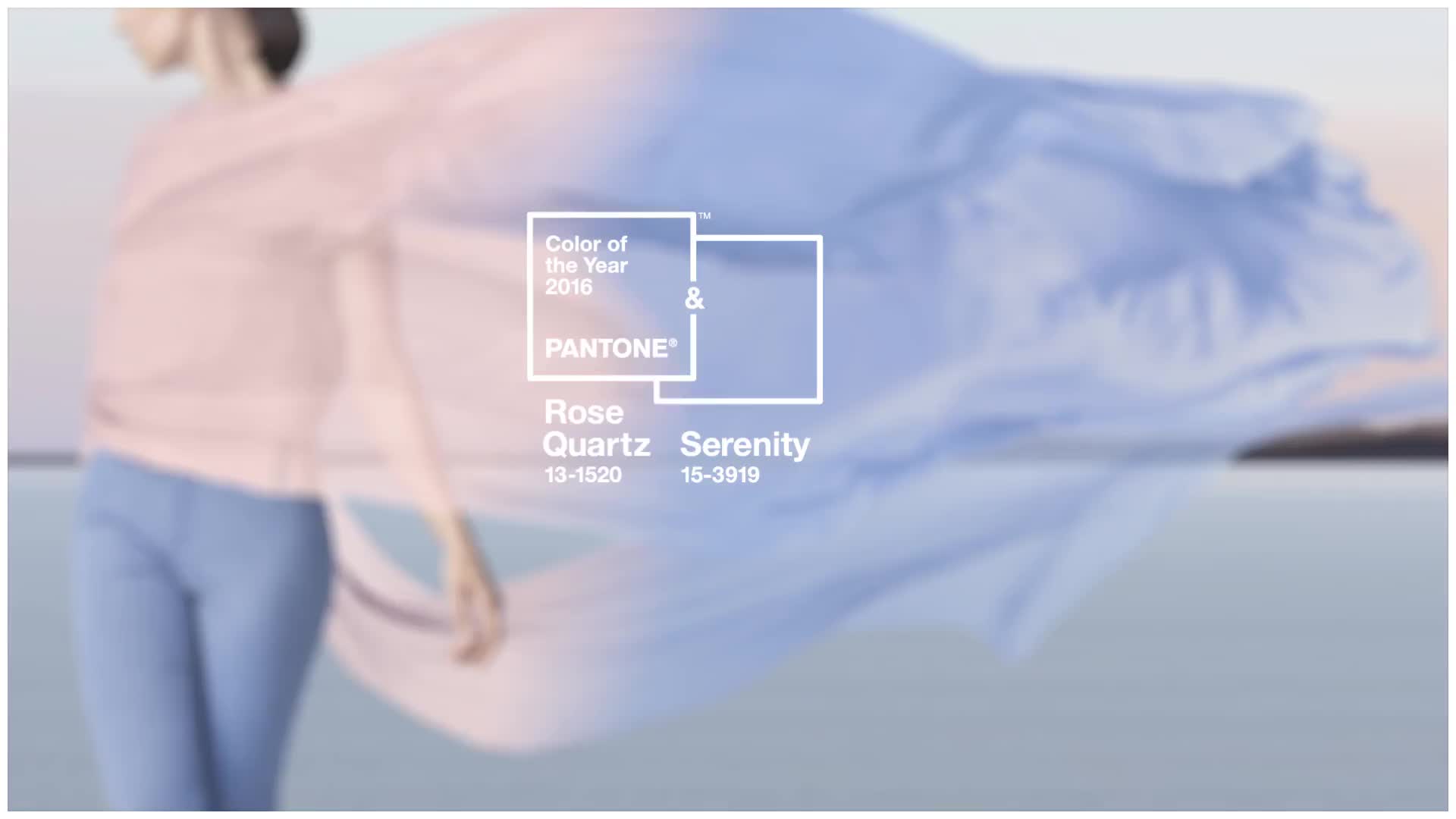
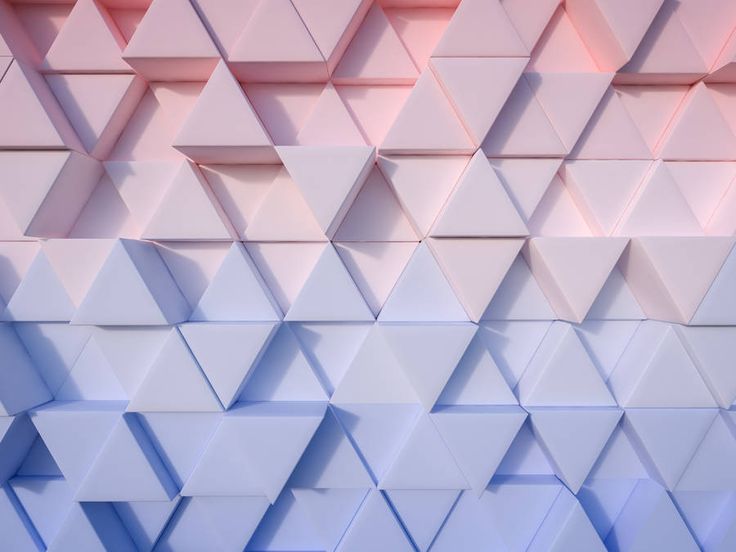
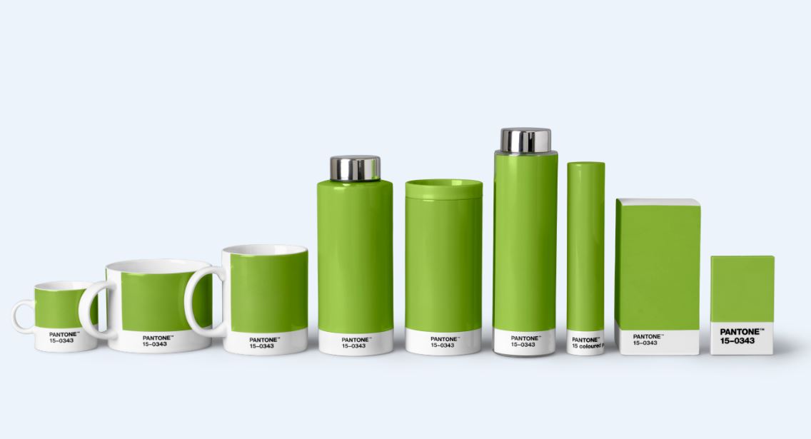
Greenery is deemed as a versatile shade that will be seamless with many color combinations. Pantone has a couple of color combinations that range from neutrals, brights, deeper shades, metallics, pastels as well as the previous Pantone Color of the Year in 2016, Rose Quartz and Serenity. These color palettes, including the aforementioned color combinations, can be incorporated in fashion, beauty, product, packaging, as well as graphic design applications.
Samples of the Color Pairings
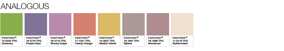
You may download the entire color palettes available in Pantone.com.
Color Applications
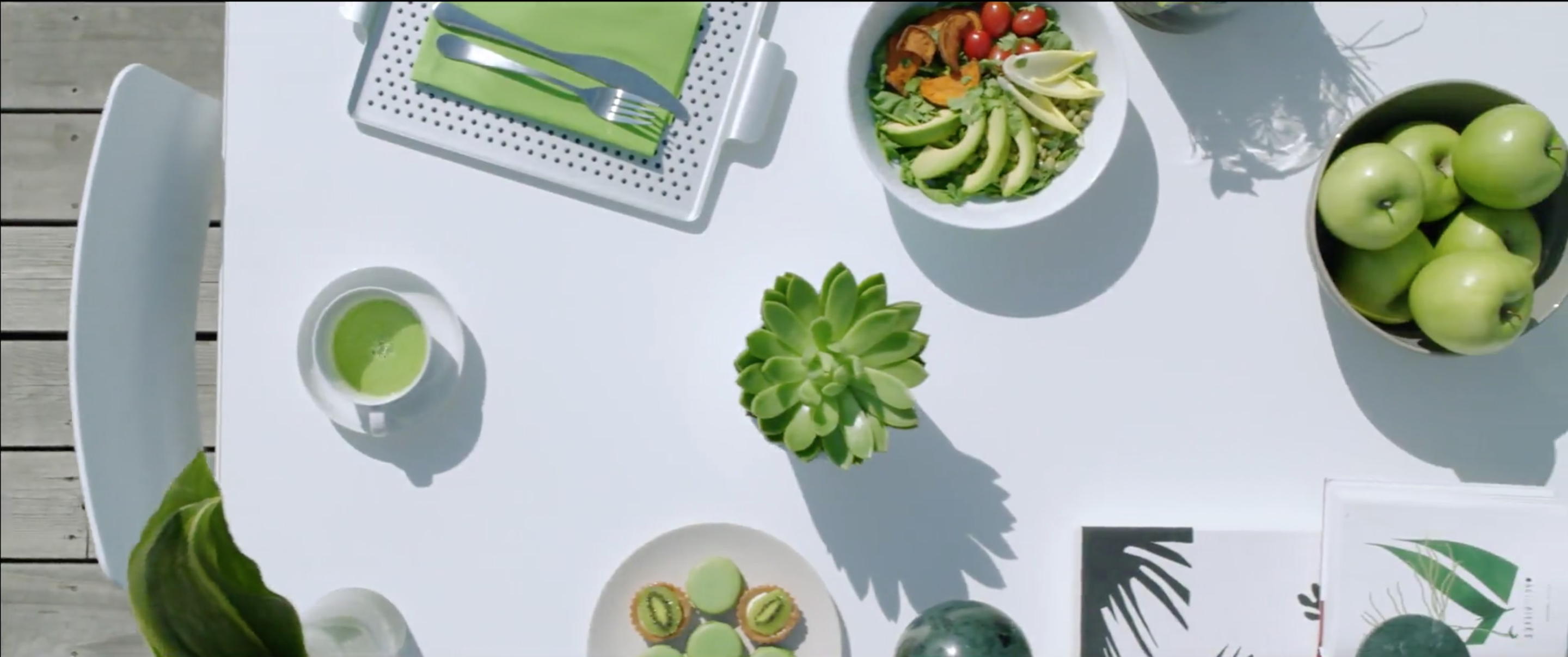
Greenery is a trans-seasonal shade that will be perfectly incorporated into any design projects and medium. We have gathered some examples to visualize the oxygenated impact such color will appeal to individuals as well as in various mediums.
These are the following:
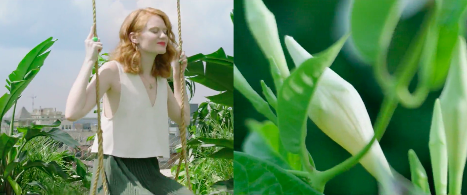
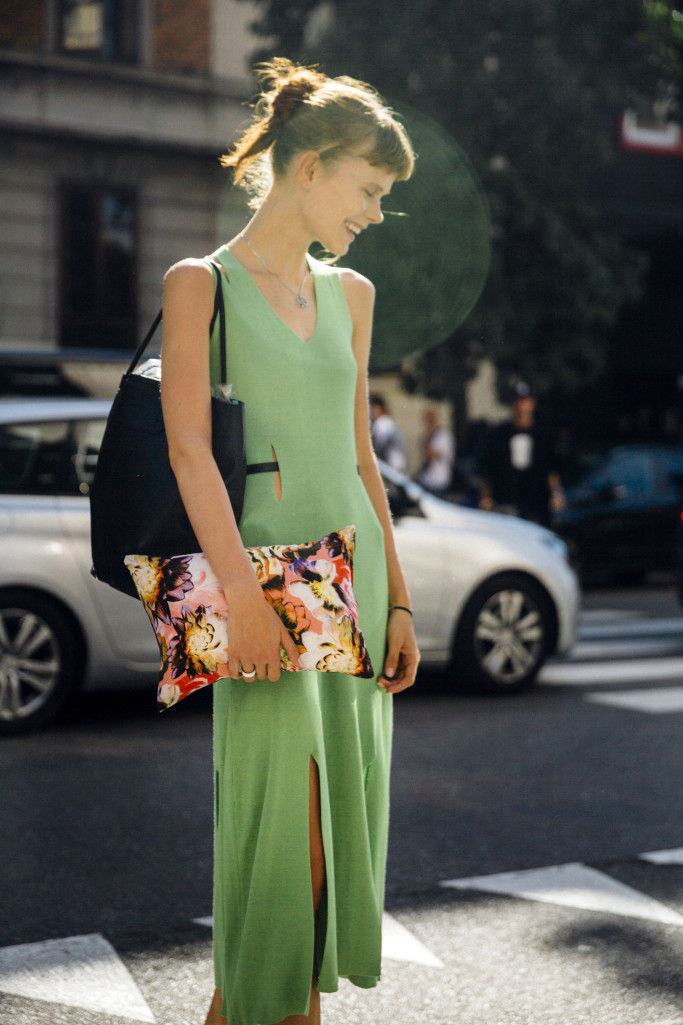
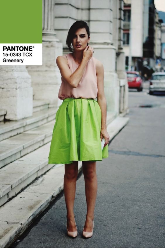
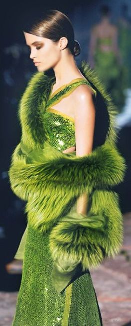
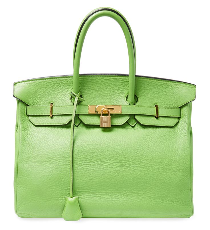
Fashion
When it comes to fashion, the color green is a hit; an ensemble becomes a statement. In some cases, the color green is tricky when finding the right green that suits your undertone and pairing it with other colors. But there is a way to counter act the trickiness that comes with the color green and in this case, the greenery palette.
When finding clothes, some green colored clothing would either flush you out or do wonders. The trick is to study the color of your veins just right in your wrist. If the color is blue, then you have a cool undertone. On the flip side, if its green then you have a warm undertone. If it happens to be both, then you have a neutral undertone. To understand more about this topic, you may go to our guide on color undertones.
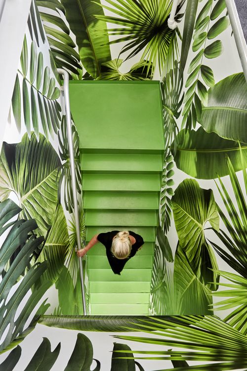
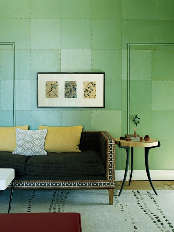
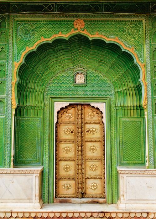
Interior Design
On the topic of design fundamentals, there are two categories of colors: receding and advancing. Green happens to be on the side of receding colors. In the case of the greenery palette, it does have this zesty appearance with a touch of warm color in its mix. The greenery palette creates this illusion of a compact interior yet it also gives an infusion of light inside.

Product
Incorporating green and the greenery palette in products suggests class and transcendence. The use of such color invites an environmental concern towards the wearer and viewer.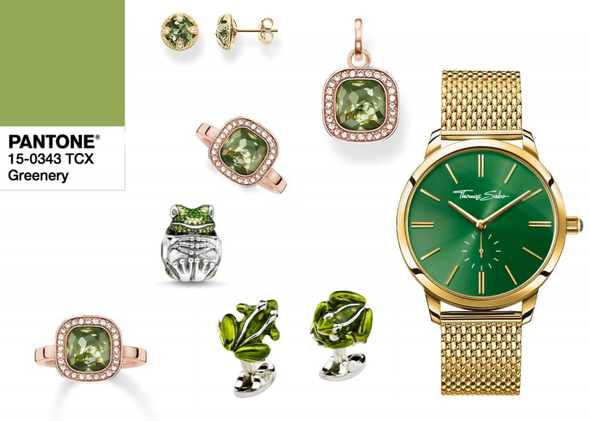
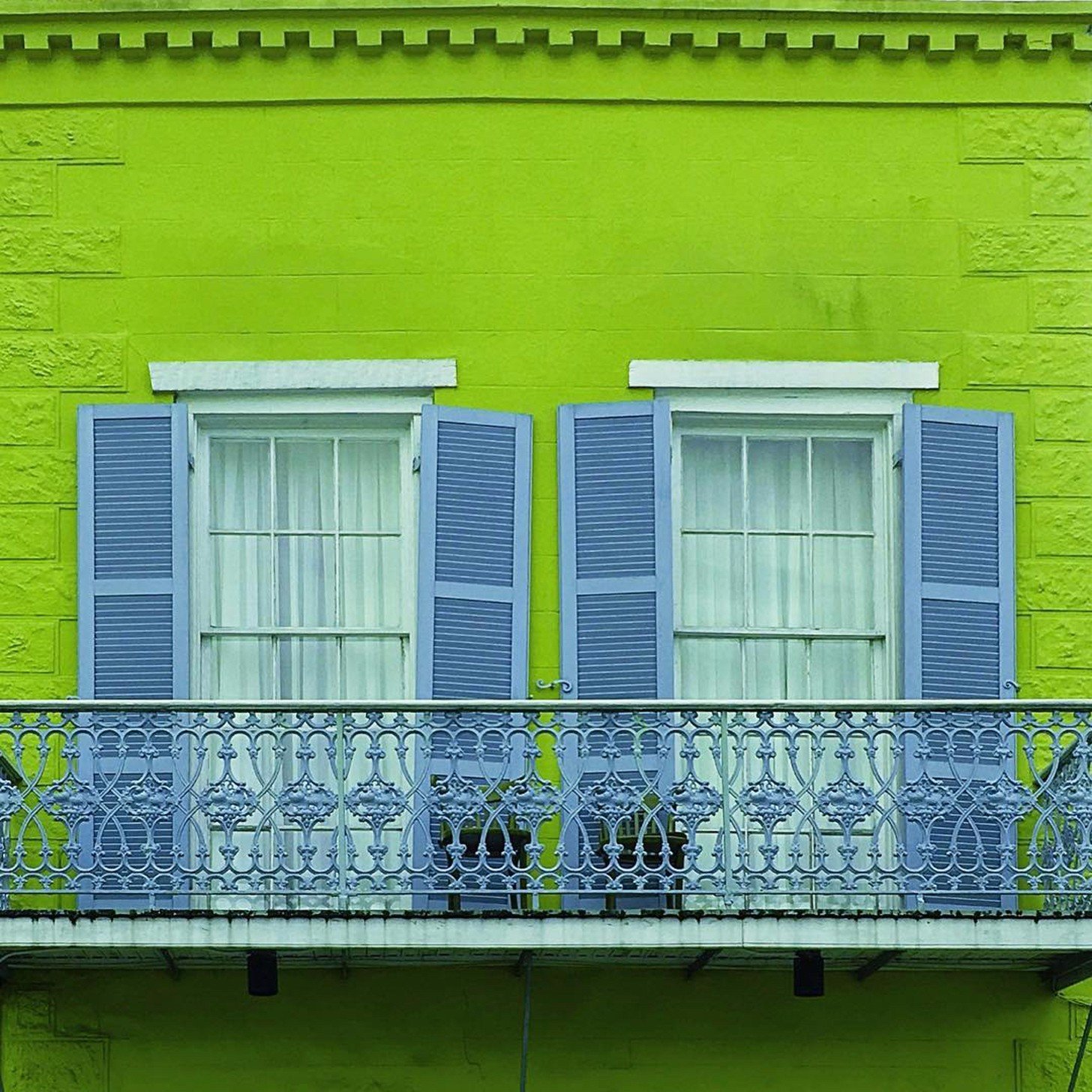
Architecture
The use of green in architecture translates a lukewarm inviting setting and can create movement and depth when paired with other colors. It is neutral in a sense that isn’t much of a trendy color.
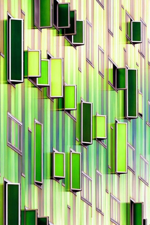
In a spectrum of color, green is considered to be a down to earth color which suggests environment and natural elements. Get in the know of the color fundamentals with our guide on color theory which is a comprehensive guide on the application of colors across all design applications.
You may also check out on the Color of the Year 2016 and its color applications and pairings.
Related Posts
15+ Cow Patterns, Photoshop Patterns
10+ Vintage Red Backgrounds HQ Backgrounds |
7+Design Elements - PSD, Vector EPS, JPG Download ...
22+ Solid Wallpapers, Backgrounds, Images, Pictures
21+ Orange Backgrounds, Wallpapers, Images, Pictures ...
15+ Free Mandala Coloring Pages - JPG, AI Illustrator Download
Rusted Wood Backgrounds
9+ Rainbow Patterns - PSD, Vector EPS, PNG Format Download
21+ Bi-fold Brochure Templates - PSD, Vector EPS, JPG Download ...
21+ Soil Textures, Photoshop Textures
15+ Free Printable Christmas Coloring Pages - PDF Download
20+ Blue Textured Backgrounds, Wallpapers, Images, Pictures ...
18+ Cartoon Drawings - JPG, Vector EPS, AI Illustrator Download
15+ Abstract Art Paintings
15 Best Bakery Logo Designs for Your Inspiration