
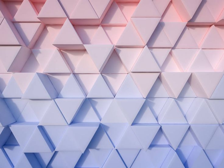
Color Pairings Fit for Rose Quartz and Serenity
These pairings could be applied on varying surface materials and finishes whether it is in matte, glossy and so on both colors appeal with other mid-tones, metallics and bright colors such as pink and yellow.

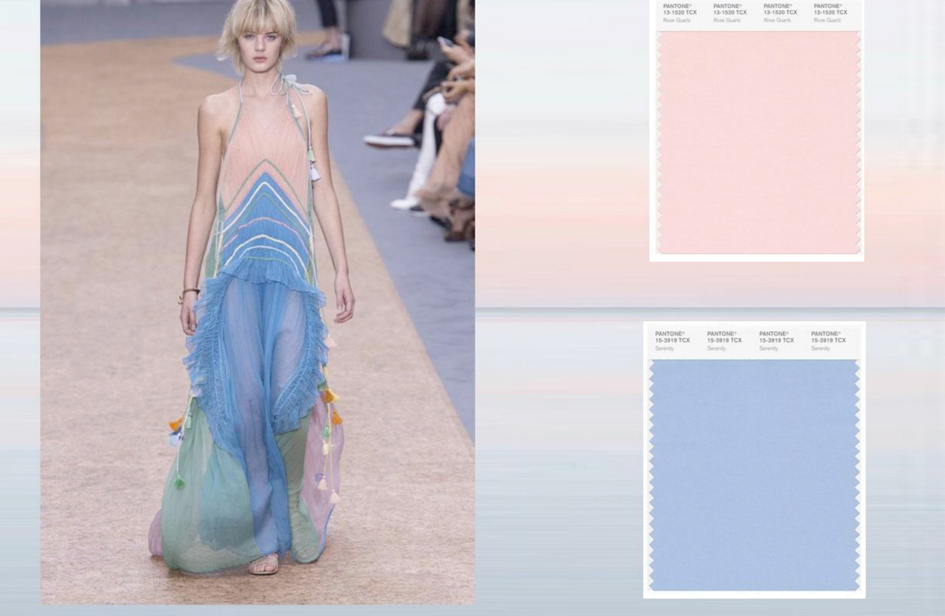
Rose Quartz & Serenity Color Pairings courtesy of Pantone
The rest of the color palettes are to be found in Pantone.com. Click the link above to visit their website.
Applications of the Rose Quartz and Serenity Colors
To choose whether to incorporate Rose Quartz & Serenity colors as one be it to create an ombre or color blocking effect or use the given colors separately, is up to you.
To help you get by, take a look at the different applications across most mediums namely fashion, graphic design, product, and so on to inspire your creative eye.
Fashion Application
Rose Quartz & Serenity shades are well visualized as one natural element visible around us. Similar with the aforementioned, fashion takes its inspiration from what surrounds as in a daily basis and crafting a concept to strengthen the idea of such. Both colors serves that fashion concept and may utilize the color even way beyond.
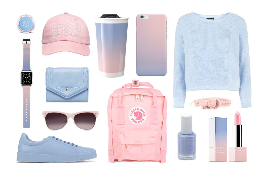
Product Application
Gradient, or ombre as it is commonly called, has been ever present in most products as well as product packaging and is considered to be a trend. But it seems that it is here to stay. As presented directly below, the products use the Rose Quartz & Serenity colors as one and separated which gives you more options in terms of your style preferences. Incorporating Rose Quartz & Serenity across designated products results to a statement.
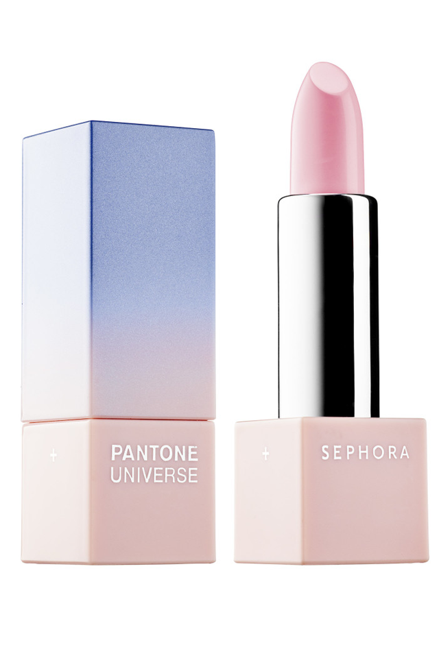
Packaging Application
Similar to the examples of products, there are also examples of packaging that incorporates the ombre style preference. Mostly used in cosmetics and hair product packaging, both Rose Quartz & Serenity shades are a perfect fit for other packaging mediums such as plastics, paper and so on.
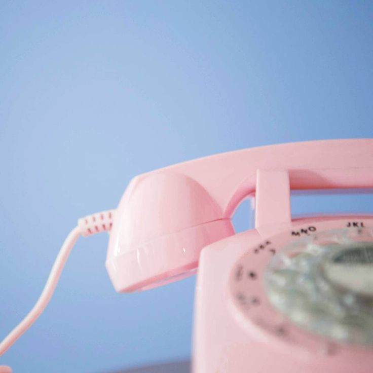
Photography Application
The blend of Rose Quartz & Serenity shades is a theme on its own already. You may incorporate the aforementioned colors to craft a product, still life, and conceptual photography.

Visual Merchandising Application
The use of the joined colors results in this welcoming appearance. If you are considering such effect, the Rose Quartz & Serenity works best for the designated theme. Utilizing such colors is a great move, especially for displays, points of purchase and other visual merchandising mediums, since the core is to invite potential customers to the displayed products.
Digital Art & Design Application
The paired colors have this balance of a warmer rose as well as this breezy cool blue undertone. Which is great to use for digital and design projects for it doesn’t clash with each other but seamlessly joined together. You may incorporate Rose Quartz & Serenity shades for digital painting, design projects and fine art projects as well.
Tell Me More!
There are more mediums you may incorporate the colors of Rose Quartz & Serenity. May we suggest a couple more mediums which you may use?
Color grading or filter. Yes, you can apply Rose Quartz & Serenity shades as color grading for images, videos, and design. Experiment as much to match the art direction you designated it to be.
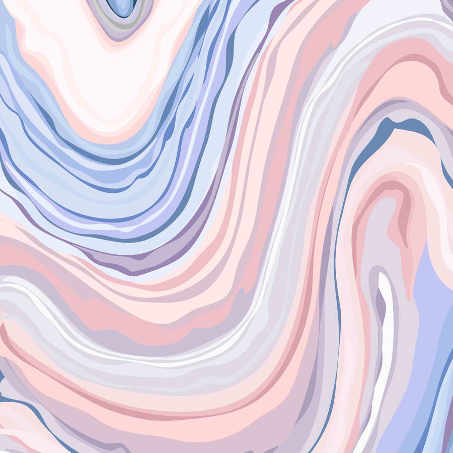
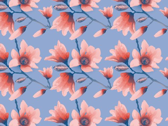
Pattern. You can also use the Rose Quartz & Serenity colors to fill in your patterns. Whether it will be a sharp chevron shape or classic scallop shape, the Rose Quartz & Serenity colors will tone as well as add this endearing charm to your designed pattern.
Cover design application. Whether it is a cover design for books or magazine, the Rose Quartz & Serenity shades deliver such calmness and a different take on cover design. It may be applied to execute a minimal or even a colorful exterior whichever fits the theme and art direction.
Interiors. We live in this fast paced world and rarely do individuals take a time to halt. Applying the joined colors into interiors be it the primary colors, piping or accents reassures mindfulness and gently calms any guests.
Color swatches, be it for a design pitch or project as well as interiors. If you are to consider incorporating the given shades, then you might want to use this as your color swatches to ensure accuracy during application.
Before We Call it a Day…
For 2017, Pantone introduced its new Color of the Year which takes inspiration from the natural elements. It demonstrates a zesty color which resonates an oxygenated appearance. You could also check out Pantone’s designated Color of the Year 2017 – Greenery.
We live in a world wherein a spectrum of colors influences our mood and well-being. As well as express individuality and nodding against normality. Even the purest white and the brightest neon green reassures every individual’s confidence regardless of how it is used.
Branding also applies the same philosophy. It incorporates a designated color that best represents a brand, its story and dissemination of the latter’s message. For an added information, you may want to go through our extensive guide on color theory that is applicable for branding and for every creative project at hand. You may also utilize it as a future reference.
Related Posts
FREE 29+ Car Brochure Designs in PSD | Vector EPS | InDesign | MS Word | Apple Pages | Publisher | AI
FREE 31+ Concert Flyer Templates in PSD | Vector EPS | InDesign | MS Word | Pages | Publisher | AI
FREE 21 Paint Fonts in TTF | OTF
FREE 20 Wave Patterns in PAT | Vector EPS
FREE 23 Brushed Metal Texture Designs in PSD | Vector EPS
FREE 25 Package Box Mockups in PSD | InDesign | AI
FREE 20 Leaf Patterns in PAT | PNG |Vector EPS
FREE 30 Concert Ticket Designs in PSD | Vector EPS | AI | MS Word | Pages | Publisher
FREE 26 Photoshop Lined Paper Texture Designs in PSD | Vector EPS
FREE 20 Crown Brushes in ABR | ATN
FREE 20 Camera Mockups in PSD | InDesign | AI
FREE 23 Lace Patterns in PSD Vector EPS
FREE 23 Photoshop Vector Brushes in ABR | ATN
FREE 19+ 3D Letters in PSD | AI
FREE 20 Number Fonts in TTF | OTF | PSD