There is a reason why people prefer specific colors more than the others. It suggests each individual’s personality, how we perceive or have a back end memory of it, and how we react when we internalize it. Similar to the previously stated, colors also give such effect on branding. Your favorite hue realizes your brand image and how your potential target audience will translate and perceive your brand or company.
Before you color your brand, we have listed the foremost spectrum of colors and colorful examples on how you can apply the colors to your branding. If you are looking for design tools for your color selection look no further since we have a number of color design tools available here.
Primary Colors
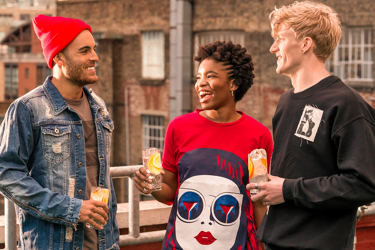
Red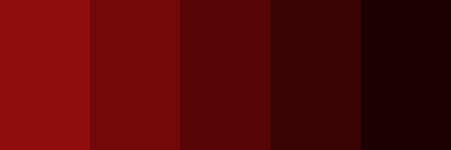

Red is a classic and head turning color that suggests passion, desire, and love. At most times, red is used to signify danger for its striking feature. Red is widely used for restaurant interiors, food, and beverage products since it enhances human metabolism and raises blood pressure.
For branding, red is used to visually translate power, modernity, and determination. It can also denote authenticity when used in such art or design themes.
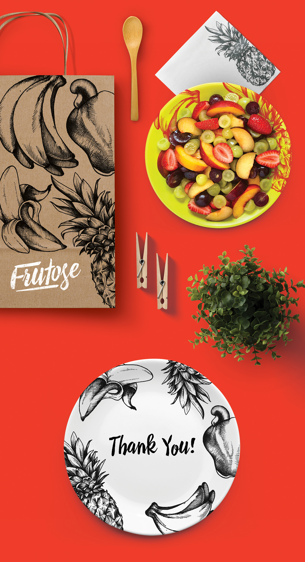
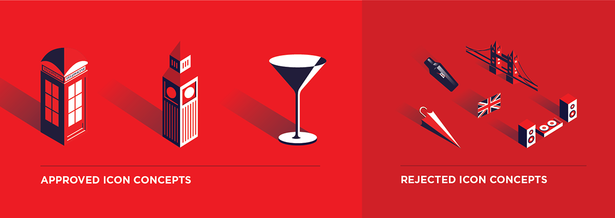
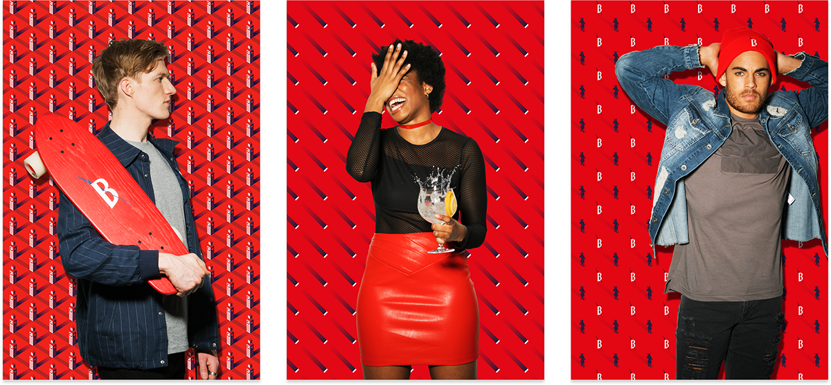
Frutose Branding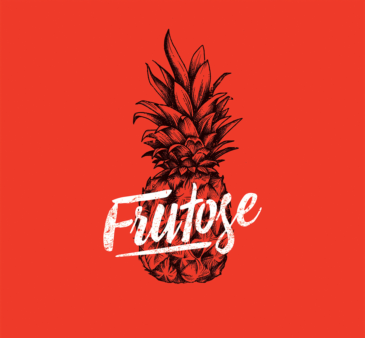
Beefeater London Re-branding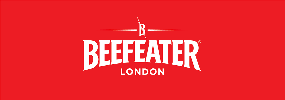
Create background patterns.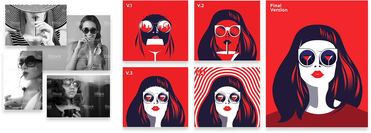
References for digital illustrations. 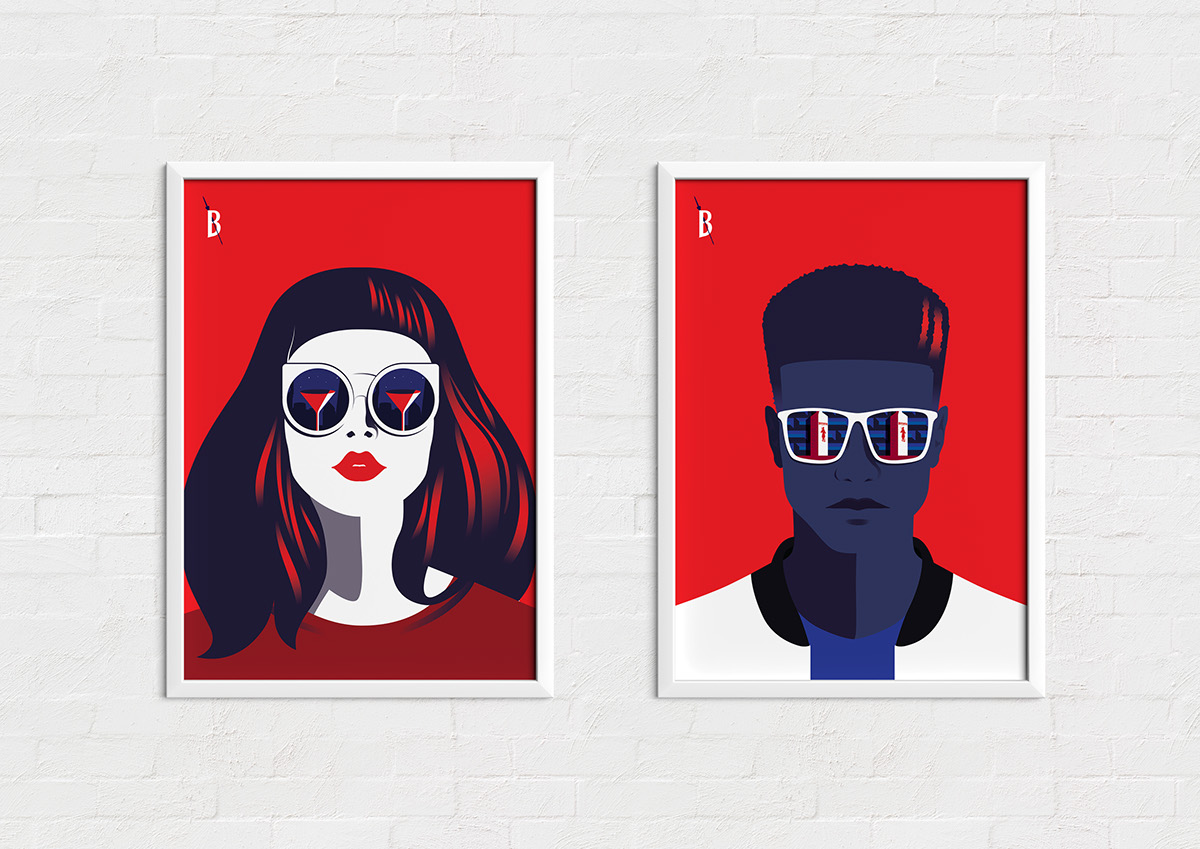
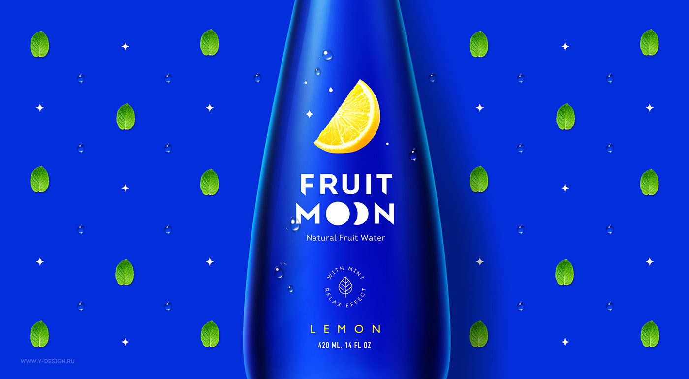
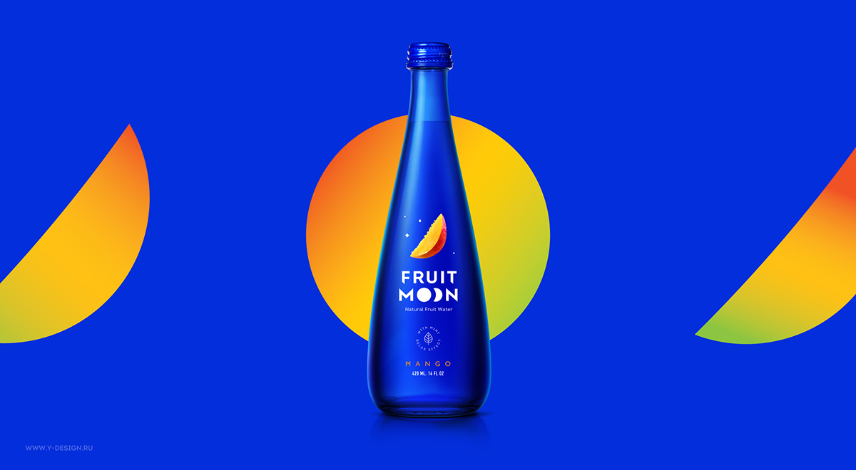
Blue

Blue is associated with trustworthiness and creates strength and dependability. Blue happens to suggest intellect, serenity, and calmness. On the flip side, blue might appear to be cold, aloof and unfriendly. But it is worth it to mention that the color blue soothes the viewer’s mind, unlike the physical reaction we get from the color red. Seeing the color blue affects us mentally especially strong blues; it stimulates clear though and aids concentration.
Most dental, medical and technological products use blue as their brand color to translate logic, efficiency, great communication, and proper duty. This turns out to assure a company’s customers about their products, quality, and service.
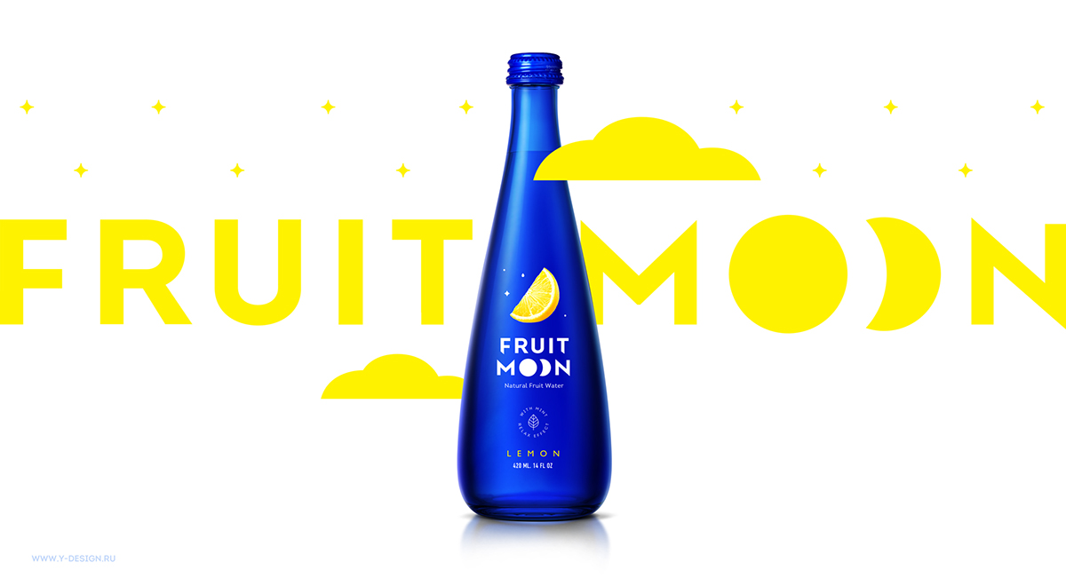
Fruit Moon Branding and Packaging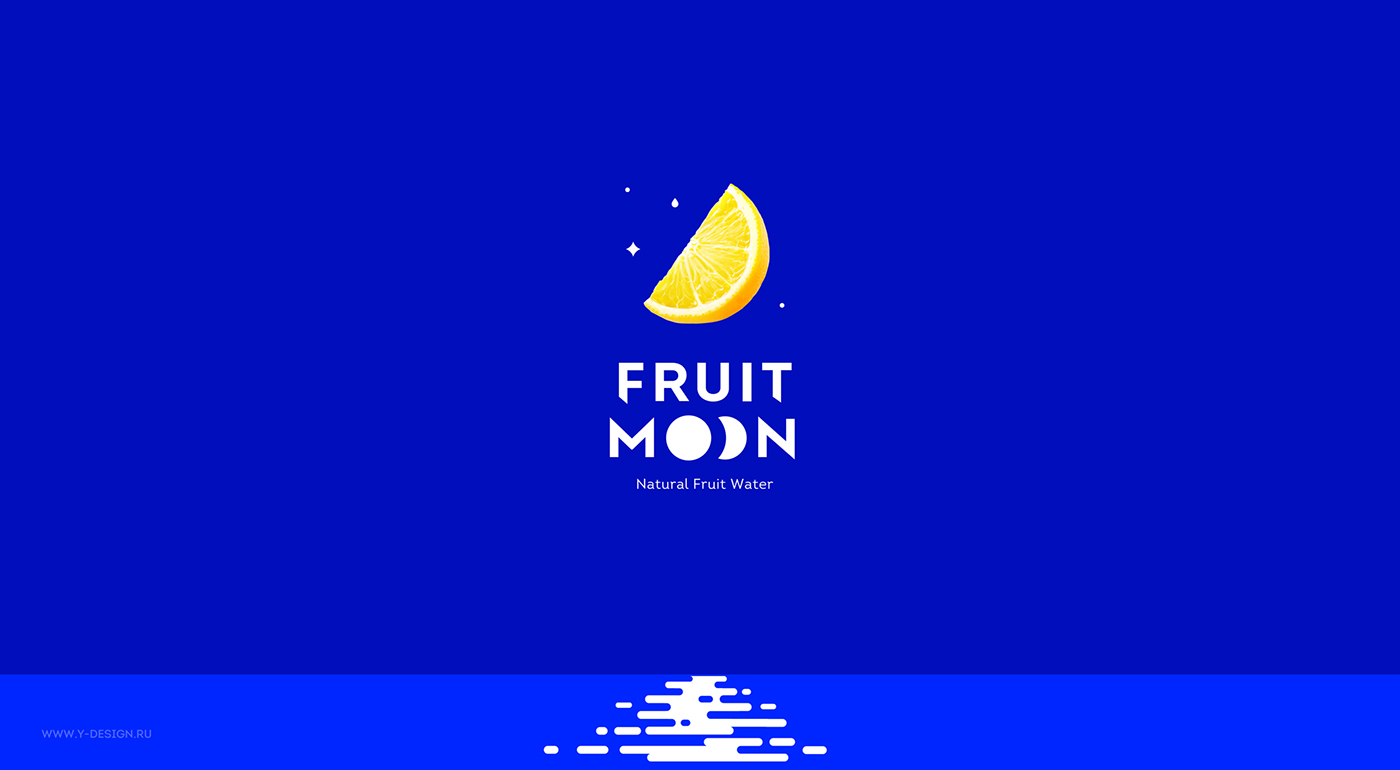
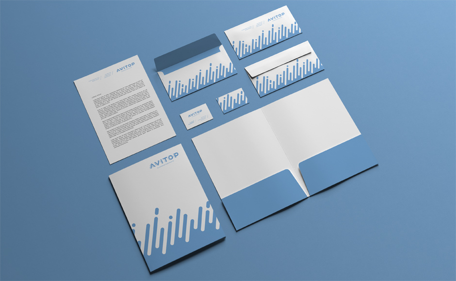
Avitop Brand Identity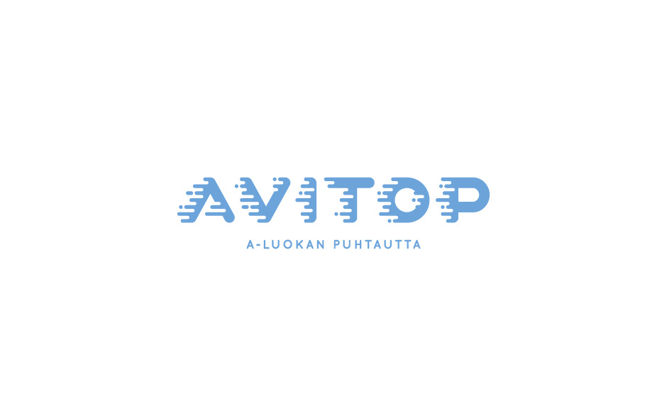
Yellow
Yellow, with its sunny disposition, is considered as the happiest color in the spectrum. It suggests optimism, clarity, and energy. The color yellow produces such warm effect that aids in mental activity and increases cheerfulness and not to mention, it is an attention grabbing color. Keep in mind that the color yellow may have a disturbing effect when overused. In branding, yellow might be tricky during printing due to the paper material and how bright it might be in print.
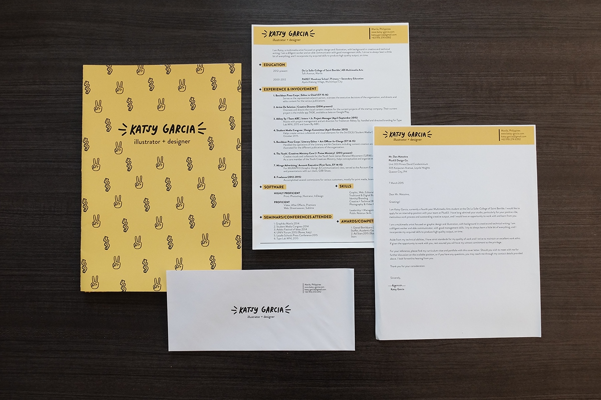
Katsy Garcia Personal Branding
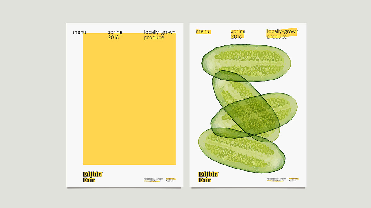
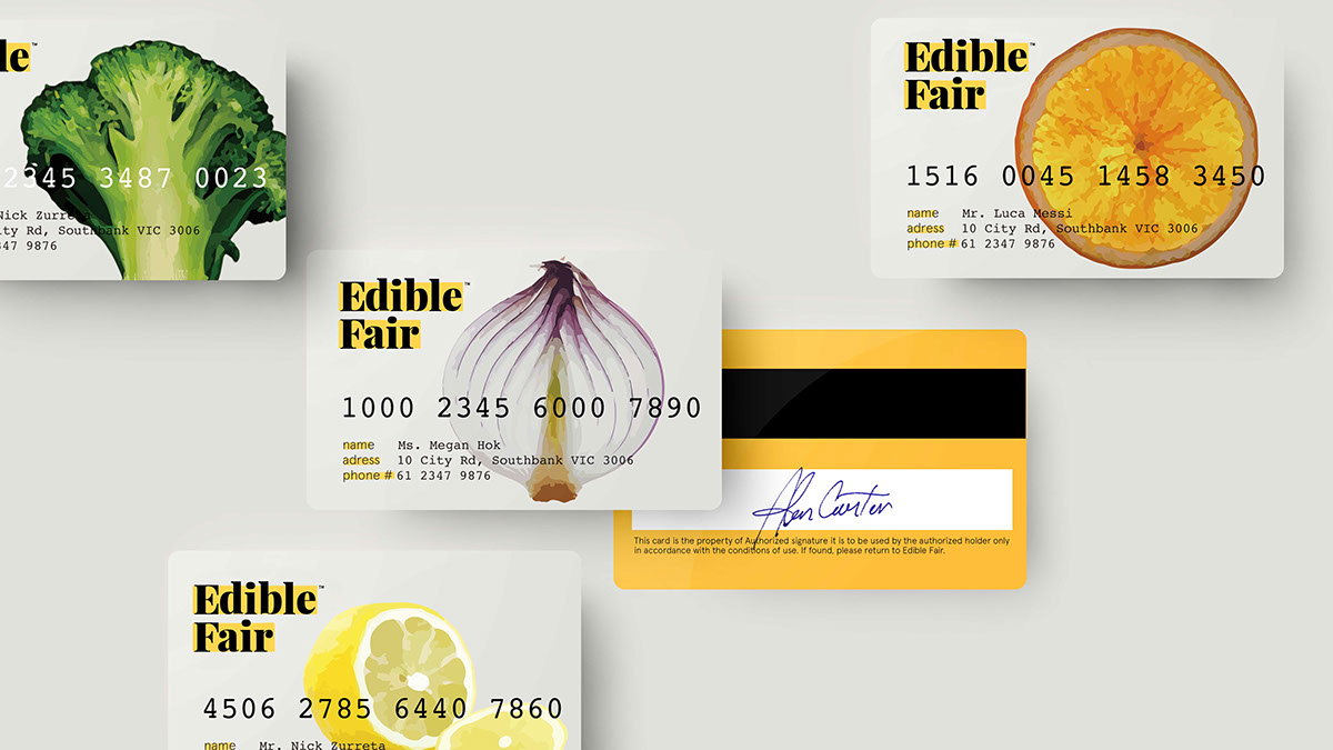
Edible Fair Branding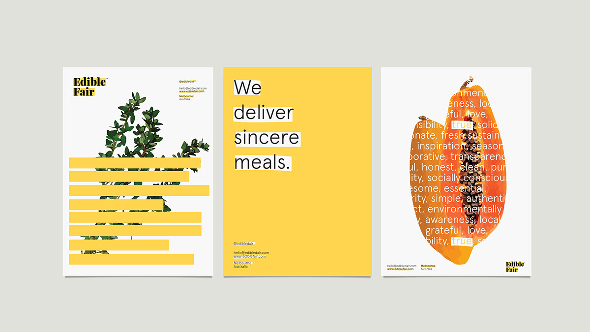
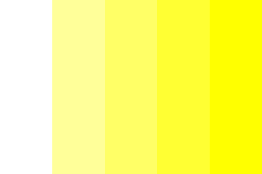
Spectrum of Colors
As said earlier, yellow is a tricky color to consider, especially during the printing process. Sometimes, colors don’t appear as what you have assigned them to be. It might be a technical error or an overlooked element, but don’t fret. We’ll get you through this by breaking down the tips to get the true colors for your design project.
Here are a few tricks:
- Calibrate. Computers and laptop devices are not made the same as well as they don’t offer users the true colors of a digital element. So, you could try to calibrate your computer device though it might be expensive its still worth the financial side.
- Test print. If you haven’t calibrated your device, you could always try another alternative—test printing. You could save time and mistakes with this meticulous process. Try printing your design in its original color and if it results in a different color or shade then do some adjustments.
- Color mode. Keep in mind to save your design projects either as RGB or CMYK. If you plan to apply your design project in a digital medium, save it in RGB color mode. If the design is intended for print, save it in CMYK color mode.
You may also go through our list of rainbow color swatches that you can add for your branding project.
Orange
Orange is a striking color for its mix of the passionate feature of red and the happiness of yellow. It identifies with the tropical locales and the sunshine. Though it may give off an immature disposition, the color orange translates abundance and fun, so no worries.
In branding, orange is used to reassure confidence and it comes out friendly towards the brand or company’s potential target market.
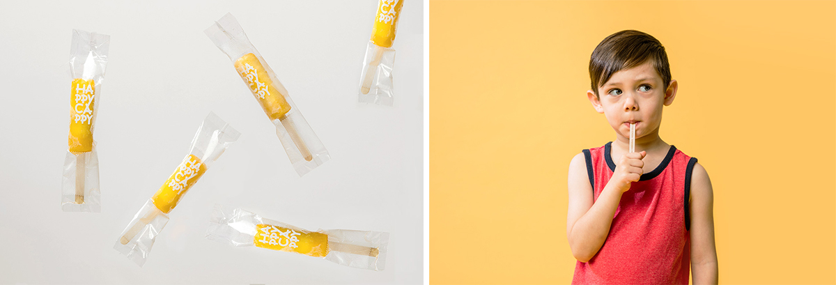
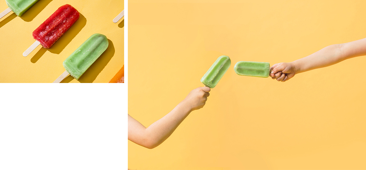
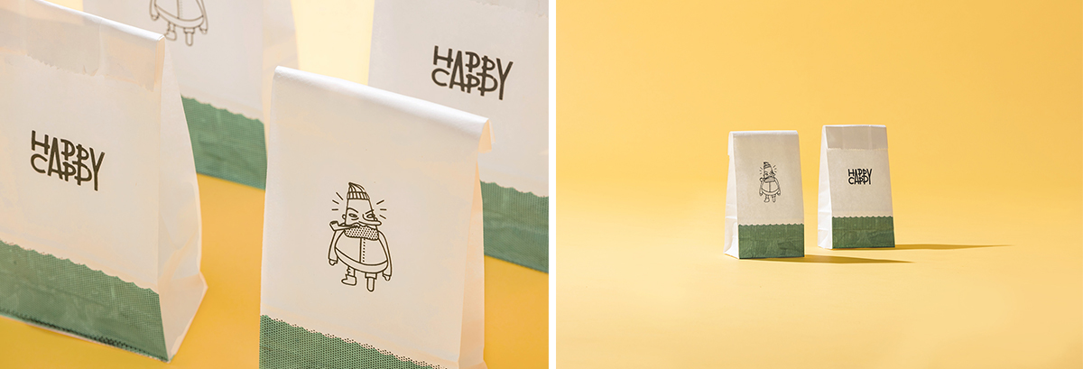
Happy Cappy Branding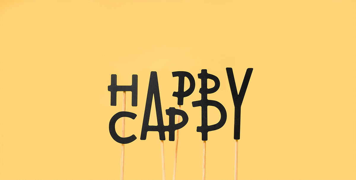
Violet
Violet brings about spiritual awareness, authenticity, and encourages deep contemplation. The color violet suggests royalty and in branding, it communicates and translates the finest quality be it the product, services, and luxury.
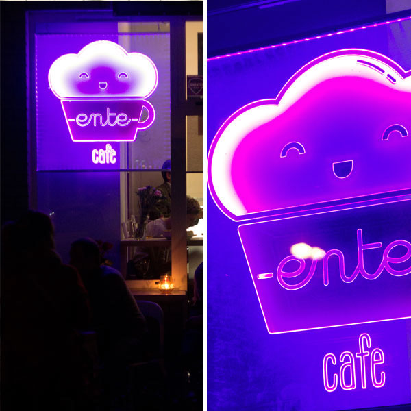
Ente Cafe Branding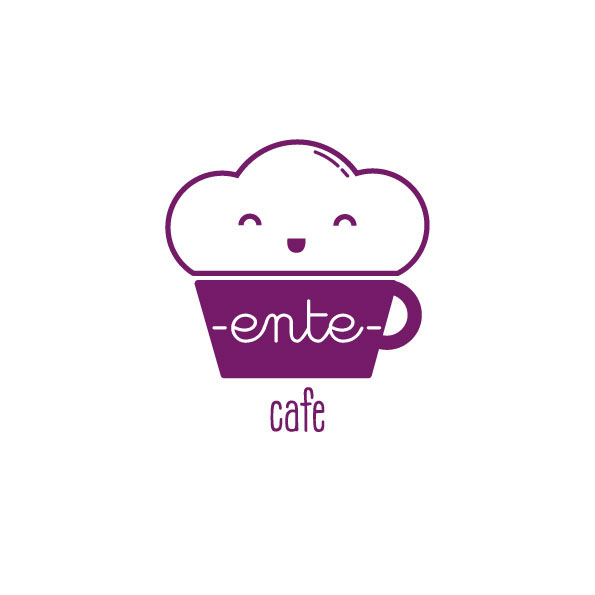

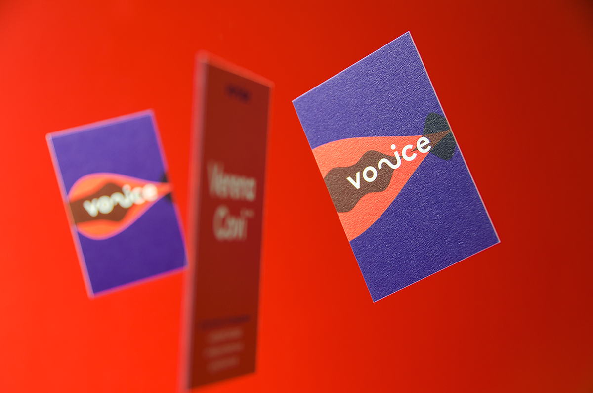
Voice Branding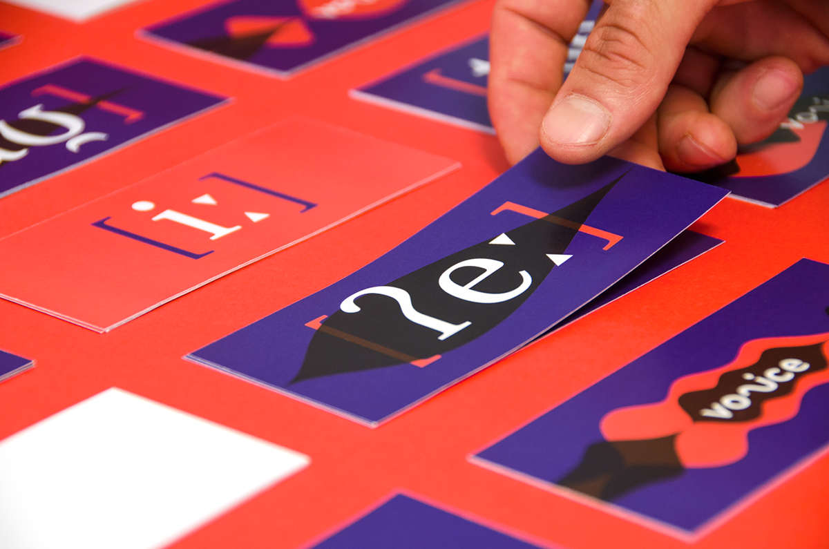

Pink
As pink is usually associated with femininity, it also incorporates positive qualities such as boldness, youth, and excitement. Pink could also indicate emasculation, physical weakness, and inhibition. But when used appropriately and according to brand design preference, it could convey the brand’s core, values, and story.
Andre Daisley Branding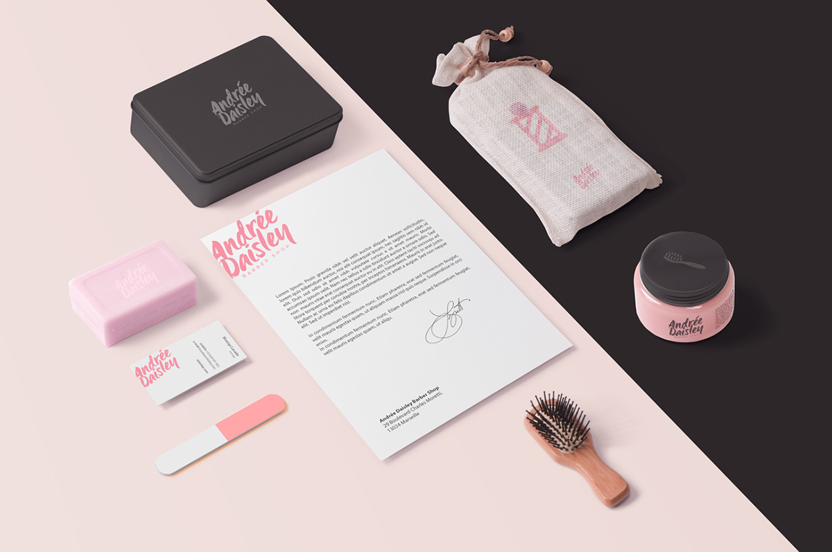
Purple
Purple conveys a light-hearted and romantic emotion to the viewer’s eye. It symbolizes magic, mystery, creativity, and wisdom. Fun fact! Purple is associated with supernatural energy and electromagnetic energy—that is the beauty of the color purple. Recognized brands such as Yahoo!, Welch, Hallmark, Cadbury, and more are associated and recognized with the color purple.
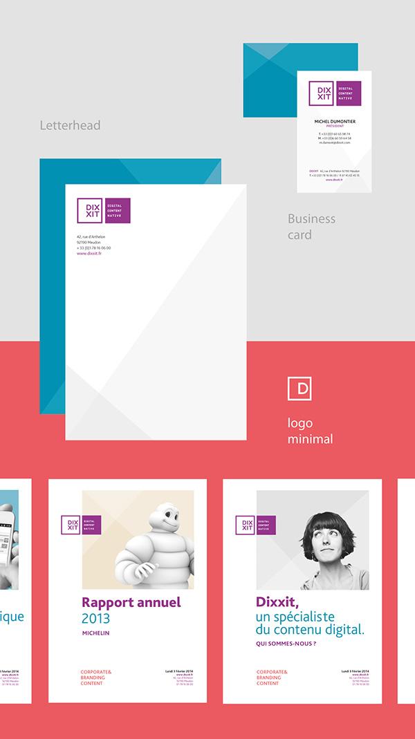
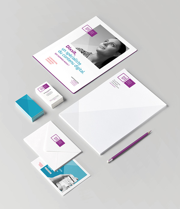
DIXIT Branding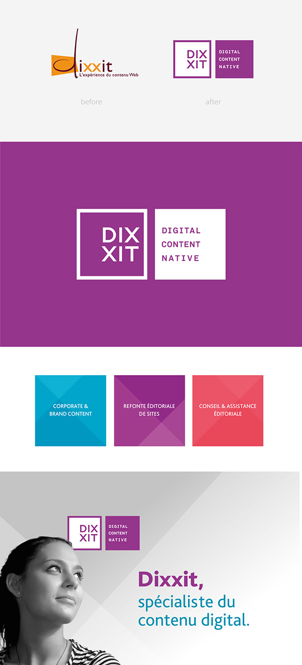
Green
It is naturally embedded in us to associate green with natural elements and life. It denotes growth, health, and peace. Most brands that associated with this specific color are serving environmental and natural products and services. Great examples of brands that feature green are Animal Planet, Tropicana, BP, and Spotify.
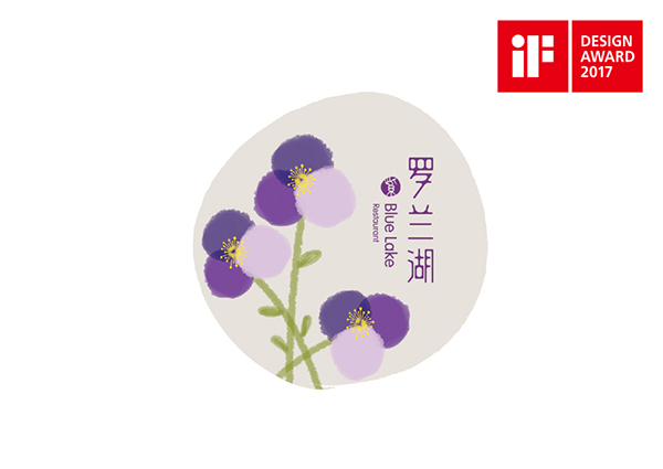
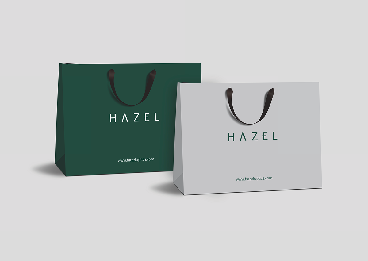
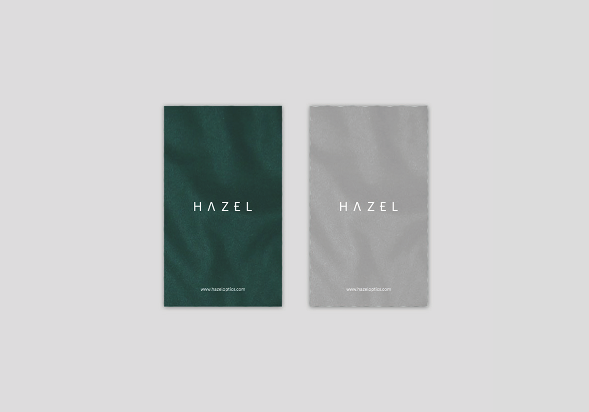
Hazel Branding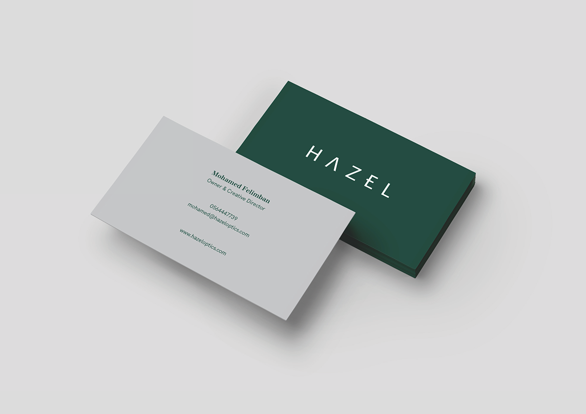
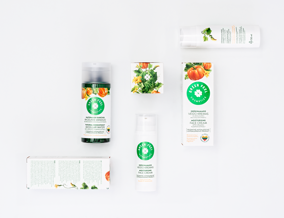
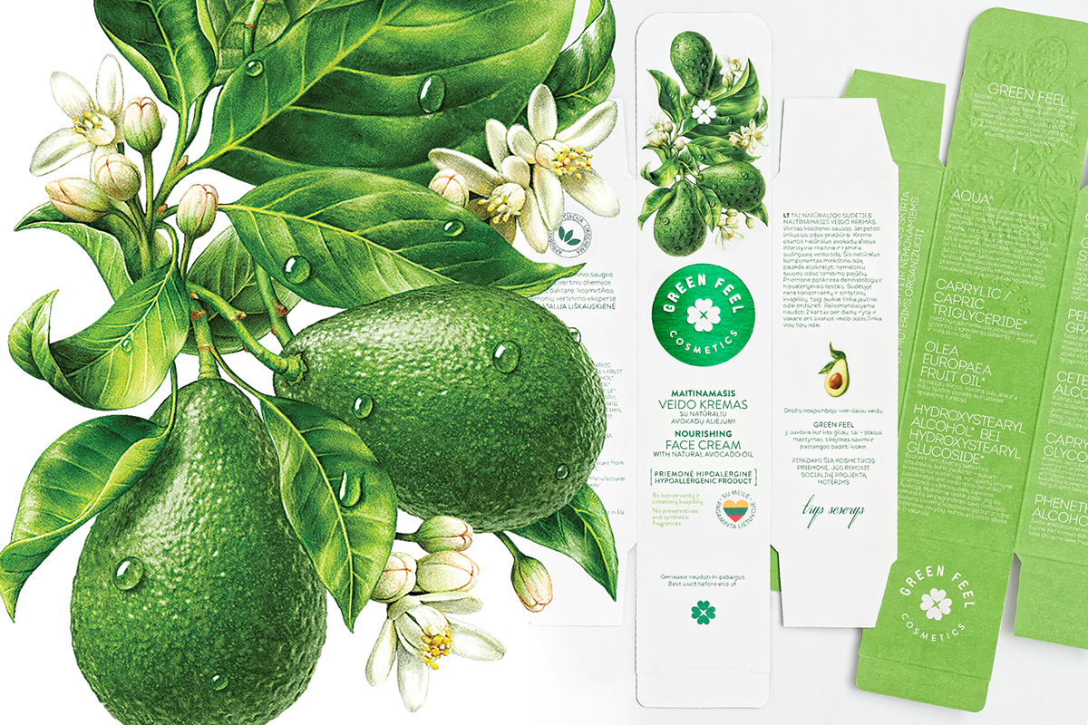
Green Feel Branding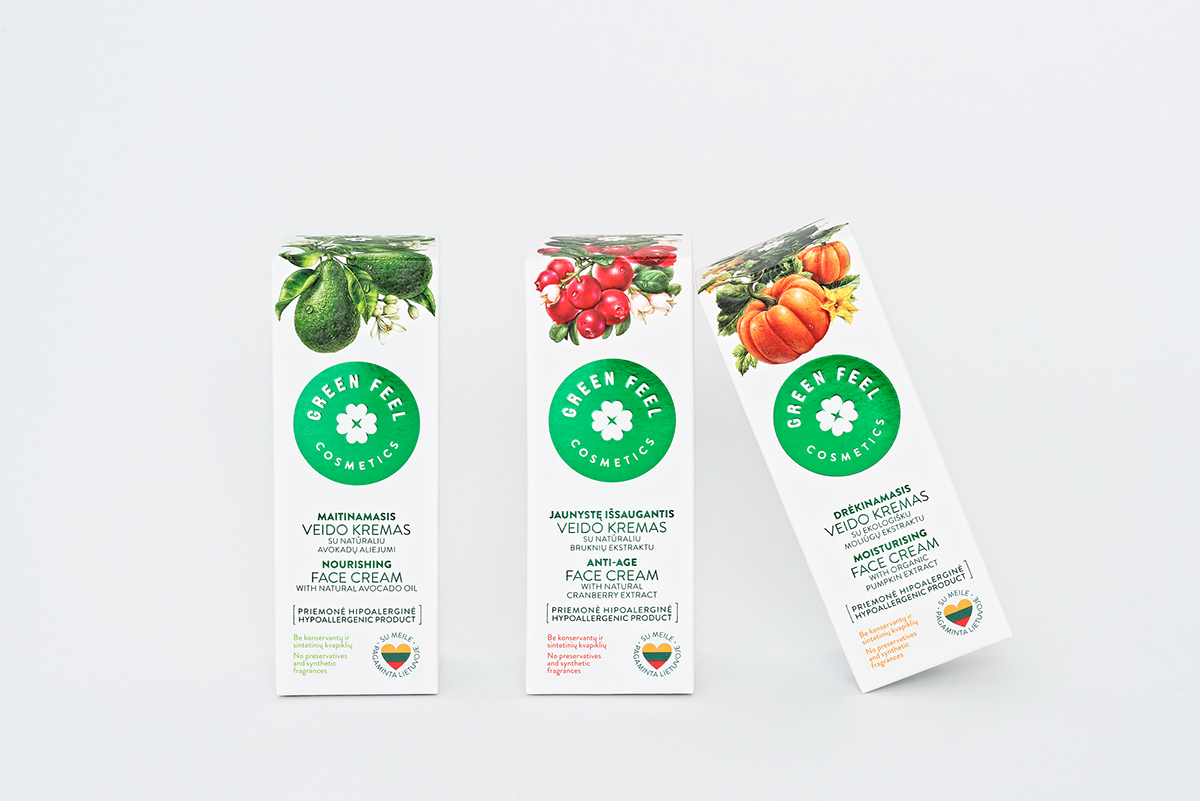
Brown

Similar with the color green, brown is associated with nature, more specifically ground dirt. Contrary to its lack of sophistication quality, it turns out brown is inviting and suggest reliability, support, and a down-to-earth personality. Brown is also a neutral since it can easily be combined with other cool and warm colors.
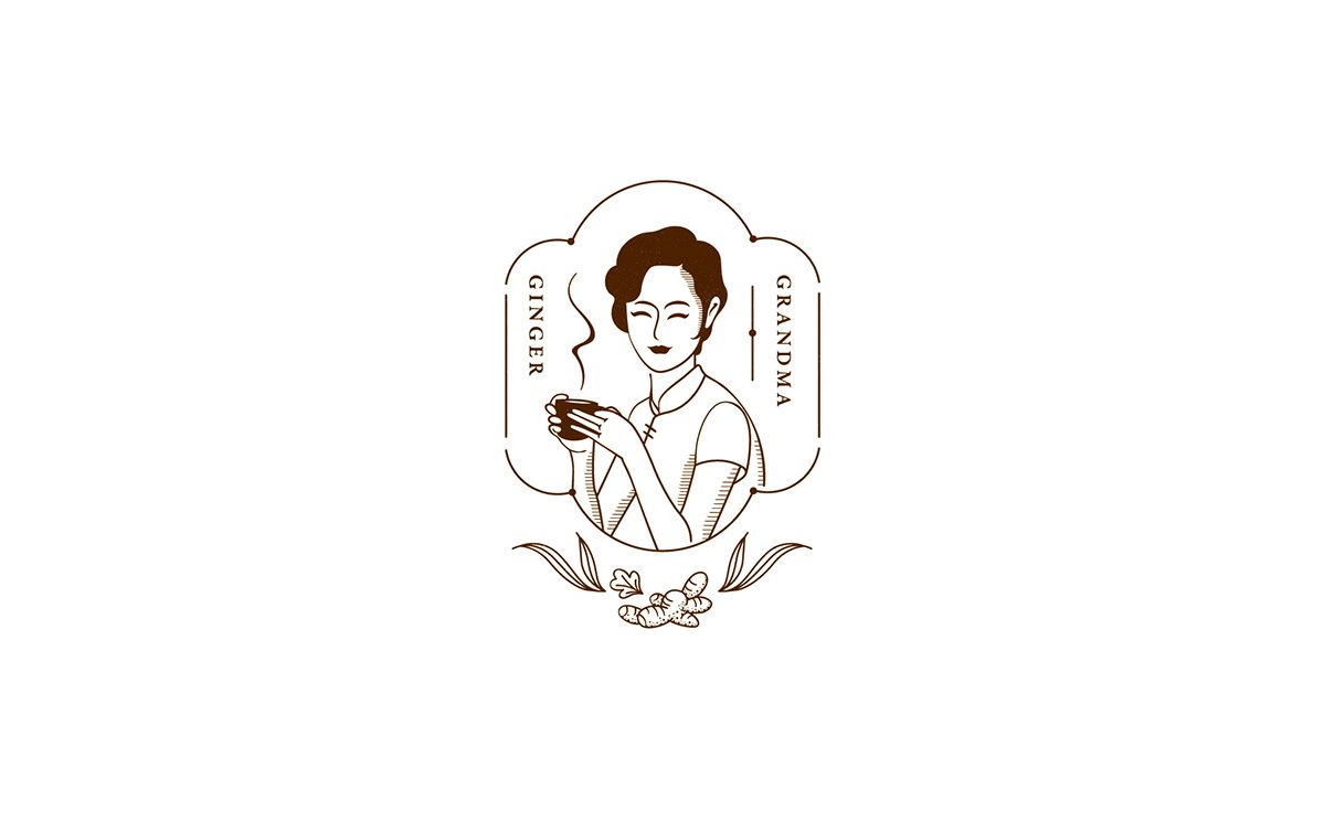
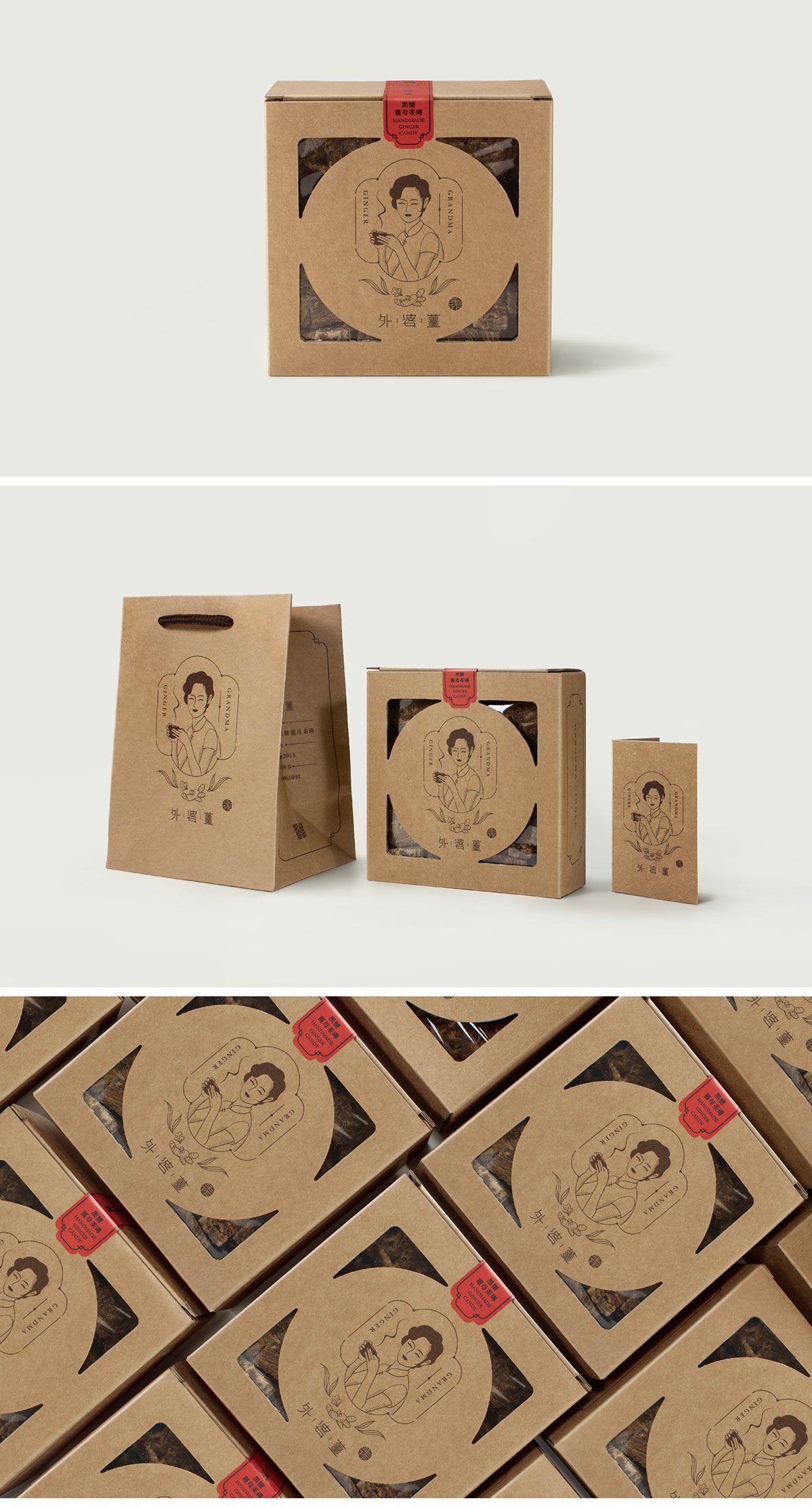
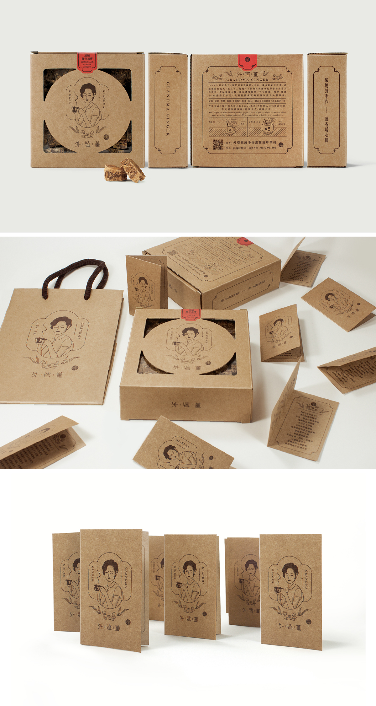
Grandma Ginger Branding
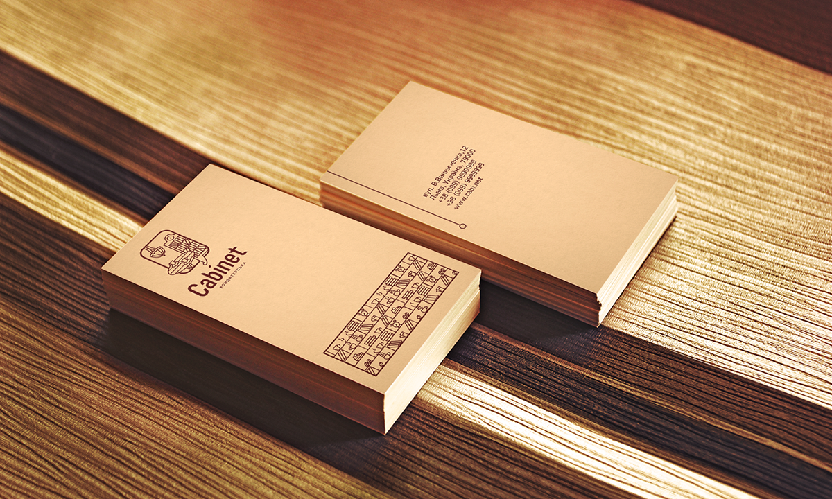
Cabinet Branding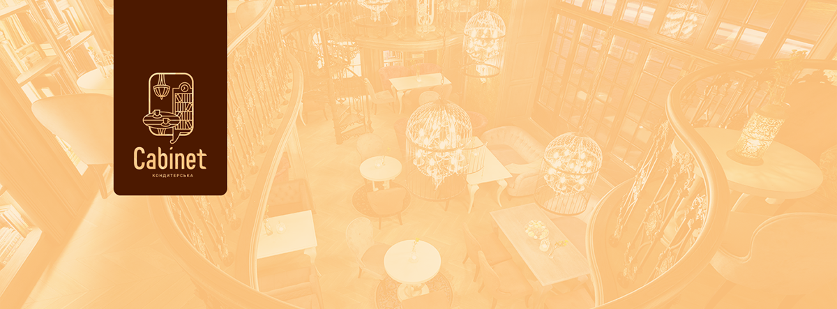

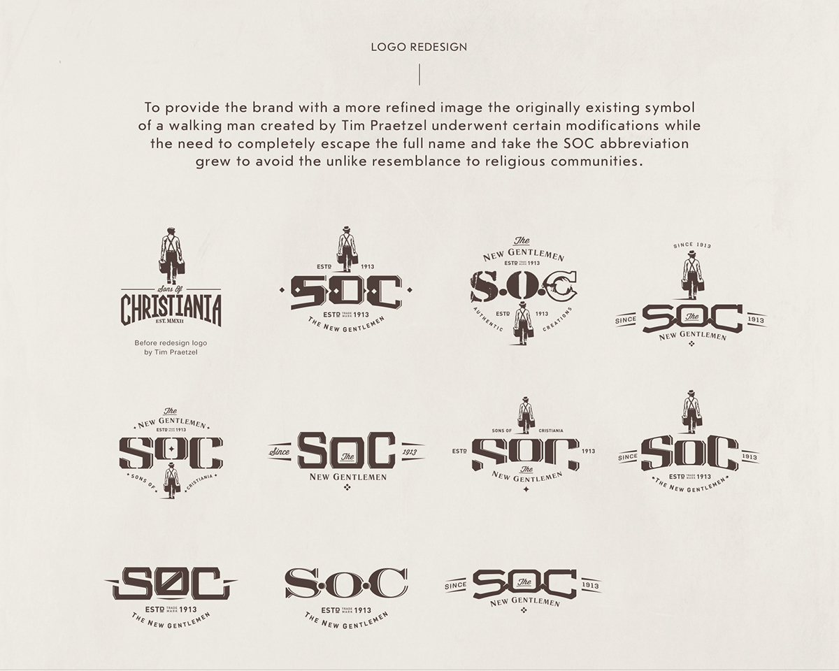
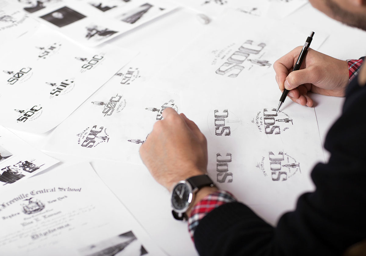
SOC Branding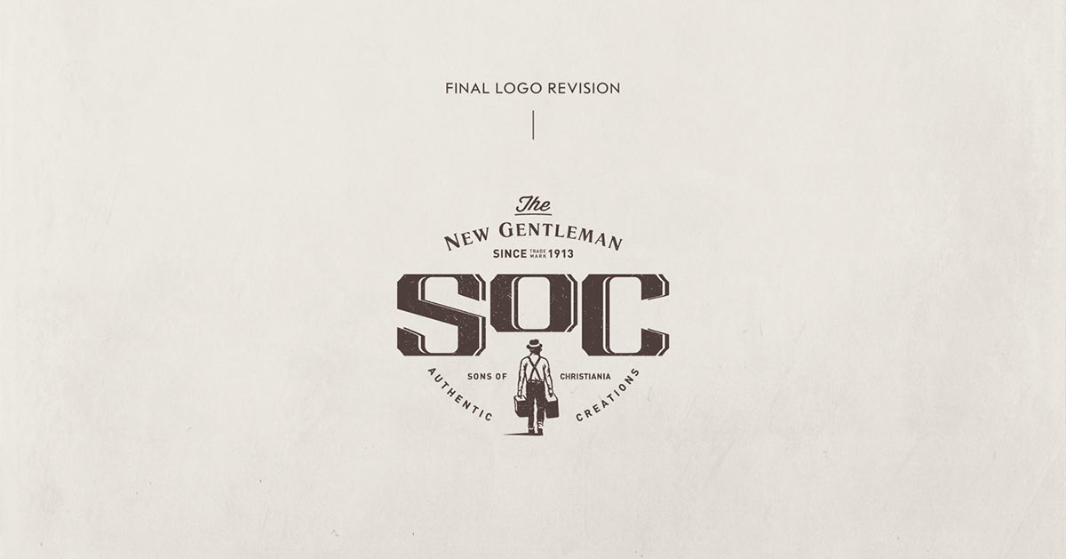
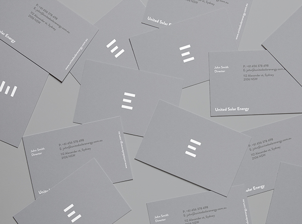
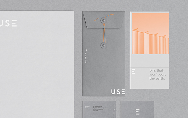
Grey and Black

Black. The color black matches well with most of the colors given as it is a neutral color. It gives off sophistication, glamour, simplicity, and substance. On the other hand, black could denote a morbid emotion, menace. It also creates weight and seriousness.
Black is usually used as outlines or as line art. But when used as a whole color, it draws attention to any medium it is placed in, be it clothing, art, or design. It also draws mystery and a negative connotation.
Grey. The beauty of gray is that it serves sleekness and a practical charm. Gray is deemed as a color “without color” due to it being an intermediate color between black and white. The flipside is that the color gray can be dull without interest or character.
Since the color grey is neutral, it has been used dominantly in the automobile industry and educational mediums and platforms. It conveys balance as well as calmness.
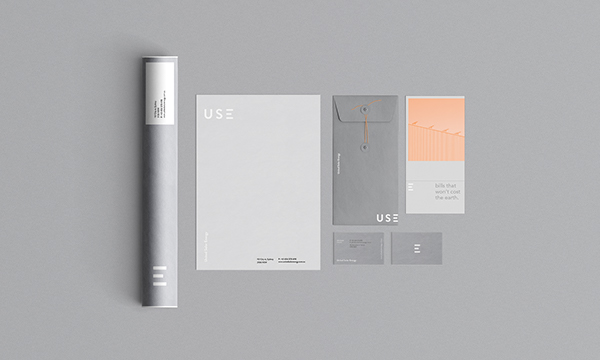
USE Branding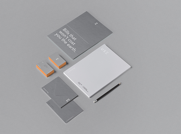
Regardless of what these colors are associated with, choosing your brand’s color is personal and must well represent your brand’s core, values, and story. There are shades and tints of these prominent colors of the spectrum such as canary yellow, Prussian blue, mint green, and so on. It’s a wide color selection!
You may also go through our heap of logo trends that we’re sure will inspire your creative eye. Knowing what’s trending with logo and brand design would help you have a reference for your branding project. You might also associate well with current styles that you can apply for your logo and brand identity or probably start another design trend.
Related Posts
FREE 22+ Technology Brochure Templates in PSD | Vector EPS | InDesign | MS Word | Pages | Publisher | AI
FREE 22 High Quality Blue Textures for Graphic Designers in PSD | Vector EPS
FREE 21 Blue Pattern Backgrounds in PSD | AI
FREE 21 PSD Vintage Logo Designs in PSD | Vector EPS
FREE 22 White Paper Texture Designs in PSD | Vector EPS
FREE 30 Square Brochure Mockups in PSD | InDesign | AI
FREE 24 Envelope Mockups in PSD | InDesign | AI | Stationery
FREE 29+ PSD Christmas Invitation Card Designs in PSD | MS Word | AI | Apple Pages | Publisher
FREE 20 Silver Texture Designs in PSD | Vector EPS
FREE 20 Bold Fonts in TTF | OTF
FREE 22 Square Book Mockups in PSD | InDesign | AI
FREE 35 Concert Ticket Designs in PSD | AI | MS Word | Pages | Publisher
FREE 21 Tile Patterns in PSD | Vector EPS | AI
FREE 44 PSD Coffee Cup Mockups in PSD | InDesign | AI
FREE 29+ Car Brochure Designs in PSD | Vector EPS | InDesign | MS Word | Apple Pages | Publisher | AI