
Flyers must visualize a certain idea of what it is intended for. Be it for events, promotions, informational purposes and so on. In this case, for professional and business purposes, flyers for such must best represent the brand and what it offers. Its design should be relevant and attention grabbing. Like most advertising and promotional collaterals, flyers should receive a brilliant design treatment to get the brand’s message across.
To help you get by, we have listed useful design tips in crafting high-impact professional flyers. Which tackles on both design and technical elements you should consider while on the designing process.
For a more extensive reads regarding designing flyer, you may skim through our guide to crafting impressive flyers. This guide focuses on the general application of flyers and showcases an array of flyers to get your creative juices flowing.
Design Tips for Crafting Professional & Business Flyers
Before heading out on working your designs on digital medium, and as strongly practiced by designers and artists, is to do some rough sketches or studies to your flyer designs. It helps to visualize ideas first once done on manual. As well as the first draft most likely wouldn’t be the final design for the flyer.
Especially when you have accounts in an advertising agency or clients, you must have a line up of studies for an extensive selection of designs. See example below.
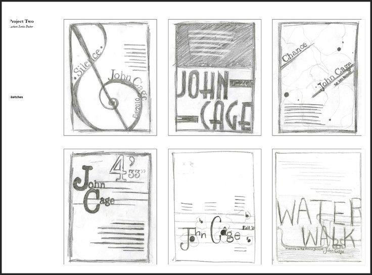
Rough Sketch example / Photo courtesy of Pinterest
Design elements.
Layout.
The standard layout as observed is with the logo placement on top on either sides. Event name, details and descriptor are situated in the middle. While call to actions are on the bottom. While this layout is already established, you may freely switch it up.
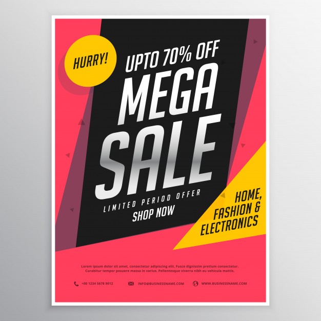
The call of action, for example, to evoke the sense of urgency you may place this specific call to action on top. See the example below.
Super Offers Abstract Flyer
Images.
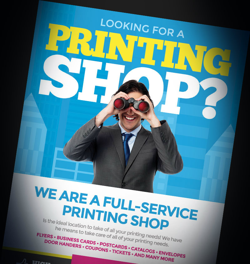
In some cases where you need to place pictures of products and corporate events occured, make sure to use well-curated pictures that best represents the agenda of your business as well as your brand. Make sure to place pictures that are high-quality. Be keen on the details such as lighting, perspective and overall appearance.
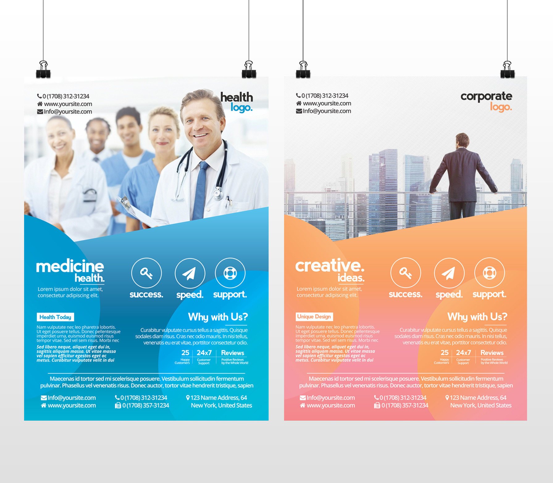
For the background image, be keen on the design and technical elements that are placed in front. Choose a quiet image which induces personality and will go along with other design elements. Avoid busy backgrounds to prevent any distractions and a misdirection to the brand’s representation and message. See example below.
Business & Medicine PSD Free Flyer Template
The Use of Typographical Elements.
The rule of thumb when it comes to designing flyers and in this case, business flyers, keep your typographical use to a maximum of three fonts.
With an array of fonts used for the design might evoke a unprofessional appearance and could be distracting when trying to skim through the flyer’s agenda. The selection of type or font selection will be based on the art direction and the brand identity.
We strongly encourage you to pair fonts with one another to bring about variety. This might be a business flyer after all but it doesn’t have succumb to traditional or standardized fonts and design. Just make sure that the selected font/s is readable and legible. Let us visualize font pairings with the example down below.
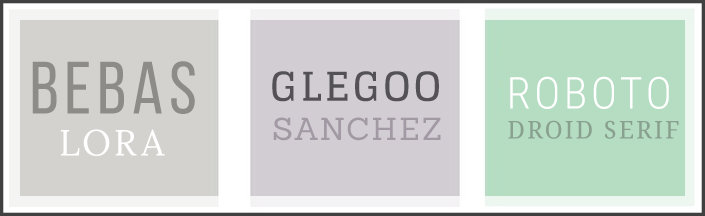
Font Pairings example / Photo courtesy of Google Images
Typographical Elements example / Photo courtesy of Flyer Heroes
On a hunt for corporate and professional fonts? How about we help you with that. We recommend the Edmondsans font for its simple and sans serif moderate weighted appearance. As well as for its versatility for various design projects you may incorporate the font on be it for modern designs and in this case, business flyers.
Colors.
Colors are powerful in bringing about personality, conveying message and a head turner in grabbing one’s attention. In a spectrum of colors, select a color that best evokes a positive emotion and outlook for the brand and agenda presented in the business flyer. In terms of business, the widely used color for such intents are blue for its trustworthy characteristic.
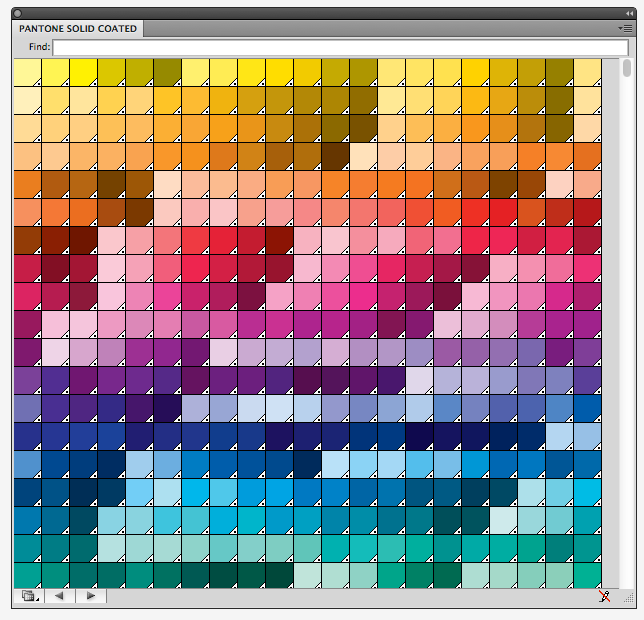
Use color swatches. If you are using Adobe Illustrator in crafting your business flyer, you may use the color swatch libraries to have a more extensive selection of colors. As you might have seen, the default color swatch only offers a few and basic colors.
To reach to the color swatch library, simply Go to Window > Swatch Libraries > Color Books and in the pop-up menu select any Pantone swatch library to your preference. It is strongly encouraged to use Pantone swatches but we also encourage you to experiment with the other swatch libraries.
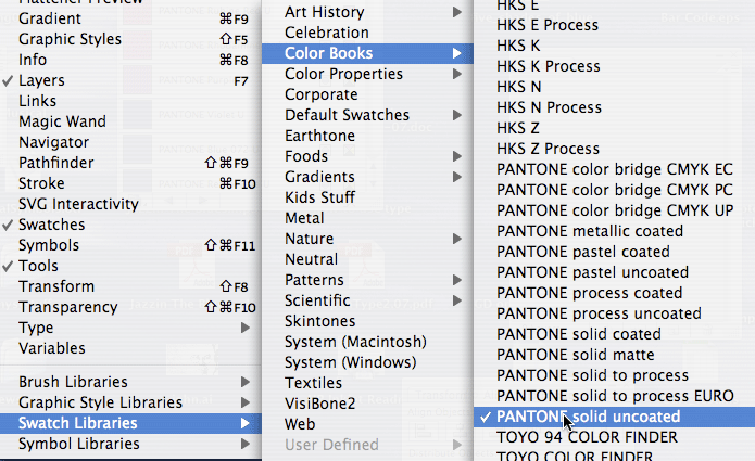
Swatch Library Adobe Illustrator example / Photo courtesy of SFCC Graphic Design
Swatch Library Adobe Illustrator example / Photo courtesy of apedogood.com
Use Color Design Tools. You may use color design tools and generators when it comes to your color selection. It’s a quick option to have especially when you need color palettes and be able to choose more in a spectrum of colors.
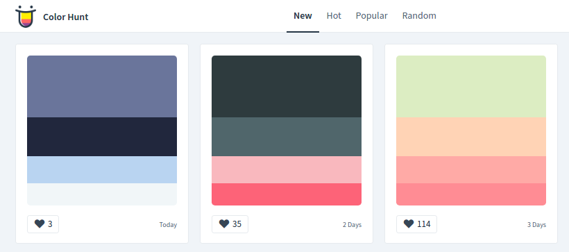
Photo courtesy of Color Hunt
Stuck which color to use? Look no further. To help you get by, we have listed the basics of color theory which dwells on the use of colors for brand identity and will be helpful in crafting your business flyer. You may refer to this guide for other design projects such as graphic design, typography, multimedia etc. and as future references.
Technical Elements.
Logo Placement. The brand’s logo serves as a visual representation and the introduction to the agenda or intent set our for the business flyer. So, make sure to place the logo where the viewers will likely be exposed to your brand and avoid stretching and distorting the logo.
Also, it is important to place the logo on a quiet background to allow the viewers to scan through the brand’s logo as well as the brand’s message to be properly conveyed.
Aside from its placement, the size of the logo should be applied accordingly to the brand’s allotted minimum print size. This is to ensure that the logo receives proper design treatment as well as properly conveying the message to the brand’s target audience and new viewers.
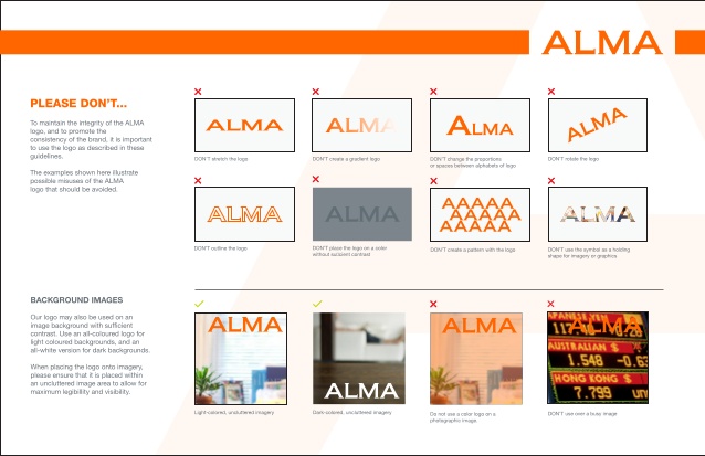
Brand Guide & Logo Usage example / Photo courtesy of Slide Share
To avoid improper use of a brand’s corporate identity, make sure to ask and refer to their brand guide. The latter serves as an instructional guide to the proper application of the branding elements.
Be it the exact use of color palettes, typographical elements, logo variations and is uses and so on. If you happen to need one or have to dip your toes a bit further with the given topic, you may freely scan through our aid on brand guides. The latter discuss the essentials included as well as brand guide examples to visualize the all important brand collateral.
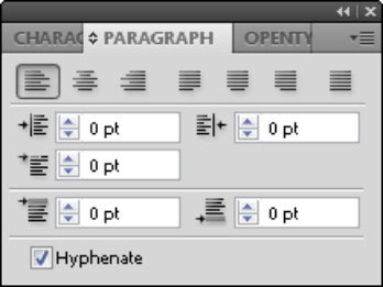
Text and copy. For a cohesive overall design for your business flyer, be mindful of the layout of your text and copy be it rags, alignment, hyphenation and placement. If you are using Adobe Illustrator, Photoshop or InDesign, simply adjust your text by going to the software’s character or paragraph window.
- For Hyphenation: Hyphenations allows the word in the text to be split onto the next sentence. Adding hyphenation to the text can get unsightly in some cases. To avoid such situation, make sure to click the text feature first on the bar situated on the left side or simply press “T” to shortcut. Once that is done, go to the tab above and click on Paragraph. Uncheck the hyphenation feature and voila!]You may also use the same exact window to align your text accordingly.
Hyphenation and Character Window example courtesy of amazonaws.com
- For Leading, Kerning & Tracking. You may find the following functions on the character window. Leading, is the distance between baselines. Kerning focuses on the spacing in between characters. Especially letters such as AW, YA, YE and so on. Lastly, Tracking is similar in concept of Kerning but the main difference is that tracking is the spacing throughout the entire word.To fix and adjust these typographical importance, go to the Character window. See the examples below.
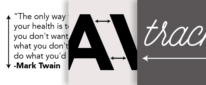
Basics of Typography example / Photo courtesy of Creative Market
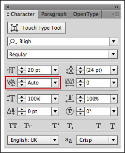
Character Windows Adobe Illustrator example / Photo courtesy of FontShop
Call to Action. In this case, the call to action can be two things; the phrases used and the website & social media account buttons. This evokes an immediate action to consider the brand’s offer as well as to aware of the brand’s website and social media accounts, if there is any.
To note that flyers in general provides a one-way communication towards the viewers and the brand or business. To break such direction, the call to action is a way to provide viewers another way to communicate regarding the business, its offers and services and so on.

Call to Action Elements Examples / Photo courtesy of stockpsd.net
You want to make sure that even the smallest of details such as social media buttons will be cohesive and neat in presentation. How about we help you with your search on finding a considerable set of social media icons. We have gathered an extensive selection of social media icons which features varying design styles and covers the widely used sites and others.
Save it accordingly.
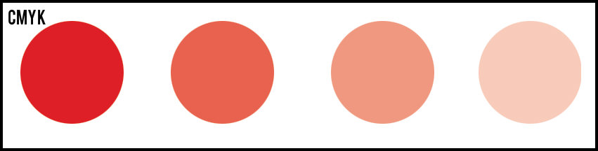
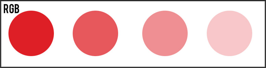
CMYK & RGB Color Mode Examples / Photo courtesy of Graphic Design Stack Exchange
Once your business flyer is done, remember to save the flyer design in a CMYK color mode. This ensures that the colors designated for the business flyer is what they appear to be on print. As demonstrated directly above, the two color modes has different results.
To further explain the difference of both CMYK and RGB, we we have gathered a list of color design tools which discusses the beauty of these color modes. As well as provide design tools for an extensive color selection.
To help you get by, here are some ways you can do and apply to ensure accuracy with your use of colors.
Calibrate your computer or laptop.
To ensure that the colors you are using are of true colors on screen, calibrating the computer or laptop is highly important. To note the lineup of Apple iMacs and laptops do display true colors in their screen.
Test Print.
You may also do test prints to ensure a mighty fine color result; it wouldn’t hurt to do anyway. Ask your printing services if they would gladly allow doing test prints. So, prepare the color you wish to print and the substitute color in case they first option would not make the cut.
We have more offerings!
Before we call it a day, we have a heap of business flyers we’re glad to share with you. The list of elegant business flyers offers a range of flyers for the various business types. As well as the collection of corporate flyers that best represents a brand and company.
Related Posts
25+ Free PSD Flyer Mockups
20+ Promotional Flyer Templates - PSD, Vector EPS, JPG Download ...
21+ Chalkboard Flyer Designs - PSD, Vector EPS, JPG Download ...
18+ Elegant Flyers - PSD, AI Illustrator Download
18+ Open House Flyers - PSD, Vector EPS Download
20+ Social Media Flyers - PSD, AI Illustrator Download
21+ Barbershop Flyer Templates - PSD, Vector EPS, JPG Download ...
20+ Tutoring Flyer Templates - PSD, Vector EPS, JPG Download ...
22+ Flyer Designs - JPG, PSD, AI Illustrator Download
15+ Retirement Flyers - PSD, Vector EPS, JPG Download ...
21+ Insurance Flyer Designs - PSD, Vector EPS, JPG Download ...
19+ Security Brochure Templates - PSD, Vector EPS, JPG ...
10+ Tips in Designing a Spa Flyer
21+ Catering Flyers - PSD, AI, Illustrator Download
20+ Cosmetic Flyer Templates - PSD, Vector EPS, JPG Download ...