
Now, you’re finally done crafting your brand and you want to make sure that all your branding collaterals get the exact treatment you set it out for. For example, you want your logo to be readable and recognizable, despite being placed in a limited space; or, even use the exact color palette when applied on to different mediums. Most importantly you want your brand’s message to be conveyed effectively in a consistent manner. The solution to the problem is by providing a brand guide or brand book.
To know what a brand guide is, scroll below to gain insight its importance as well as the essentials needed in crafting one. This should be easy once you have a fully-realized concept and completed designing your brand identity.
If you haven’t started developing your personal branding, we’ll help you get by with our guide to developing a personal branding. Once you have established your branding, the brand guidelines come next.
Why Do You Need a Brand Guide?
Let us think of it this way, a particular brand specializes in crafting pieces of furniture. Now, time has come for them to advertise their products through printed materials. During the design process, the layout artist placed the brand’s logo on top of a busy background; the logo, in turn, loses its importance and emphasis. Types of situations like this example are the ones to avoid at all costs.
On a broader scale, a brand guide, or sometimes called brand book, matters. In the long run, a brand may grow and it needs to work effectively to make that happen. Without any guidelines provided, a brand’s message could be conveyed differently just because a logo was used improperly, among other examples.
Uses of a Brand Guide
A brand guide provides brand consistency across all branding collaterals anytime they are used. It is not to limit creativity but to put rules in place to diminish creative constraints. Having consistency in your brand elements results in building a powerful and recognizable brand.
A brand guide sets the specific standards and rules. Sure, a brand guide contains the color palette used and logo variations, but it also houses the exact measurements and proportions as well as the provided adjustments of a brand’s logo. This also includes the do’s and don’ts of the logo usage.
For example, a brand guide will specify the maximum and minimum print and screen sizes logo that are allowed to incorporate once used in other mediums. Another example would be the exact color codes, Pantone swatches, and hex codes of the color palette used.
A brand guide identifies which brand logo to use, whether it is a wordmark or symbol logo to be used separately or as one in certain mediums. The bottom line is, a brand guide is a reference on how to properly use the brand’s elements across the brand collaterals.
Lastly, a brand guide helps avoid confusion, especially to latest staff employees or designers.
Let’s break this down one by one:
- New members of the brand or company wouldn’t necessarily grasp the story and values of the brand. Having a brand guide gives the latest candidates a visual picture through the brand’s rationale, story, values, mission, and overall core.
- As for designers, in some cases, your brand could be featured in an article or AVP and it is to be included in a website or any printed medium. Designers need to have an idea on how to place your brand in a way that it is properly featured. There are cases as well where your brand could be the subject of a thesis proposal, be it re-branding, advocacy campaign, visual communication, and so on. The potential thesis takers would have an idea on the rationale of the brand, formation of the brand and the technical elements of a brand through a provided brand guide.
The Essentials of a Brand Guide
Table of contents. It is necessary to include the table of contents in a brand guide due to its extensive array of subject matter.
Brand story. For the brand story, this is a narrative of the brand’s formation. It is more of introducing your brand to your target audience. Think of it this way: if this were advertising, the brand story is a “soft selling” for the brand.
Brand vision. Every effective brand is laid upon a strong foundation, giving a clear direction for customers to see. A brand starts with a vision that inspires you, employees, existing customers as well as potential ones. Brands now focus not only on their target audience but also their employees. This is extremely important to have a solid internal that appreciates and delivers the brand’s values.
This category is more of the end-in-mind achievement or what you want your brand to become in the upcoming years, given its current situation and future strategies.
Brand mission. The most important question to ask for this category is what is the brand’s core purpose? What are the brand’s special assignments in the long run in to attain its goals and visions?
Brand values. What do you stand for as a brand or business? Behind every successful brand embodies a set of values to ensure an emotional and personal connection with its customers. This also serves as a positive motivation for employees. Know your brand values to effectively engage with your company and in the broader scale, target audiences and prospects.
Logo rationale. This is a summary of the formation of the brand’s logo. Do explain the inspirations as well as the technical design elements used and how it represents the brand.
If you want to review the basics of crafting a logo, you may have a look at our guide on the secrets of shapes in logo design. It is a great help in developing your next branding projects and you may use them as future references.
Tone of voice or brand tone is the established tone of voice for messages and content. Is your brand casual in tone, professional, or technical?
Measurement & proportion. This is a technical part of the brand guide. This category involves the spacing on the logo as well as the allowed maximum and minimum sizes for print and screen purposes.
Logo variations display the allowed placements of the brand’s logo. This includes the brand logo on a black and white background, the brand’s color palette and other colors best paired with the brand’s logo. While those are the most important, there are other elements that should be included, such as the following:
- Symbol. A symbol could be included if your brand contains any.
- Wordmarks. Use wordmarks when deemed appropriate. You may go through our list of the basic types of logos for a quick review as well as for future references.
- Graphic elements that may be used separately from a logo.
Do’s & Don’ts.
- Do’s. For a direct approach, you may write down a note such as “Follow guidelines such as the measurements, logo variations, color palette, etc. and pay attention to details.”
- Don’ts. For this category, place at least a minimum of 6 don’ts to ensure accuracy in the use of the brand’s logo. Examples are of this category are: Distortion of the logo, changing the brand’s logo color, changing the letter forms, placing a logo on a busy background, rearranging logo elements, adding of drop shadows and so on.
Color palette. Place the brand’s color in this category, both primary and secondary colors used. Include the hex code, RGB and CMYK code, and Pantone swatch code to ensure accuracy in the brand’s color usage.
Typography. Place the type or font used for the brand design. This includes the upper and lower case type and glyphs offered by the typographical elements used for the brand.
Branding applications are a visual picture on how to incorporate your brand elements across your branding collaterals such as business cards, CV or resume, letterheads. This also includes other applying the brand elements onto pins, stickers, stationery, personalization mediums, so on and so forth.
To know more of other branding applications to use, you can go through our guide on developing your brand. It explains the basics of branding as well as the technical, design, and creative processes involved in crafting a brand—personal, commercial or business types.
Iconography. This category in the brand guide are the icons that best represent and exposes your brand through a compact size of a graphic. This is mostly placed on the last part of the brand guide but you may place them wherever you prefer.
What do Great Brand Guides Look Like?
We may have established what brand guides are, being the owner’s manual on how to use your brand. However, we haven’t had visual imprint of how it looks like from different successful brands and their creative directions.
Lucky for you, we have gathered a collection of brand guides to help you during design brainstorming and that you may use as future references. Below are brilliant examples of brand guides that transcend time and most importantly, conveys the brand’s message in all forms. The list features inspirations from culture, brand stories, and social issues to get your creative juices flowing.
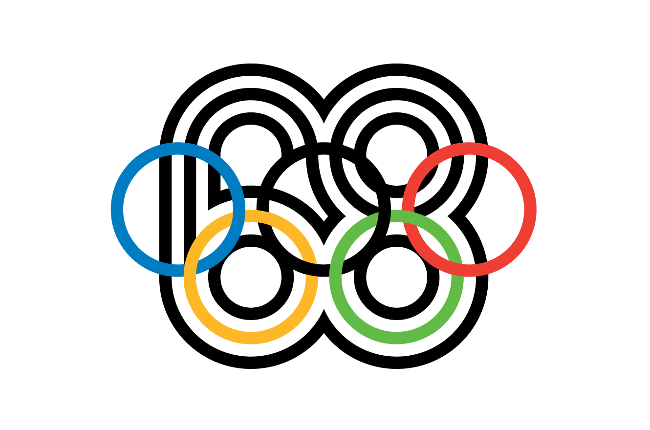
Mexico Olympics 1968 Branding
Designer: Lance Wyman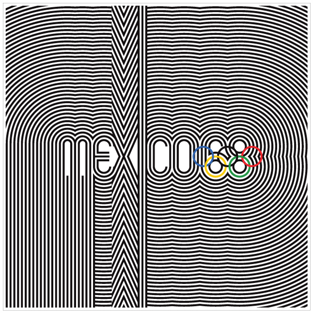
Formation: Mexico 1968 Olympics Branding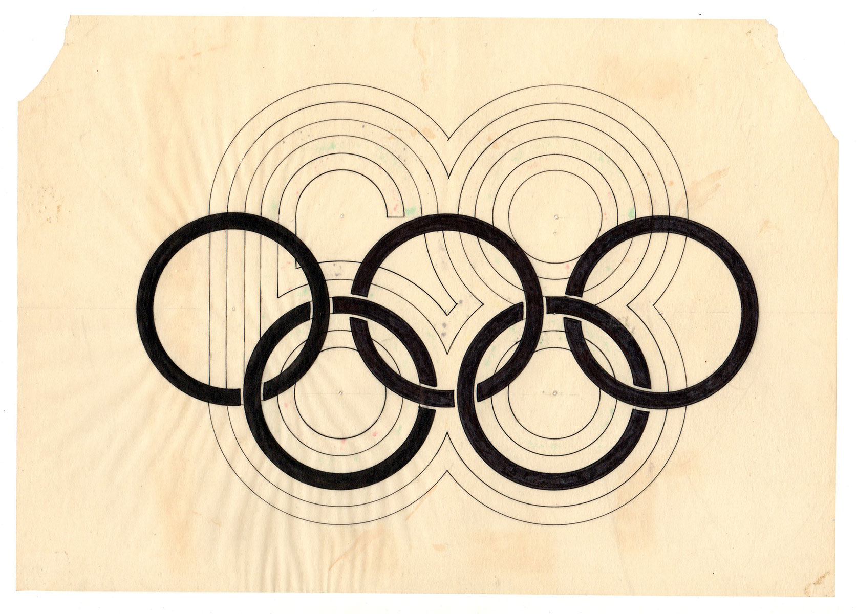
Gandour Brand Guide
Designer: SocioDesign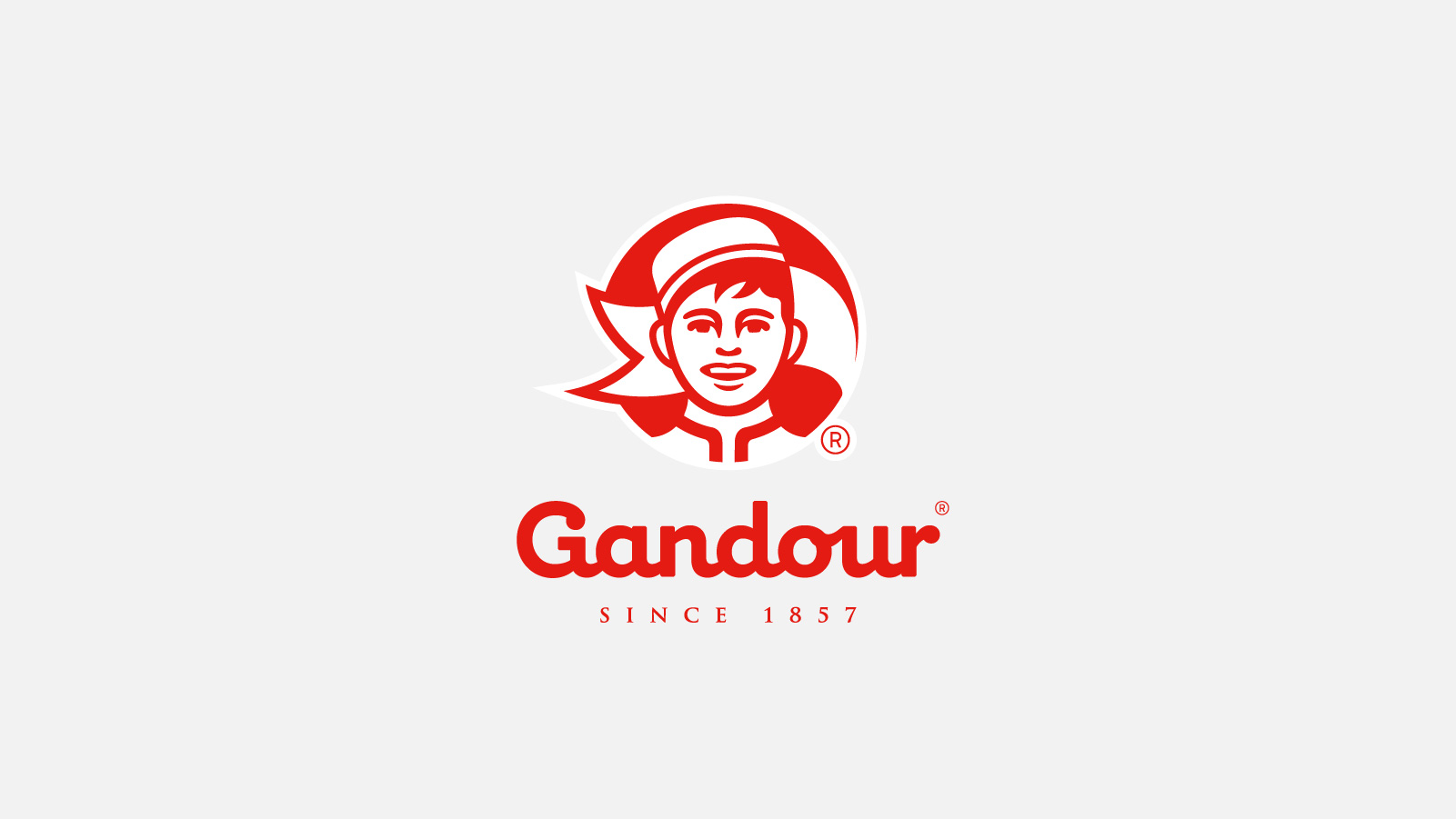
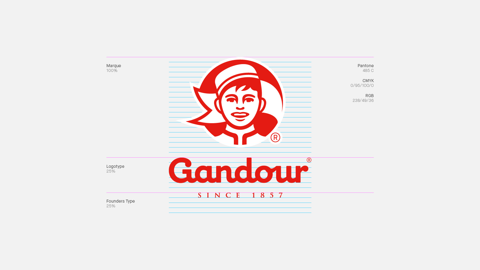
The logo was crafted in a symmetrical manner through an extensive process with the use of grids. The brand has a dominant use of circles and curves to their logo which suggests a transcending brand if it is vintage. The brand guide takes you to its specific spacing and proportions to properly use the logo.
UNICEF Branding Toolkit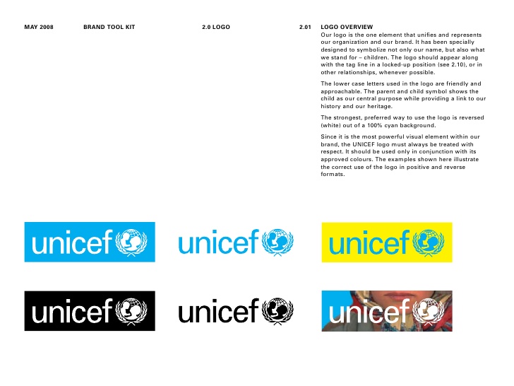
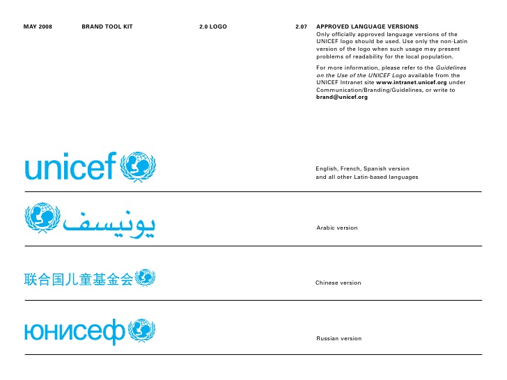
UNICEF, a universal brand, incorporates different languages as well as seasonal branding that conveys the brand’s message and strongly encourages oneness.
Scout Partner Guideline
Designer: Telenav – Internal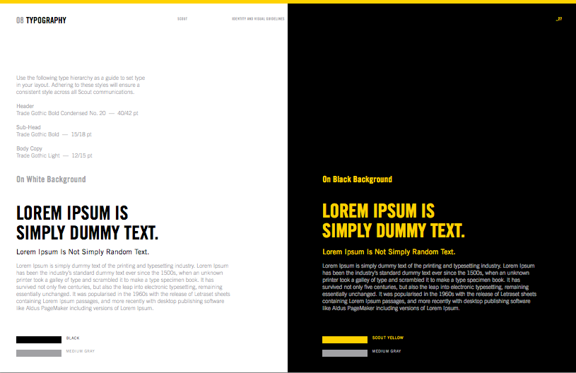
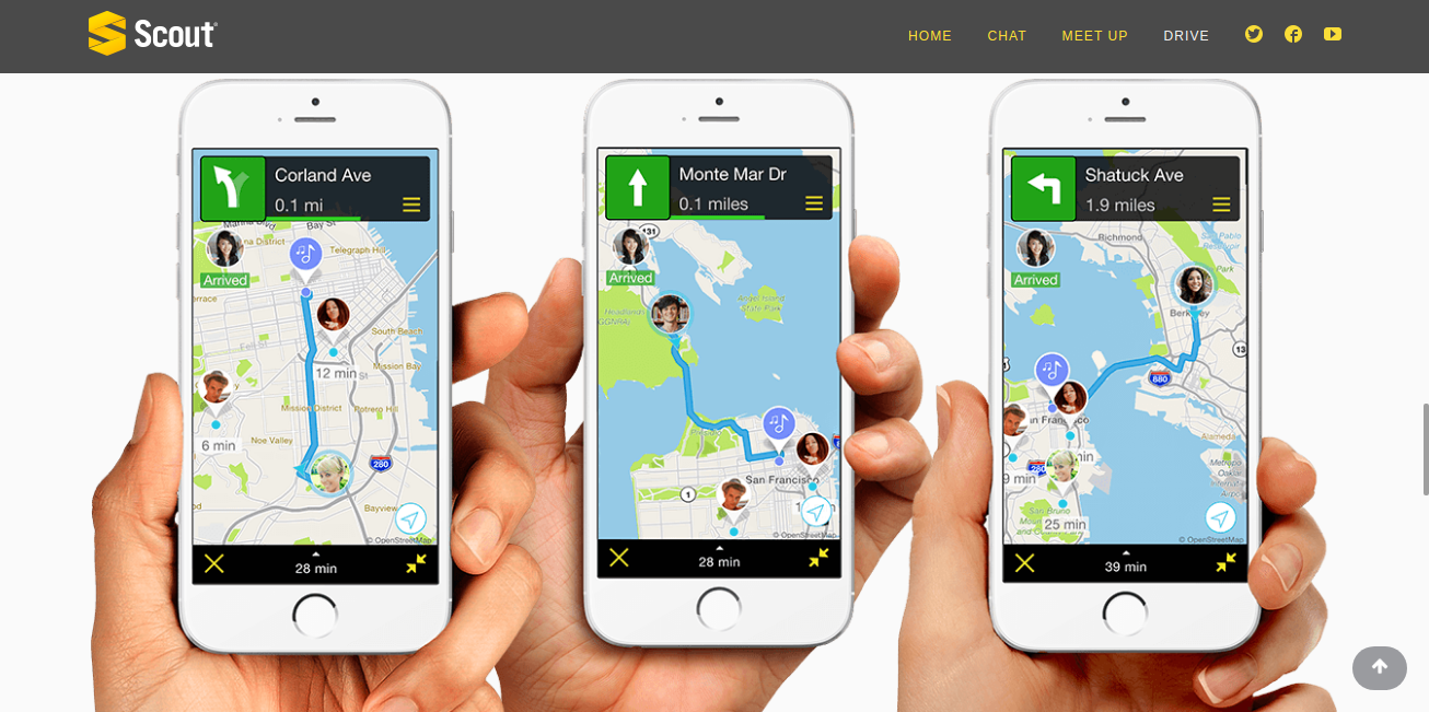
Scout Partner Guideline on PDF
Navigation just got social with Scout as your travel guide. With that said, target audience uses this app for an ease in travel. Scout’s brand, on the other hand, embodies a straightforward quality in their product and service as well as more alternatives in navigation. This is also clear in their brand book, with a guide on preparing various colors in case their brand’s text won’t appear on white backgrounds. Talk about preparation!
I Love New York Brand Guidelines
Designer: Milton Glaser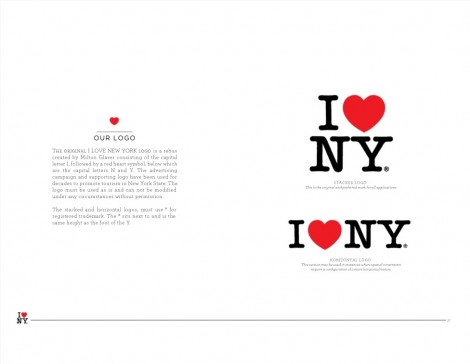
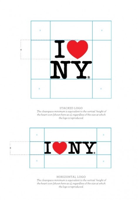
I Love New York Brand Guidelines
The iconic I Love New York logo has been a staple in American tourism and has become one of the most imitated images internationally. Its slab serif, American Typewriter typeface feature and simple and direct message were created by Milton Glaser to promote the state of New York in 1977. With a proper brand guide, the I Love New York logo could be used accordingly. The contents and layout of the brand guide is simple and minimal to achieve a cohesive design along with the logo.
Kae Brand Identity
Designer: SocioDesign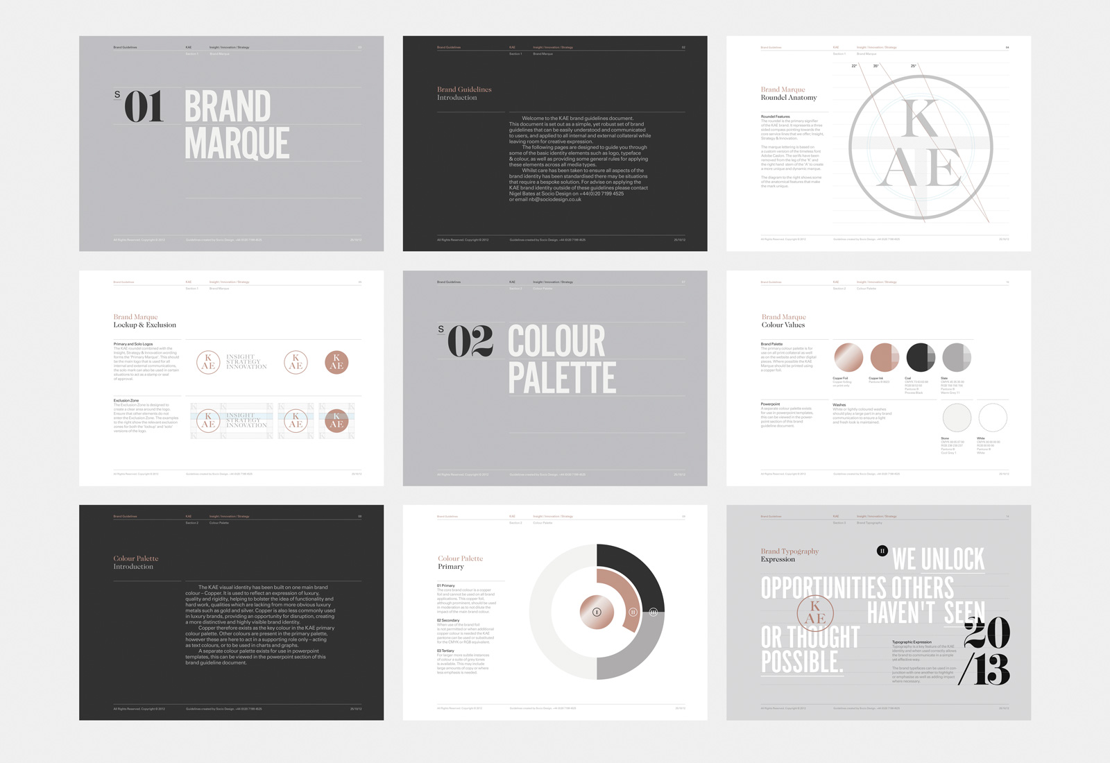
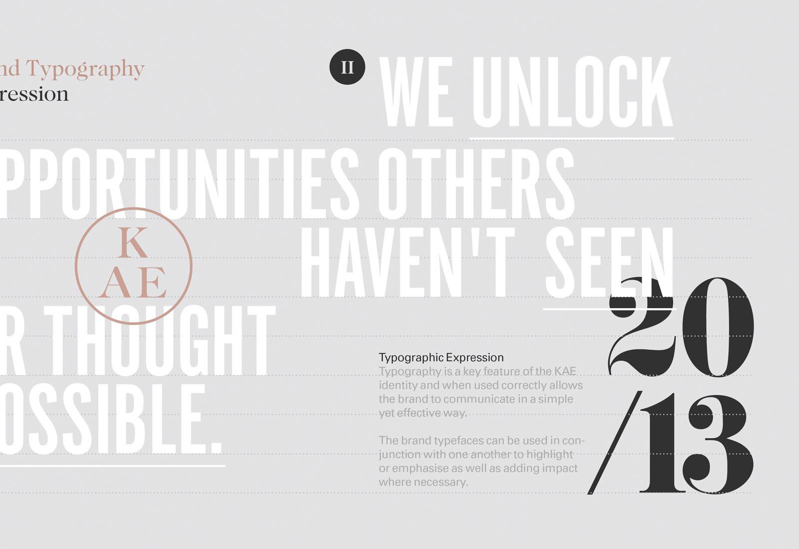
Kae Brand Guidelines are dominantly typographic which is a major identifier for the brand. One of the boldest features in this brand guide is the use of bold serifs and copper colors for the web medium as well as foil for their printed materials.
Before you go..
We hope that this list was of great help in crafting your brand guide as well as finishing your branding projects on time.
But one last thing, if you are having a hunt for typefaces for your design projects, may we suggest a two? Namely Edmondsans font and KanKin font.
Both are medium weighted fonts yet different in exteriors. The Edmondsans font offers a readable and legible exterior.
On the flipside, the KanKin font has this 30’s and 40’s vibe though not intricate as other related fonts. The KanKin font is perfect for both modern and retro themes, talk about versatility.
Experiment as much as and have fun while doing it!
Related Posts
FREE 16 Credit Card Designs in PSD | AI
FREE 32 Ultimate Photoshop 3D Text Effects
FREE 23 A4 Brochure Designs in PSD | InDesign | MS Word | AI | Publisher
FREE 39 Photoshop Custom Shapes in Vector EPS
FREE 17 Photography Flyer Templates in PSD | Vector EPS
FREE 16+ Stamp Designs in PSD | AI
FREE 23 Portfolio Template Designs in PSD
FREE 19 Metallic Effects in PSD | AI
FREE 31 Best Magazine Design Templates in PDF
Color Theory To Your Brand Identity
FREE 24+ Logo Design Examples for Brand Identity
FREE 14+ Advertising Ad Banner in PSD | AI
FREE 23+ High-Resolution Blurred Background Designs in PSD | AI
FREE 8+ Cool Tattoos in PSD | AI
FREE 17+ App Login Pages in PSD | AI