A lot of factors determine a great food experience. Some of it is reaching toward its target market in a way that entices them to visit as well as the ambiance and treatment once a visitor enters a specific restaurant. One factor not to overlook is the menu card. It houses visual display of sustenance available and meals that are deemed as one’s specialty, which is unique from other competitors and for eaters. The content of the menu card should induce one’s desire or cravings as well as represent the brand and the assortment of food appropriately.
To help you get by, we have gathered a heap of appetizing and practical designs perfect for your restaurant menu cards. With our list down below, we have curated a list of menu card designs that best demonstrates a great display of food as well as making sure that the overall design along with its layout serves practicality once printed and utilized. You may freely skim through and download our lineup of restaurant branding mockups.
Design Guide for Crafting Menu Card Designs
We say, be keen on the details, whether it be the images used, text, layout, and overall design that is presented. In this case, the readers and customers are the number one priority for the overall design. Keep in mind that the readers might have problems in terms of eyesight or even as keen on the details that every nook and cranny of the design is visible to them. To ensure great quality service, let us break down the details and elements in need of attention when it comes to designing menu card designs.
Menu Card Size
First up on the list is the selection of menu card size. The first thing in deciding what specific card size to choose is how much assortment of food is available in service. That way you may select a back-to-back type of menu card or a book type to feature a variety of sustenance and more importantly its size, as well as how will the food be showcased onto the medium—will it receive a dominant use of images or will it include the ingredients to crafting the dishes?
The Font and Type Used
Don’t disregard readability and legibility for aesthetics reasons. It is best to use fonts and type that offers readability while scanning through the menu. It is strongly encouraged to use either bold, thick, weighted, and serif fonts for the menu card since they offer readability when setting in a small sized menu card as well as for the bigger card sizes.
Speaking of fonts, may we suggest one? If you are looking for a simple and versatile type, the Edmondsans font is a perfect selection. Given its uniform weight, the font applies copy fitting to allow text to occupy its given space to set a cohesive look.
Hierarchy: It is a given to incorporate hierarchy when designing and creating a layout for a design and, in this case, menu cards. For your text, do apply hierarchy for readers to establish importance and direction with its text, which will be easy for readers to navigate through the content.
Restaurant Menu Card Designs
Restaurants provide the use of menu cards as an overview of their assortment of food available and specialty dear to their loyal customers.
With our list down below, we have collected a lineup of restaurant menu cards with a variety of design styles and for the different food and beverage businesses.
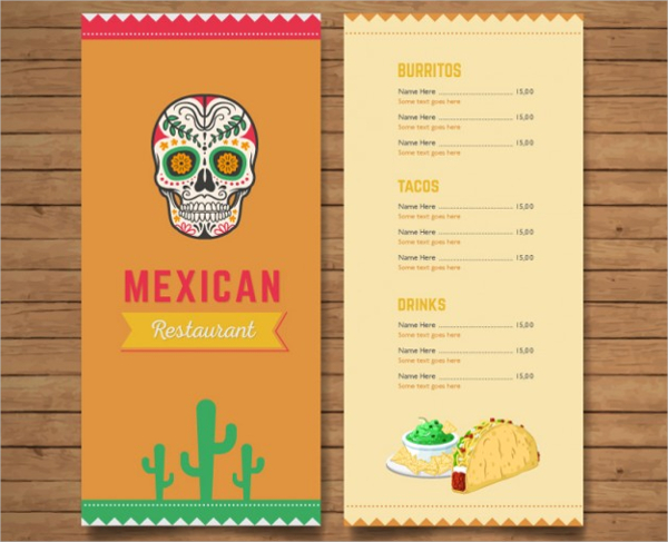
Mexican Restaurant Menu Card Design Bundle
Paper Fan Menu Card Design
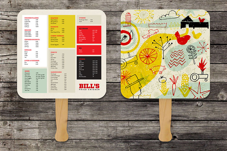
The illustration and the concept of a multipurpose medium is greatly appreciated. The fan slash menu card could be of great use for outdoor seats in restaurants and serves cool air during hot weather conditions. As well as using the fan to signal the management that your order is ready to be taken. How cool is that?
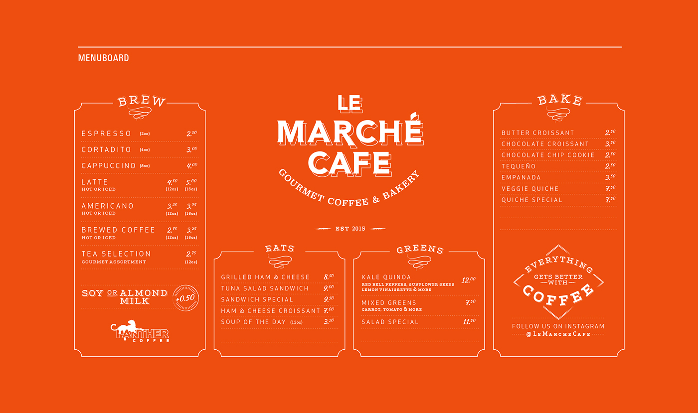
Le Marché Cafe Coffee & Bakery Branding
Illustrated Restaurant Identity Creator
Having a strong and well-developed branding for a business and in this case, food business translates well onto the overall comprehension of the brand and target market, as well as how the potential customers see and react to your brand and business.
For this specific menu card design, it embodies a strong vision of a brand and how it connects with its target market.
Seafood Restaurant Menu Card Design
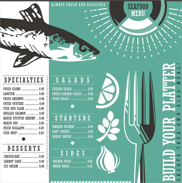
This specific seafood flyer utilizes a clever use of color blocking for its layout. This is to separate the segments properly thus giving direction to the viewers once scanning through the content. The design is simple as well and is sans of the commonly used naval theme, hence, a fresh take on seafood menu card design.
Newspaper Style Food Menu Card Design
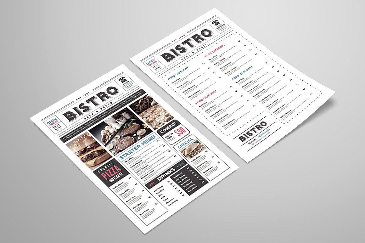
In this case, the spaces are well used as an overview of the food available and is a direct way of showcasing. As you may see, the back portion of the menu card is sans of any graphics and images to allow a quiet background for skimming through the content.
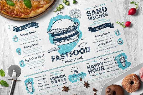
Restaurant Menu Pack
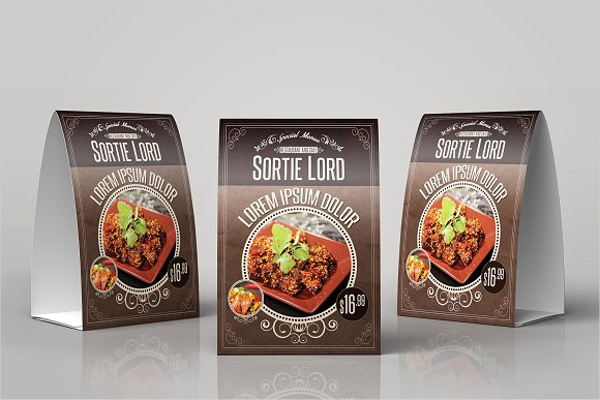
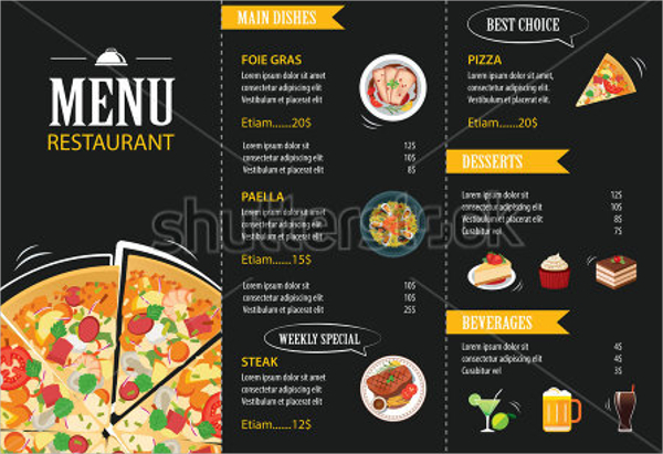
With a dominant use of images allows emphasis on the food or specialty being presented. This type of menu card is perfect for showcasing new dishes available as well as the restaurant’s specialty. One way that this type of menu card is effective is its placement in tables as it serves as a point of purchase kind of strategy, which allows guests and eaters to skim through and even order one.
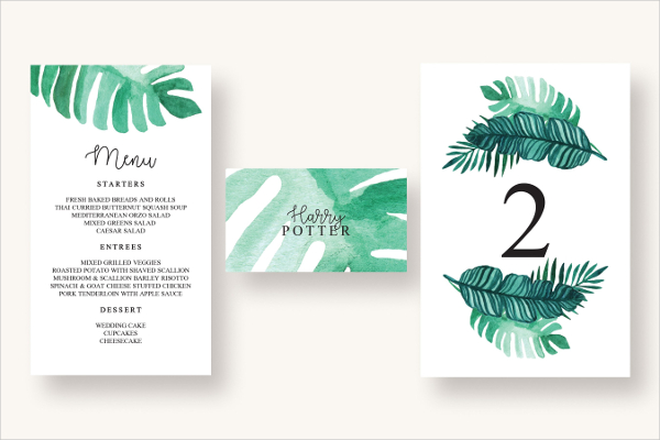
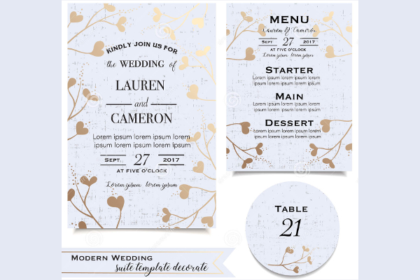
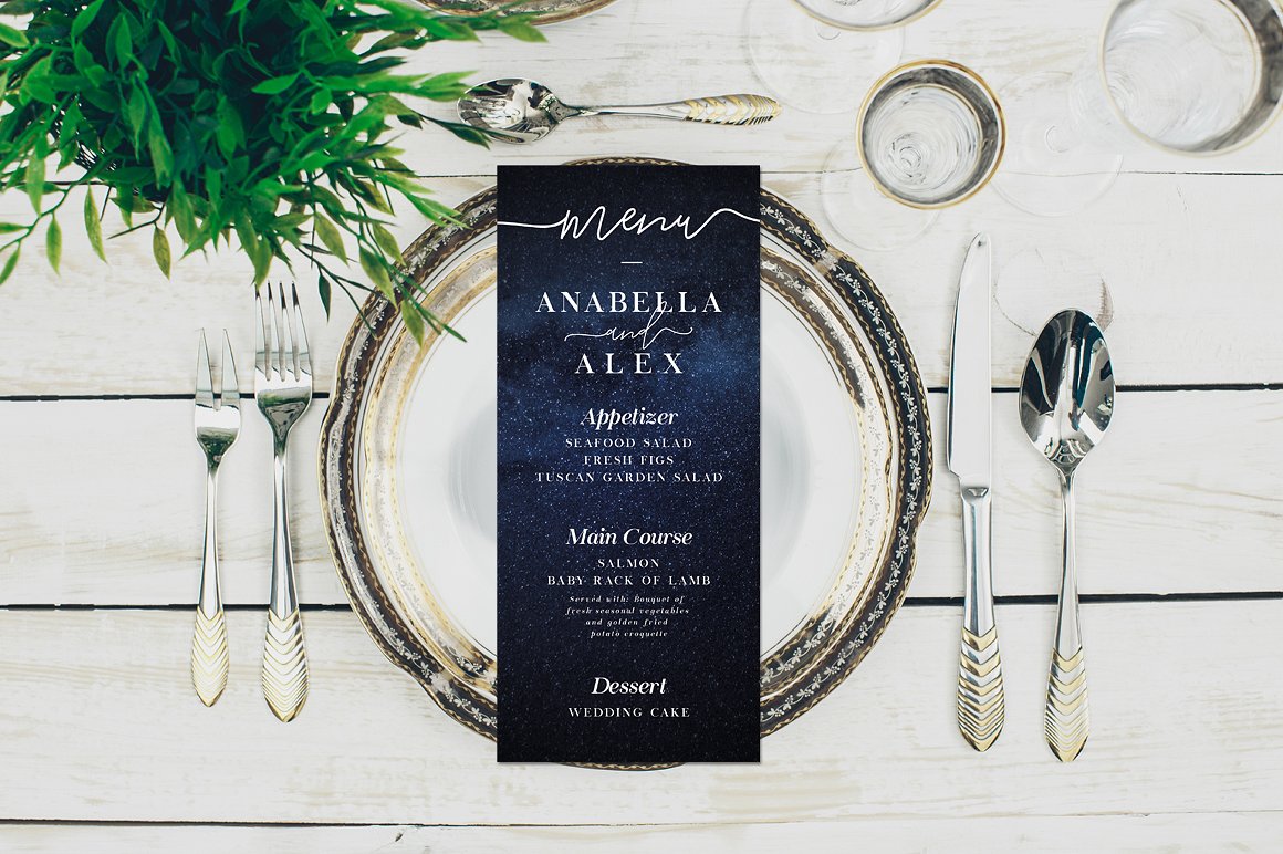
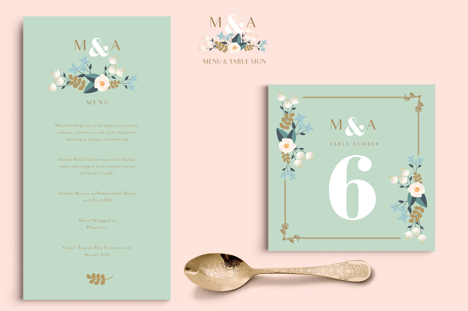
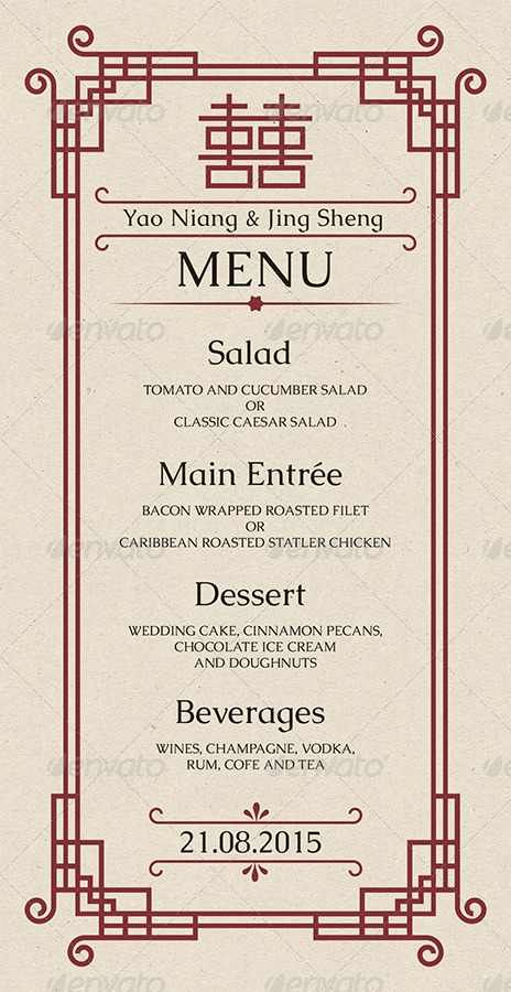
Wedding Menu Card Designs
Wedding invitations are enclosed together with RSVP card, event locale address, menu cards, table number, and so on. In this case, wedding menu cards receive the same design treatment with the rest of the wedding invitation collateral, though it usually differs in composition and in layout.
In our list down below, we have gathered simple, fuss-free, and impressive wedding menu card designs that offer high-quality designs and a more personal take on its exteriors and execution.
Tropical Themed Wedding Invitation
Blue Wedding Invitation Card
Night Sky Themed Wedding Invitation
Sweet Wedding Set with Illustrated Elements
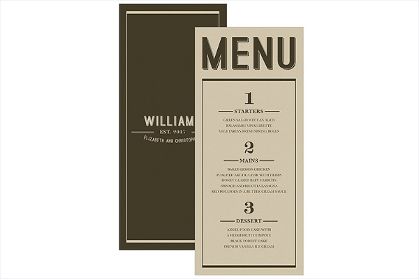
Retro Inspired Minimal Wedding Menu Card
Flat Menu Card Design Template
A Lineup of Beverage Menu Card Designs
With an array of beverages to drink, it is best to showcase them in a way that guests could browse and select accordingly to their preferences. It is a common practice in displaying beverages on menu cards to place the ingredients made to complete this drink. This way customers as well as first-times could have more extensive selection to their desired drinks.
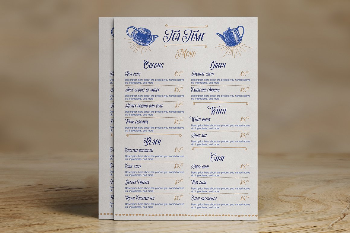
Tea House Menu Card Design
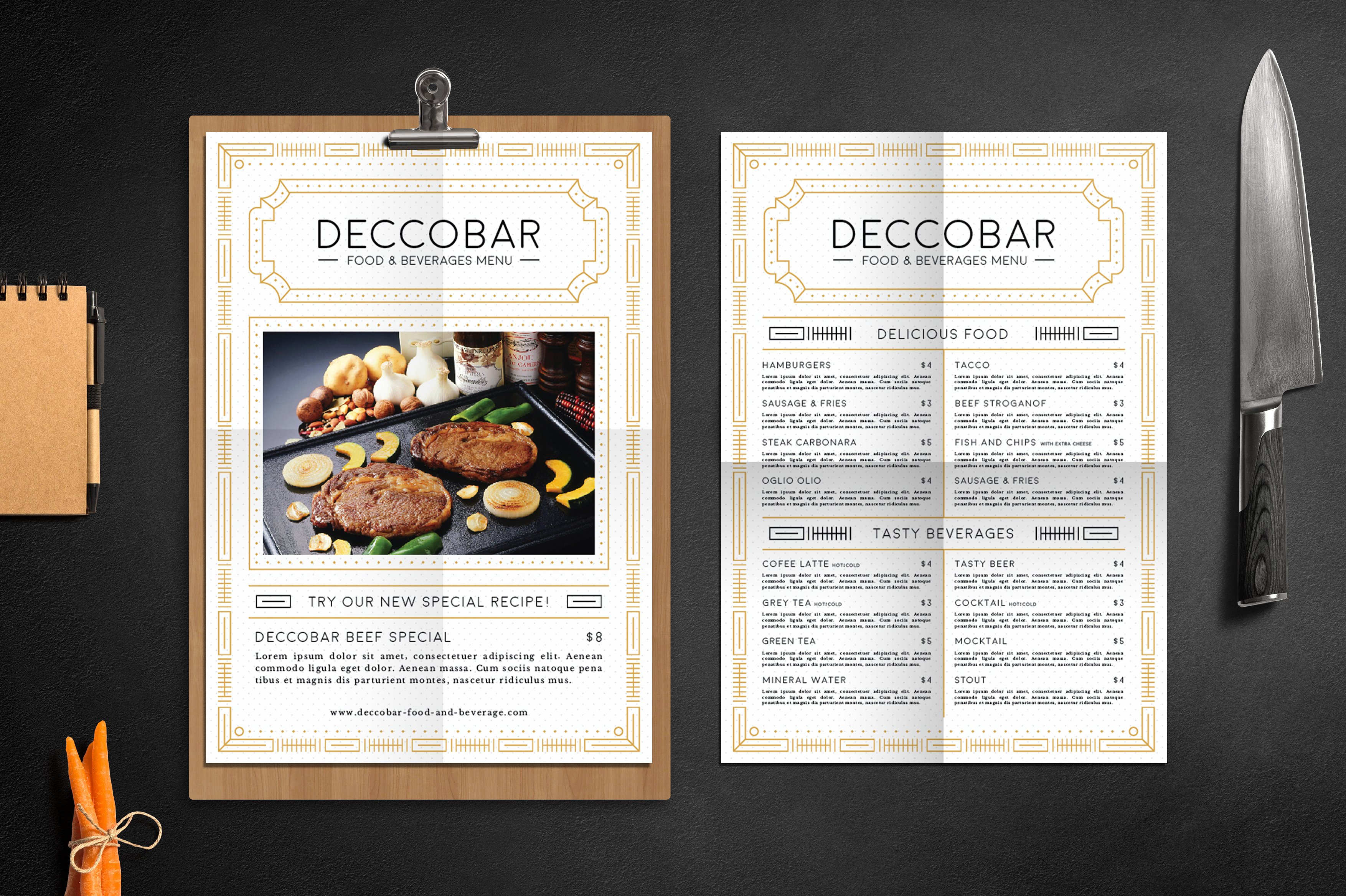
Art Deco Food Menu Card Design
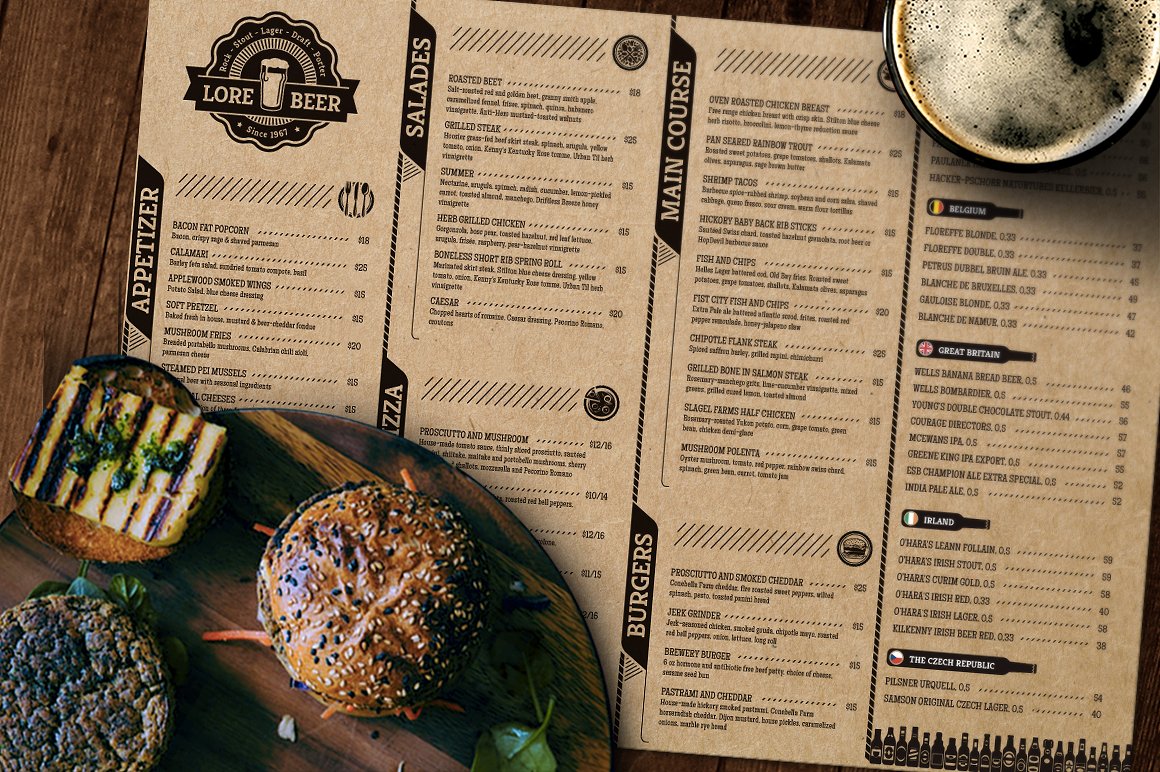
Beer Pub Food and Drinks Menu Card Design
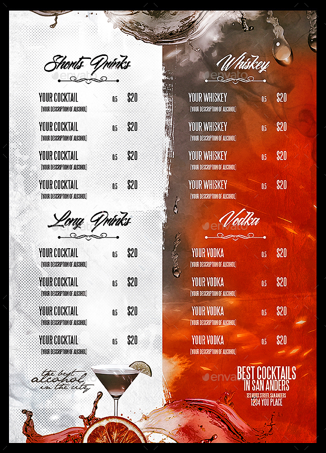
Extensive Cocktail Drinks Menu
Hand Drew Modern Menu Card Design
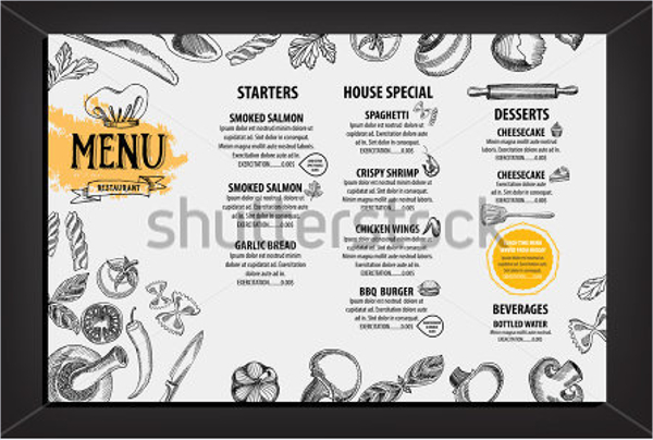
A touch of yellow brings about a pop of color in a monochromatic color palette. The contrast of traditional graphic elements with retro typographical elements combined with a flat lay type of layout brings in a modern appearance.
Breakfast Menu Card Vector Design
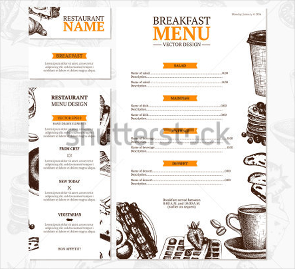
Breakfast is an important meal to kick off the day. When guests come for breakfast, you better offer a great set of meals ready and an appetizing display of food in your menu card, or at least be direct and simple with the design as to not keep the hungry eaters waiting. This specific breakfast menu offers just that.
Tell Me More!
Yes, there is more. To ensure an extensive guide to crafting your menu card designs, we’re glad to share with you more of the technical and design elements that are in need of proper design treatment. Scroll down below to skim through more information that will be of great help during your designing and post-production process.
Food Photography/Images
Apply proper Lighting. Food is best showcased through images and in actual placement. It is best to showcase the assortment of food and beverage as it appears in its physical form. When you dabble in food photography for your menu card, the first priority is the use of lighting. Too dark or light of an image might speak as a low quality assortment of food.
In this case, depending on your creative direction, you have the options shoot your products with the use of natural light, or to be fixed and shot in a studio setting; just keep in mind to use good and proper lighting.
Image usage. As much as possible, do use your own pictures for the images to be used in the menu card designs. Since the process of taking the images went with a creative direction and appropriate setting. It is a fast and sure way to display your array of food accordingly, and think of all the time you’ll save in editing when you use your pictures.
Scale Proportionally. Another strong dislike when it comes to design is the wrong application of images. When setting your images, keep in mind not to distort or stretch the image.
To avoid such situation, do lock in your image while scaling up and down or if you are using Illustrator and InDesign, simply press “Shift” while scaling your images. If you want to keep the image in place while scaling up or down, do press both Shift + Alt.
Image resolution. When it comes to image resolution, keep in mind to avoid blurred images, distortion, and image quality. Since we are dwelling with menu cards, do save your designs in 300 dpi, which is the recommended format for mediums that are to be produced in physical print. This format ensures that your text and images are produced in high quality. Lower than 300 dpi, let’s say 120 to 75 dpi, offers a pixelated outcome for your menu cards.
Also, keep in mind to save your images at the correct dimensions for its designated destination to avoid any pixelation. The latter occurs when an image is placed at a size larger than its original dimensions. For example, a photo with a 60 × 60 px (in pixels) is placed or fitted into a 1200 × 1200 px space.
Coffee Shop Menu Card Designs
To be convinced by the taste of coffee is through the experience and little with the the drink’s exterior. When it comes to coffee shop menu cards, adding the available options (such as hot or cold) and other flavors helps one in selecting their drink of choice.
Some brands hand out menu cards that also double as brochures to inform readers to the coffee’s origin, kinds, and its process to making, which you may incorporate for your coffee shop menu card designs.
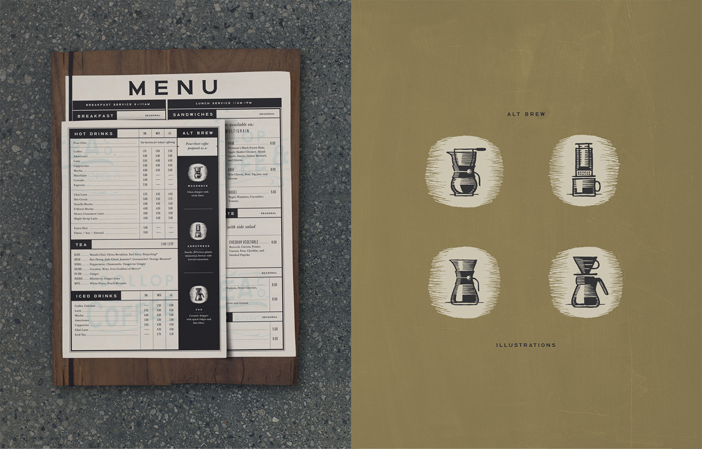
Dollop Tea Branding Collateral
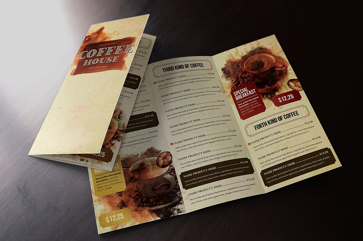
Coffee House Brand Identity Menu Design
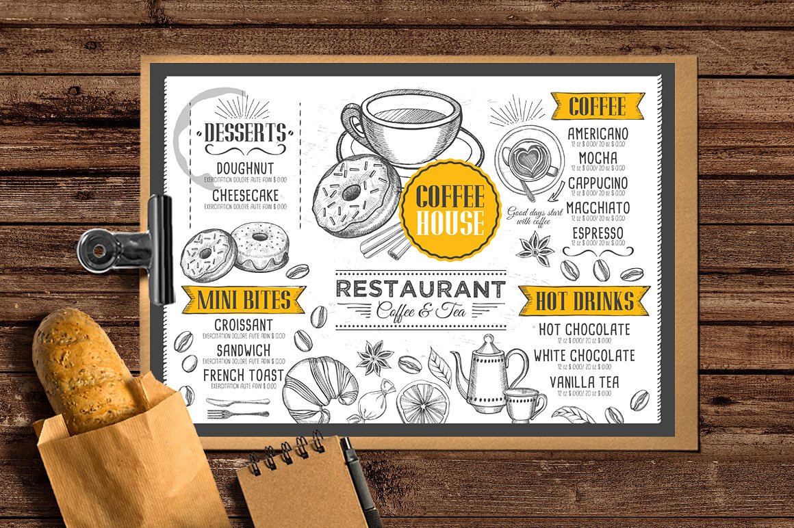
Coffee Restaurant Flyer
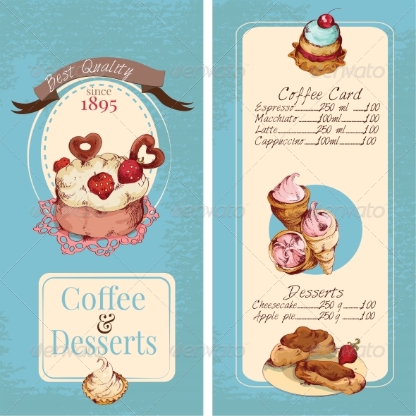
Dessert Menu Card Designs
For brands that heavily focus their assortment on desserts or desserts that are inclusive of the menu, it is best to showcase such through the use of graphics or at least with the use of imagery to bring in the character and ambiance of the selection. As well as to allow guests to visualize the product and decide from then on whether or not to order.
The beauty with this segment (unless separated) of desserts in the menu card design is the utilization of colors and the application of composition, layout, and experimentation of the design, which may result to an exterior that induces cravings—that is, once done correctly.
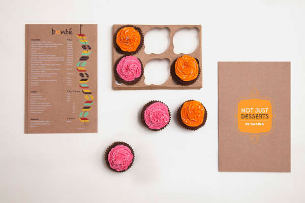
Desserts Branding & Menu Card Design
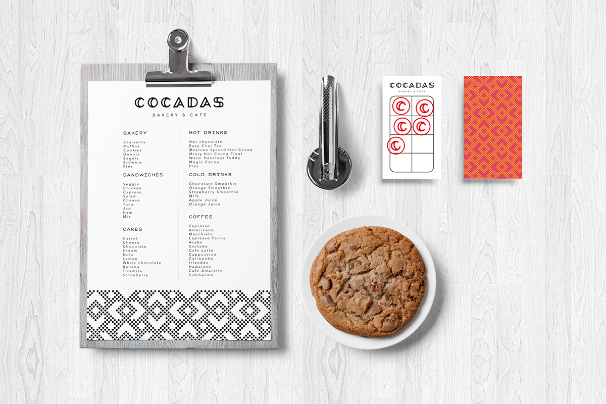
Bakery & Cafe Branding Collateral
Desserts Menu Vintage Design Style
Authentic Menu Card Designs
In our list of menu card designs above demonstrates styles and creative direction that is fitting to its brand or type of business. With this list, we wanted to showcase a cultural and international take on menu card designs for en extensive selection and design inspiration. Since application of subcultures or prominent international styles immediately showcases what the brand is about and what is serves. It is also an invigorating take on the Westernized type of design styles once applied onto mediums.
Oriental Style Wedding Invitation Card
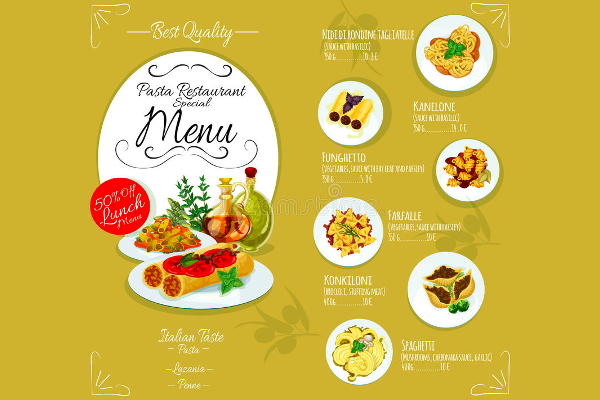
Pasta Menu Card Design template
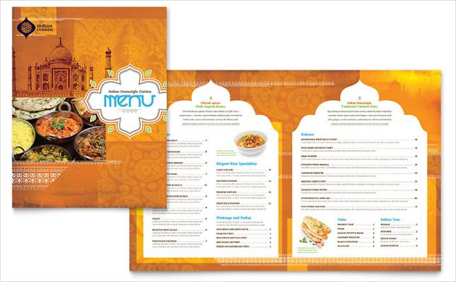
Indian Restaurant Menu Card Design
Before We Call It a Day…
Layout
Keep the layout of the menu card simple and with direction. You may experiment with the layout or use masking to fit the content on a page depending on your creative direction.
To help you get by with designing a layout, you may refer to our guide on the use of columns in design. Though its context focuses on magazine layout, the same philosophy is applied onto design and, in this case, is a great help in strengthening your menu card layout design.
Also, keep in mind of the technical elements upon crafting a layout for your menu card such as bleeds, margins, and columns. Adding bleeds are important specifically during printing as to not cut off any important parts of a text or image. As for margins, it gives the layout artist a boundary to enclose all design and technical elements in.
Categories
Categories for menu cards follow a standard flow with its content by starting with appetizers, entrees, desserts, and drinks. With a standard flow, categories and the layout goes together.
Color Matters
Food, as mentioned previously, is best demonstrated through visual and physical form. Color also brings out the mood and influences cravings and hunger. How can you best use color in your menu card design? Attention-grabbing colors are perfect to incorporate in your menu card design.
Bright colors is commonly associated with sweets and desserts. In some cases, it can be applied onto drinks such as juices and cocktails.
Brown and earth tones bring about a natural and appetizing appearance.
Subdued colors connote savory flavors and it signifies rich and complex flavors.
Protection
Once all of the design and technical elements are placed accordingly, you may want to secure your menu cards from a wear and tear utilization. There are various options for the protection of your menu cards. You may select lamination, with the use of plastic-type books, or apply customization.
For lamination there are two versions you may apply: the hard and soft types. The hard lamination type is perfect for a back-to-back or if limited items are listed on the menu, while the softer type will be a great pick for small sized menu cards and with an extensive selection of sustenance available.
To finish off, we have one more offering we’re glad to share with you. You may freely download examples from our list of restaurant menu mockups, which will be of great help for business purposes, design projects, design proposals and presentations, branding mockups, and so on. We hope that this was of great help for you.
Related Posts
9+ Chalkboard Menus - PSD, Vector EPS Download
12+ Inspirational Personal Business Card Designs
10+ Awesome Interior Design Business Cards
21+ Catering Flyers - PSD, AI, Illustrator Download
20+ Greeting Card Designs - JPG, Vector EPS Download
18+ Acrylic Invitations - PSD, AI Illustrator Download
21+ Menu Flyers - PSD, Vector EPS, JPG Download
21+ Birthday Greeting Card Design Tips
17+ Free Wedding Samples - JPG, PSD, AI Illustrator Download
25+ Christmas Cards - PSD, AI Illustrator Download
Greeting Card Designs
20+ Free Printable Christmas Cards - JPG, AI Illustrator Downlod
21+ Wedding Card - PSD, Vector Download
20+ Housewarming Invitations - PSD, Vector EPS, AI Illustrator ...
20+ Free Gift Cards - JPG, PSD, AI Illustrator Download