
Like every historic architectural feature has incorporated the use of columns to create a stronger foundation for their structure. Think Greek architecture and exquisite baroque marble columns. In this case, for designing magazine layouts, the application of columns allows the content of the page to be compressed evenly and in a way that would be a breeze for readers upon scanning through the text and image. If you happen to be having a hard time with designing your magazine layout, don’t fret.
To help you get by, we have gathered several typical column sizes that will be helpful in designing your magazine layout. You may also go through our guide on the makings of a magazine cover. Which describes the basics and the elements applied and utilized to craft a high-impact magazine.
The chief support of every good layout.
Before anything else, do resist to close on all sides or conform to a standard formula when it comes to designing your layout. These columns serve as design elements that will guide you in incorporating characters that would be ideal for such columns. As well as line length and the proper setup for the article.
In layout, there is an unwritten rule that a wider column suggests an important article or main story. Which is also a practical move to apply, so readers won’t have to jump to the next line of the text. On the flip side, a narrow column is designated for less important stories. Which gives readers a shorter time in reading.
While it all depends on your design, columns can vary in width. You may stick to using equally wide widths or you may combine types of columns on one page. For example, the main text will be placed across two columns, while the rest of the text can be set on three or four column grid.
You may also want to scan through our list of tips and tricks in achieving a well-thought out and high-impact magazine.
To help you get by.
You might encounter a couple of unusual terms below. To help you get by in the use of terminology, get in the know the basics and essentials for designing a magazine layout.
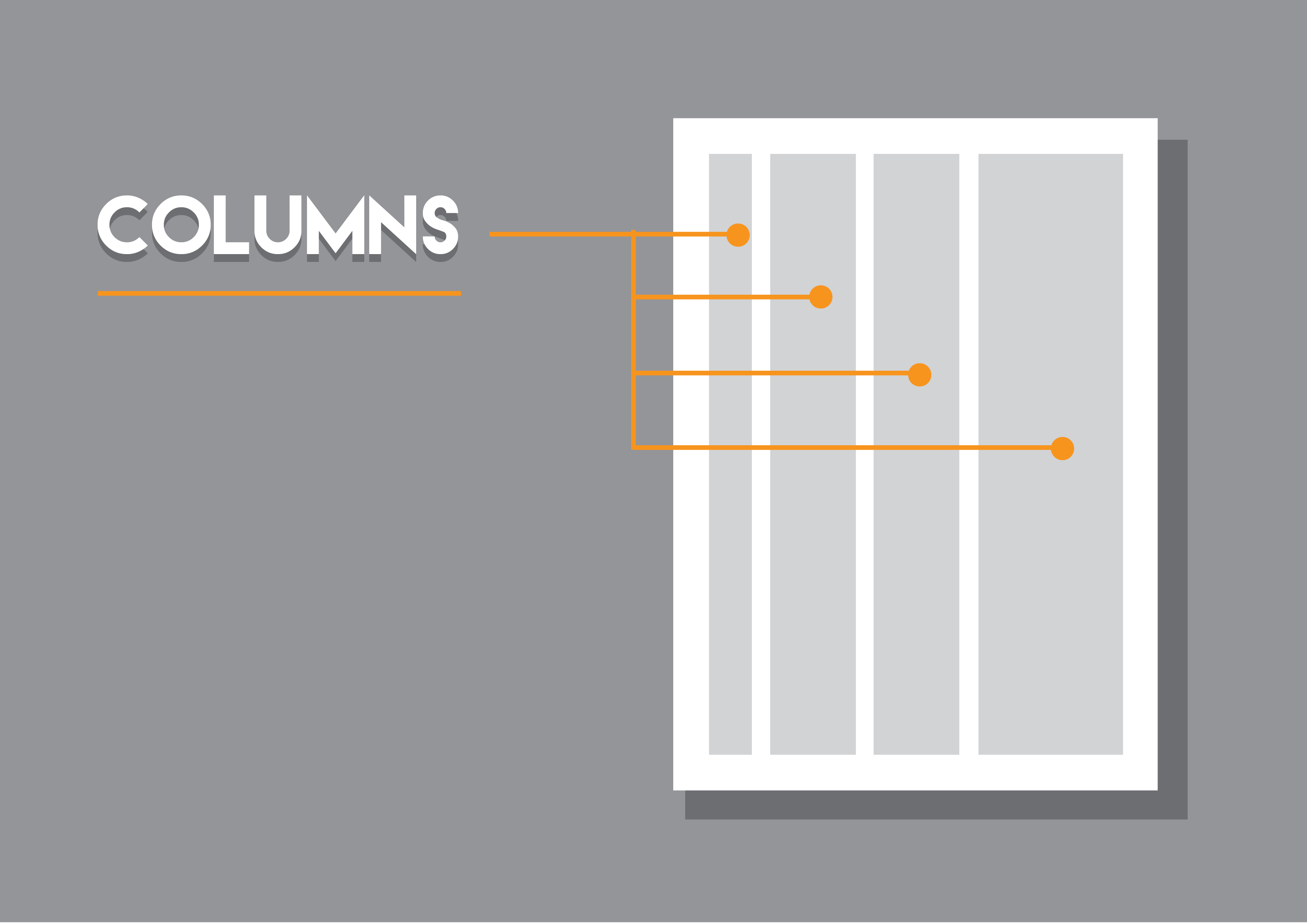
Columns.
For our examples down below, they grey strips will represent the columns used in designing a magazine layout.
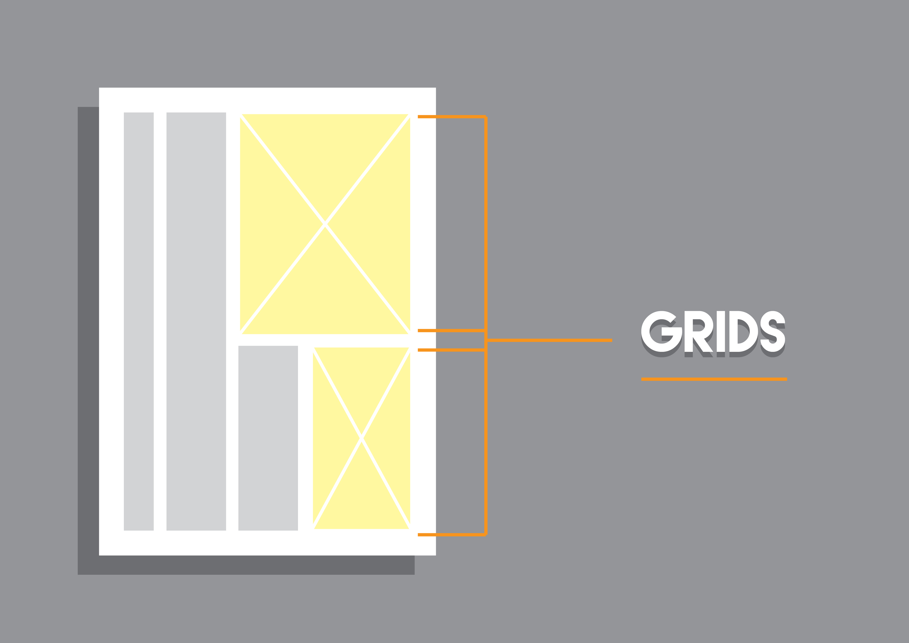
Grids.
Grids, as shown directly below, represent the image placement in the magazine layout. Grids are usually placed with an X sign to indicate its size.
The different column sizes.
One Column.

This type of layout is rarely used due to its dull and heavy exterior. In this case, using the one column grid is too wide for most magazine layouts. If you are to consider using such option, opt for text that should be larger in size to allow readers to scan through the text immediately.
On the other hand, the one column grid is commonly used for the editor-in-chief letter at the introduction of the magazine. The unwritten rule, as previously mentioned, suggests that the use of wider column proposes the importance to the story or article. How important is the editor’s letter? The latter is the welcoming letter that comes with a brief explanation of the magazine content as well as relaying any related issues and inspirations that occurred prior to the magazine’s issue date.
Two Column.
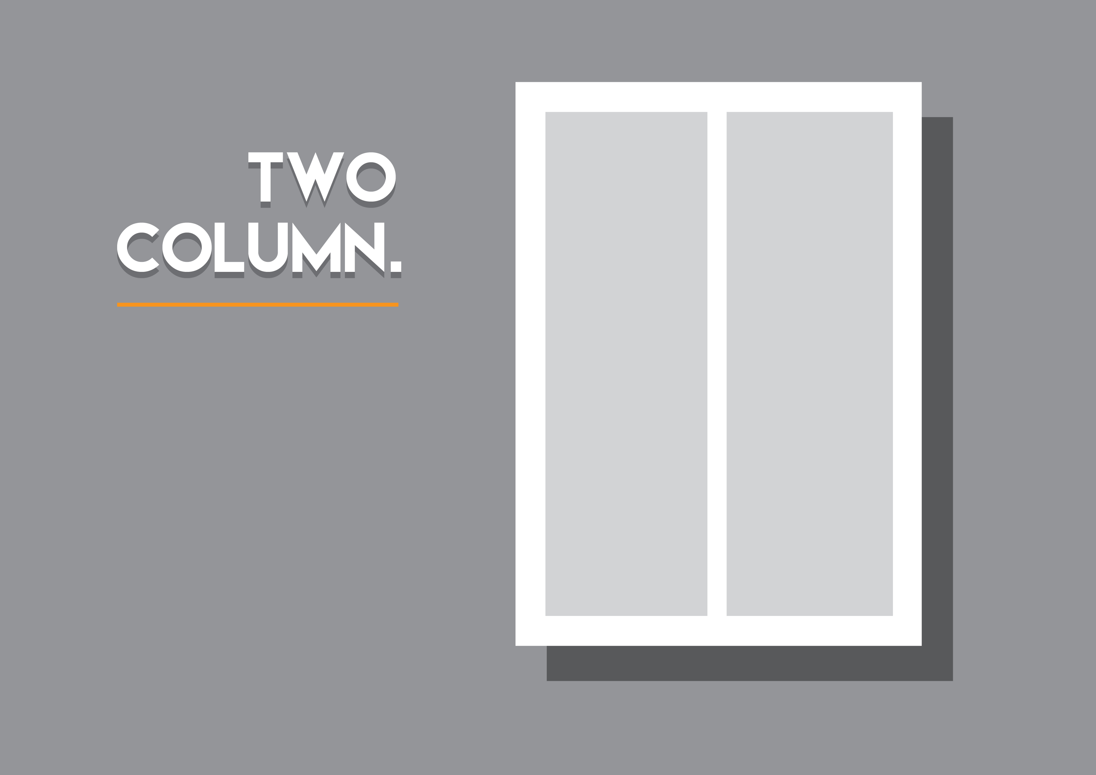
The standard two column grid, mostly used for the magazine’s main stories and important articles. You may apply the philosophy of using narrower columns to trick readers that the content isnt heavy by its appearance. Incorportating such narrow widths should be accompanied with bigger margins either to the outer or inner sides.
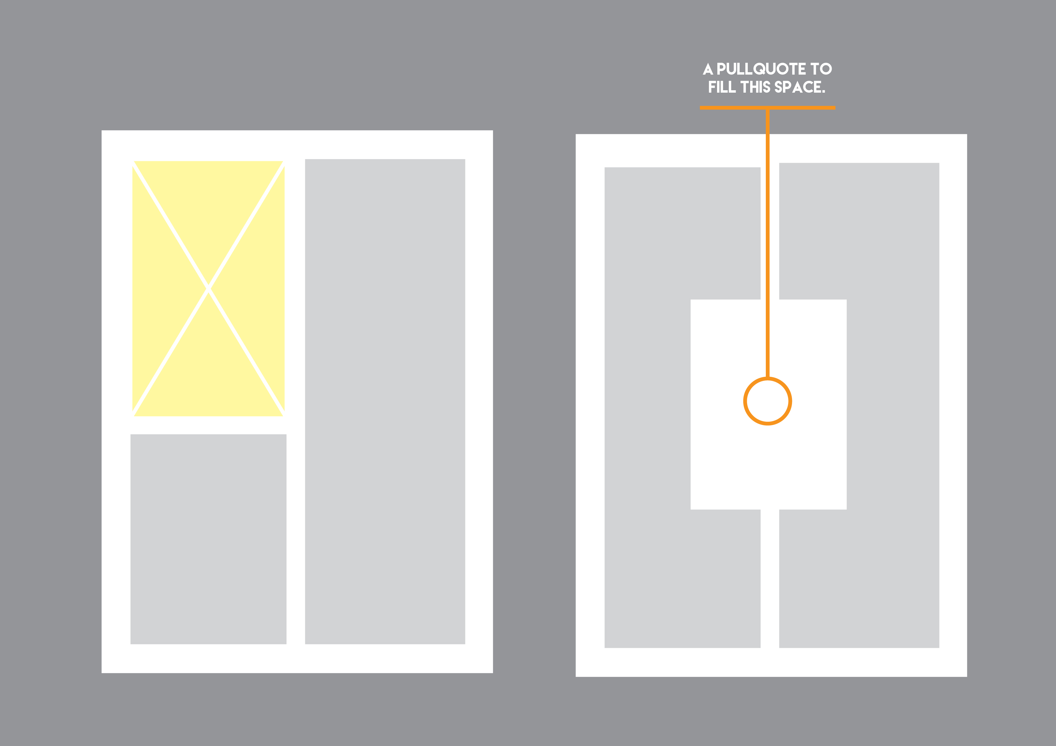
Three Column.
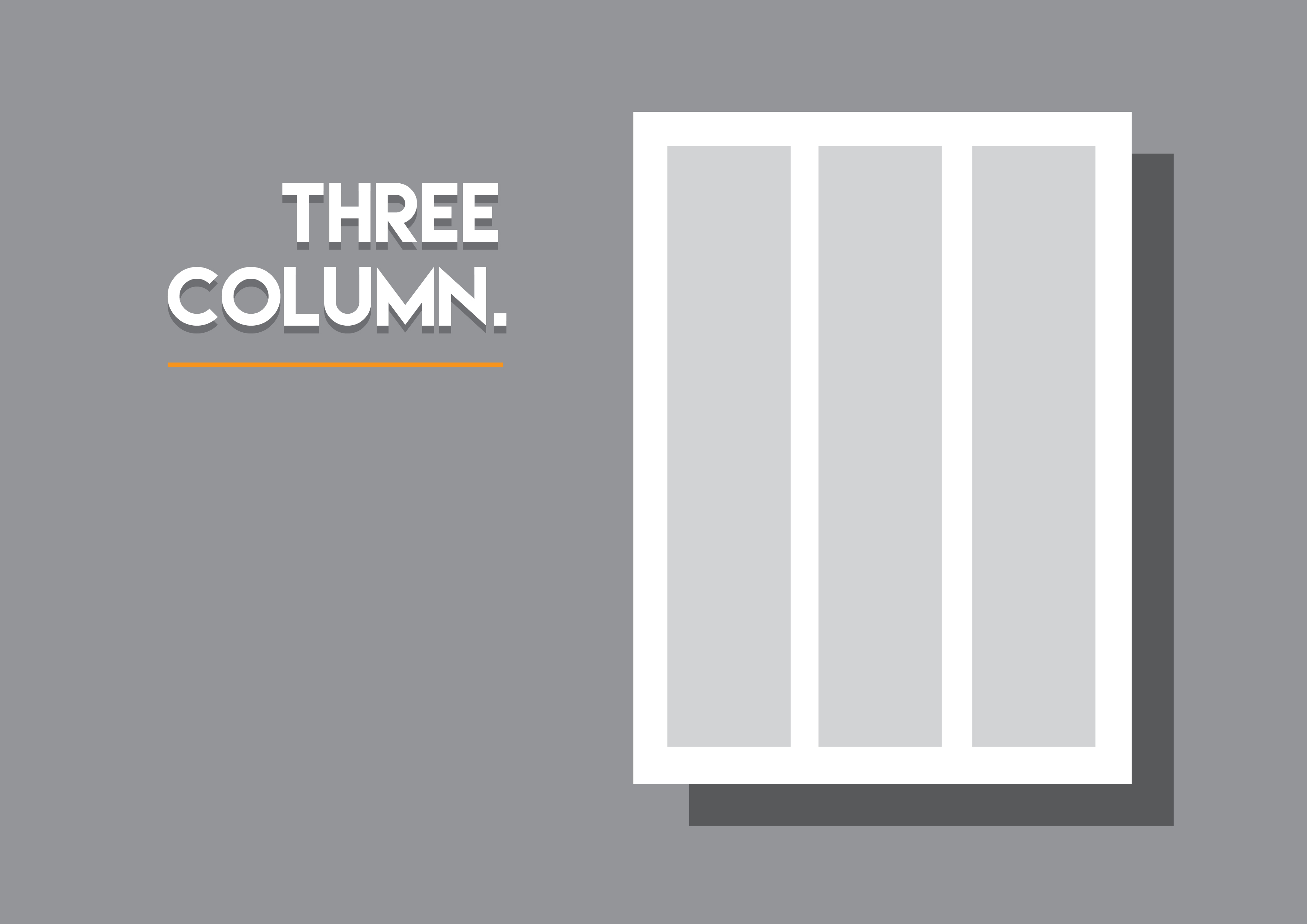

The use of the three column layout is usually designated for longer articles. The beauty of this given grid is that you may break one of the columns to set a pull quote either to spread across two columns or within one column to create an interesting layout.
Like all column sizes, you may place a sidebar to create a white space to break and add some interesting layout to the page.
Four Column.
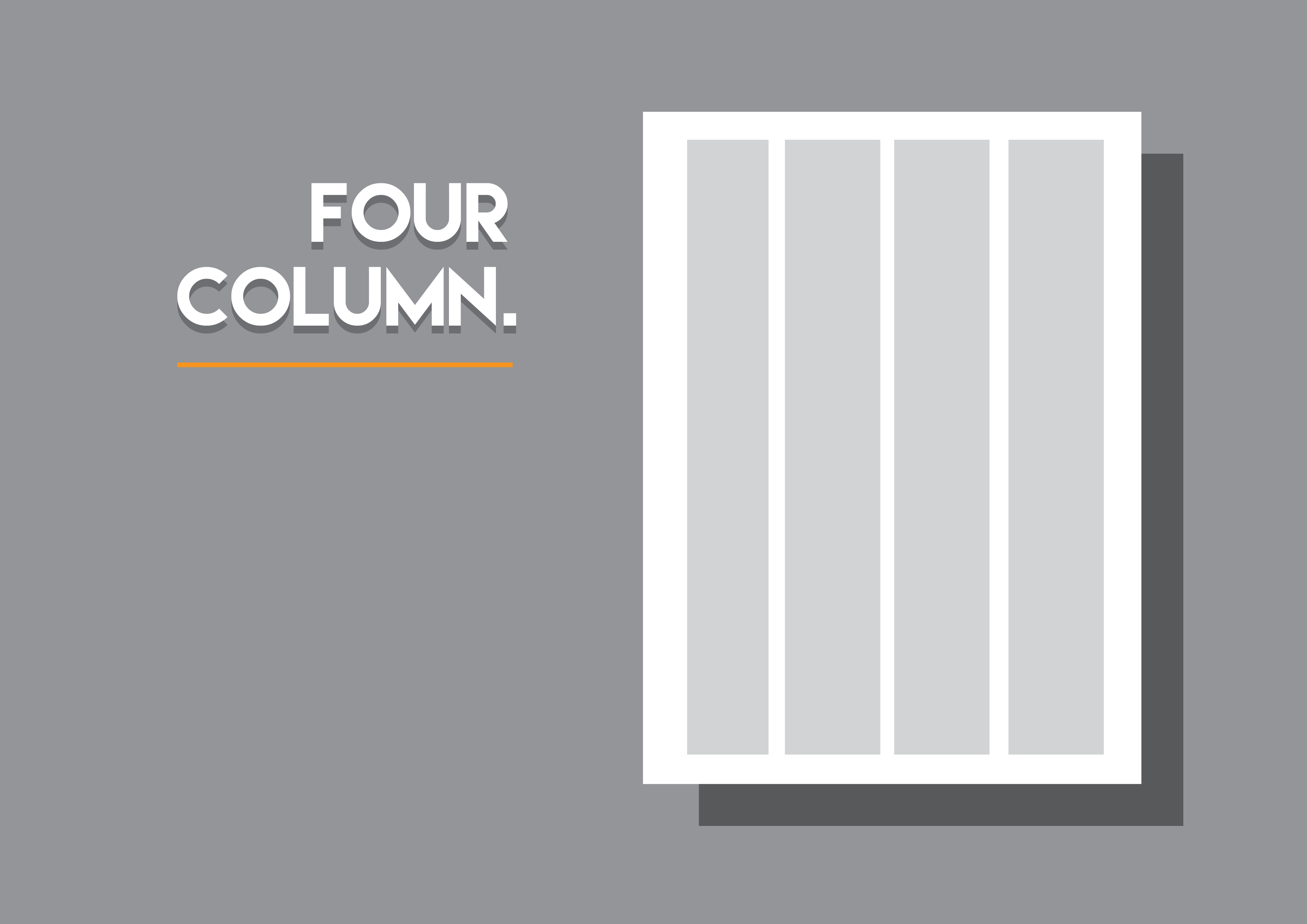
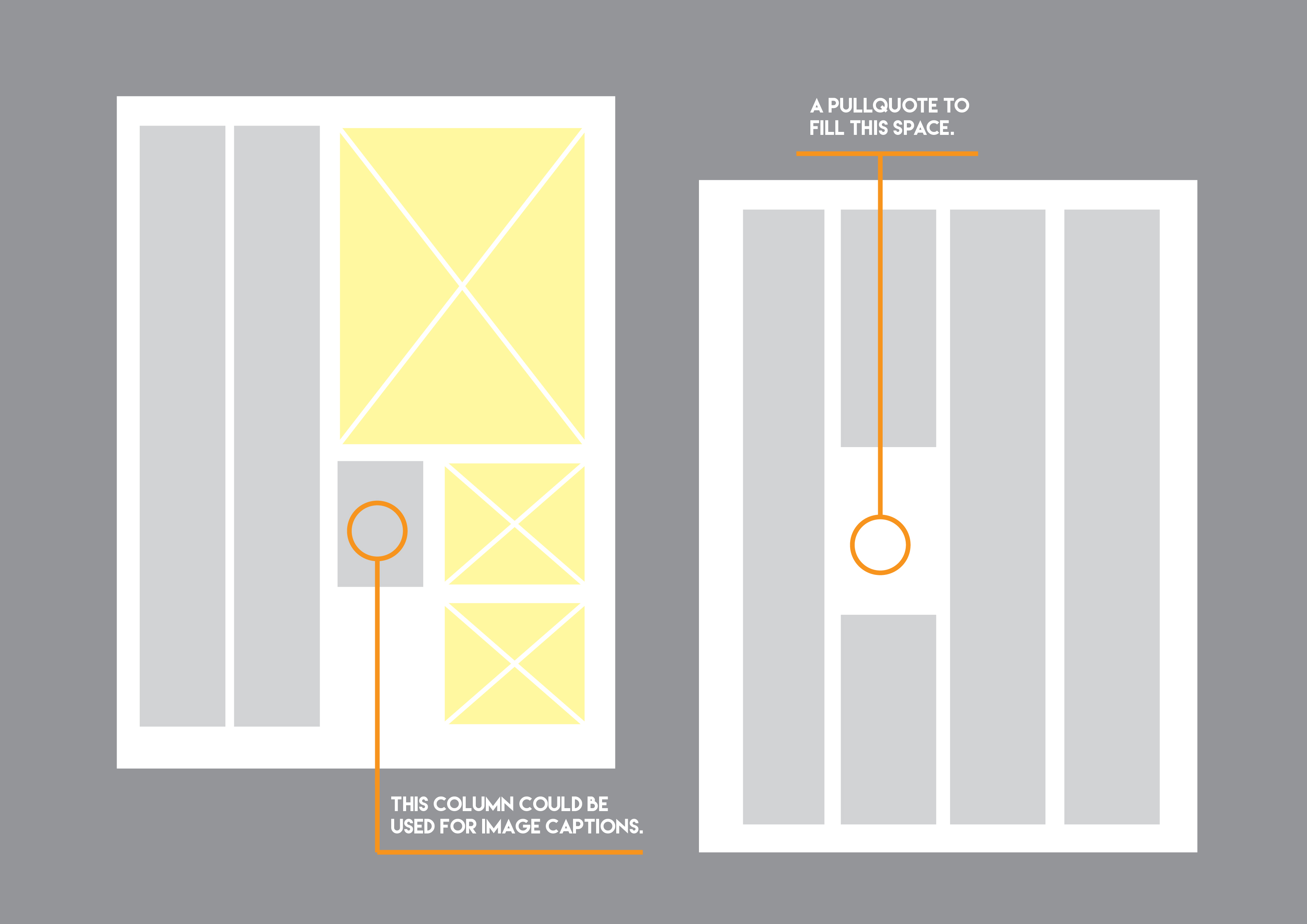
The four column layout is a great option to consider to which you can play in designing your layout and for improvisation. With this type of column grid, you may set your text in two columns wide or in three while leaving space to place the images or pull quotes. You may also leave one column with a narrow width for small bits of information.
Keep in mind to set your text in a minimum to avoid long blocks of text which is not pleasing to the eye and to read.
Five Column.

This type of column grid is mostly used for magazine’s news and culture sections and the informational segments. You may also combine both narrow and wide widths or columns when you apply the five column grid. Just as what was previously mentioned, place the important content in a wide column, while the flip side can be set to a narrower width.
Do experiment as much, with guides such as the given coud result to variations in layout which could craft an impressive exterior for the page or spread.
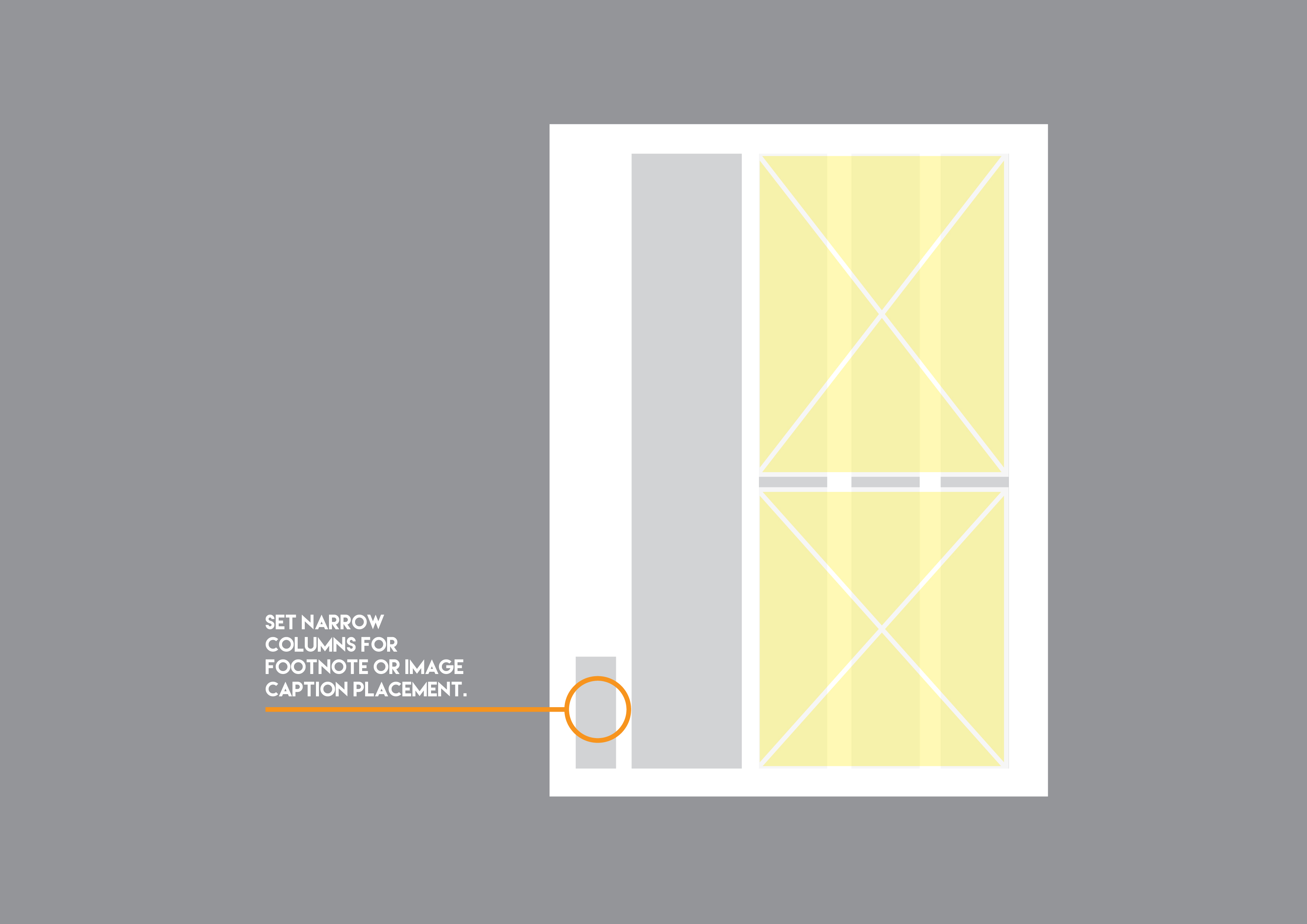
Keep in mind that when you set a placeholder into one column, it would appear to be narrow. This constraints could be used for image captions and short text blocks. Make sure to set the type size smaller when you place text on narrower columns.
Six, seven, nine and twelve columns.
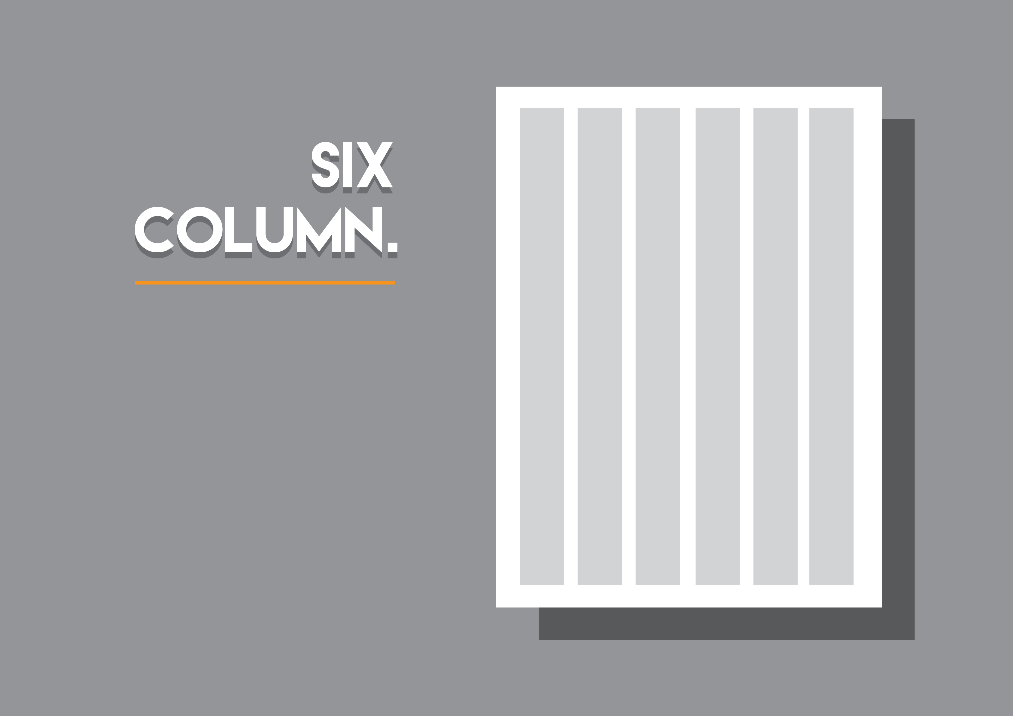
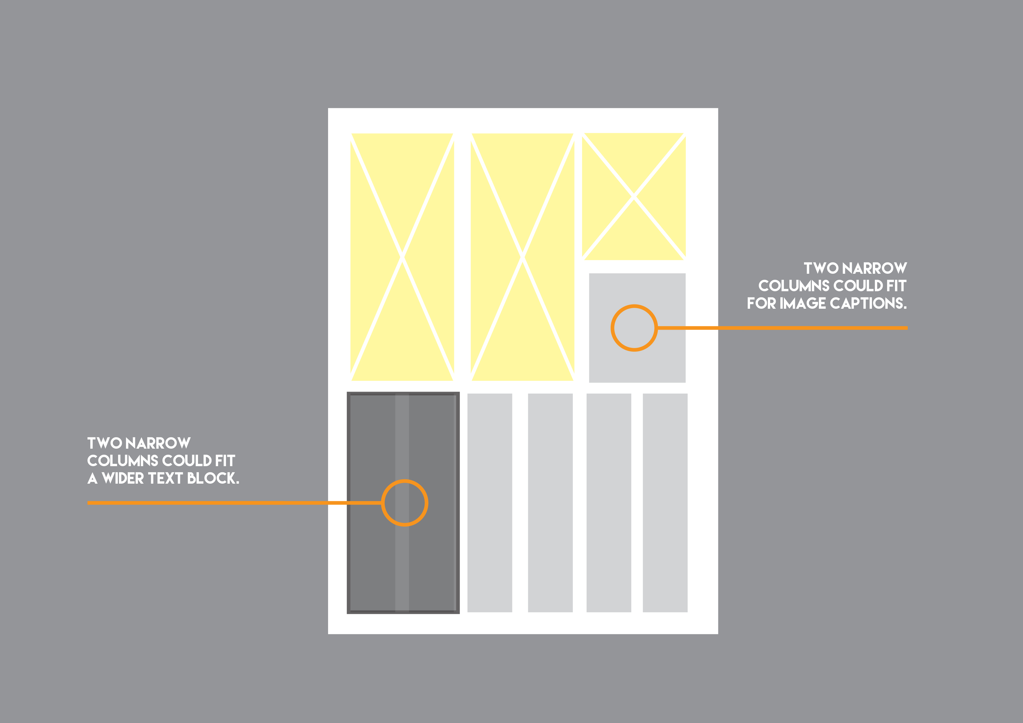
With a wide selection of columns to use, you won’t be placing any text in one column. Since it will result to a narrow block of texts and layout but you may apply such narrow grids for short image captions.
The use of twelve columns is commonly used for newspapers; given that there are text and image elements that might apply for a smaller or wider space be it for advertisements, articles and other segments.
For these types of column sizes, you can use them in any variations that deems necessary and will go through the creative direction of the magazine.
Before we call it a day.
Before starting your designing process, know what you want to achieve for the overall magazine layout. That may also require a set of magazine guidelines to follow which houses the standards and creative direction for the magazine.
These magazine standards and design guidelines will help ensure a cohesive application of the magazine’s theme and concept and will direct a team of designers, layout artists, writers, editors etc. On the elements to be incorporated.
Stuck in a creative block?
To help you get by, we have collected impressive magazines to get you back on the creative and designing process. These magazines are heavily focused on the topics of art, design, culture as well as the business side of design.
Related Posts
21+ Professional Magazines - PSD, Vector EPS, JPG Download ...
20+ Technology Magazine Designs - PSD, Vector EPS, JPG ...
8 Top Magazines Fonts - OTF, TTF Download
20+ Tourism Magazine Designs - PSD, Vector EPS, PSD, AI Download
9+ Free Wedding Magazine Designs - JPG, AI Illustrator Download
15+ Free PSD Photorealistic Magazine Mockups
Free PSD Magazine Ad Mockups
Magazines: Standards and Design Guidelines
Tips & Tricks on Crafting High-Impact Magazines
Design: Introduction to Magazine Covers
10+ Tips For College Magazine Designs
20+ Corporate Magazine Designs - PSD, Vector EPS, JPG ...
10+ Magazine Mockups - PSD, Indesign, AI Format Download
Inspiration