
There is a wide range of collaterals that complete a brand, namely business cards, portfolio, brand guide, branding applications and the letterhead.
Out of the given, we’re here to talk about one specific branding collaterals and that is the letterhead. The latter is a stationery used for professional transactions and discussions. The letterhead also bears the brand’s name, contact information and sufficient amount of white space to open any concerns and discussions.
Down below are brilliant examples of letterhead designs and gain insight on the design side of crafting such. To know more on crafting a brand, you may go through our guide to building your brand. It features the creative process and hints on the designing process to turn your brand from an idea to a fully realized concept.
Tell Me More!
Is a letterhead necessary?
We say, yes! Due to it being equally important as the brand itself. It bears the physical representation of your brand or company. Having a good quality a letterhead could translate a positive first impression to your potential clients and a well-measured response to your loyal clients or prospects.
We Love Letterheads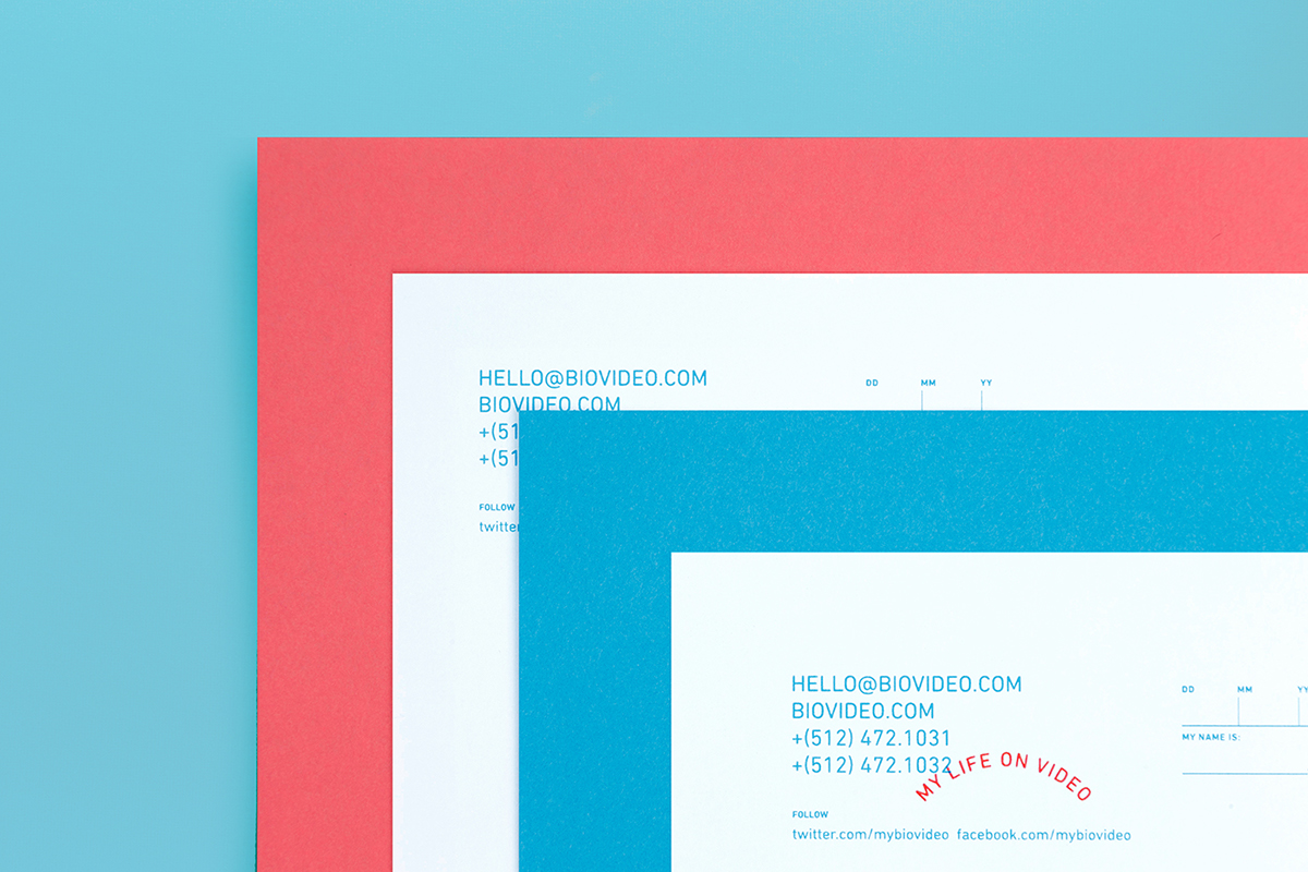
We Love Letterheads on Behance
Advantages of Letterheads
Direct mail. Letterheads could come along with newsletters, coupons, special offers, and other incentives appropriate to hand out to companies and clients. This is not an advertising print vehicle but serves its purpose as an advertising and branding medium.
Establishing credibility. Let us think of it this way, a neat and well-designed letterhead could translate your personality and character towards your client. When such is send out, it receives a measured response. On the flip side, when you sent out a piece of paper that loosely represents your brand, it won’t grab as much attention from your client or prospect.
It means more. While sending a digital letterhead might be convenient and received within seconds, it won’t seem official than sending the physical letterhead. It would definitely mean more to send a letterhead in its printed form to impart importance towards your prospect and client.
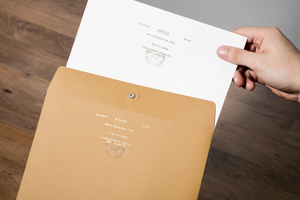
Don’t Leave these Behind
Remember, a letterhead is the physical and visual representation of your brand and company. While the corporate design will make up for it, adding these elements add a level of professionalism as well as continued communication and measured response from the recipient.
Logo or brand name. This is already a given. Since this would be the main focal point of your letterhead, it is better add hierarchy to give emphasis on the brand name. Just make sure not to let other elements overpower it to not confuse or add clutter to the design.
Physical address. Unlike business cards which have a limited size as a medium, letterheads allow designers to place long addresses. However, keep in mind to keep it brief and updated.
Email address. Remember to use a medium or thicker font for this text. Even if it is a simple or a complex email address, the recipient must be able to read your email address to ensure communication towards the client.
Contact details. This includes your fax number, telephone, and mobile number. It could be a work or personal contact information just as long as its updated and current.
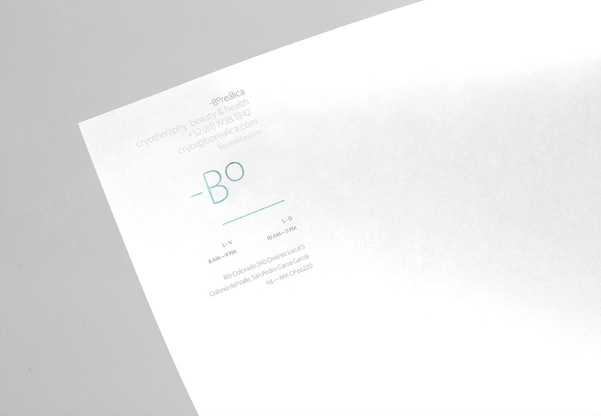
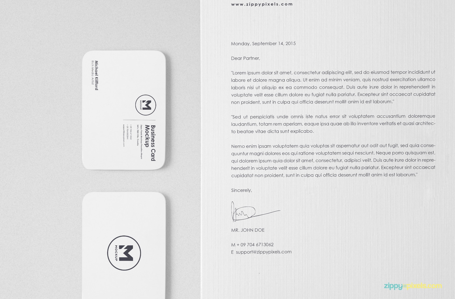
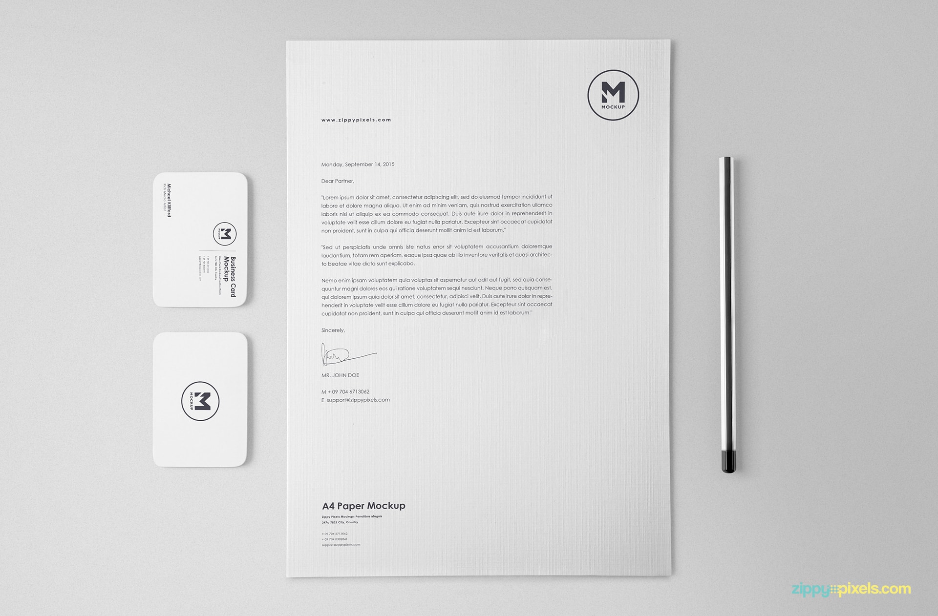
Use this letterhead as an example that is complete with all necessary contact information and brand representation. Letterhead example by -Bo on Behance.net
Designing your Letterhead
While it all depends on your design preference and creative brief, there are technical elements that you must keep in mind since a letterhead design wouldn’t be complete without it.
These include:
Know your size. The standard letter size is equivalent to a short bond paper size, which is 8.5×11. If you are considering a medium that is a little bigger in size, A4 paper size it might be for you since it measures at 8.27×11.69 inches.
If you are using Adobe Illustrator (which is strongly encouraged to be used for projects involving texts), they have more international paper size options available for you.
Know your material. Will your letterhead be printed in a standard bond paper or you are you considering a colored and textured type of paper material? This won’t affect your letterhead in terms of design but it matters for the appearance and cohesiveness with the rest of your branding collaterals.
Keep in mind to know how thin and thick the material would be. Consult with your printing service on what paper materials are available and pick according to what is suitable for your design.
Layout is the structure of the elements of a design. This process basically, the designer or layout artist is given the content and material to decide on which to place the color, size, images, texts and so on.
Composition. Layout and composition are two similar design terms. But on the other side, the composition is the arrangement of separate elements be it the images, text, graphic elements, etc. to form a whole cohesive design.
- In applying composition, find your emphasis or the focal point. This is where the viewer’s eye direction starts and then continues to another element in a work and in this case, letterhead.
- For your letterhead design, apply scale and hierarchy to differentiate your text and brand representation. Hierarchy is particularly important to text and type to communicate the importance and typographical hierarchy is it the headline, subheads, text or body copy.
The things to consider in a composition are the focal point, applying scale and hierarchy, balance, complementary elements, repetition of elements and white space. Experiment as much with combining layout and composition and incorporate your brand as well.
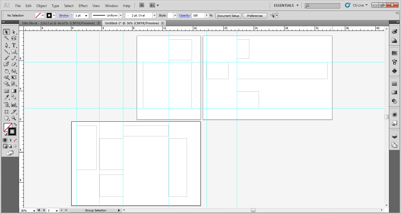
Guides. In software such as Adobe Illustrator, they offer guides as an alignment tool. The main reason is to make sure that your text and other design elements are aligned.
If you are a starting designer and has yet to navigate the software previously mentioned, the guides are of easy access.We’ll teach you some shortcut keys for both Windows and Mac devices to help you get by easily in your designing process and access the guides immediately.
Guides example by studiomaven.org
Do the following shortcut:
- First, we have to release the artboard rulers. Press Ctrl + R (Windows) or Cmd + Option +R (Mac).
- Once the artboard rulers appear on the right and top side, click on the rulers (be it the top or right side), hold it and drag. When you see a fine, bright blue line, that is the guide we are talking about.
- Drag according to where you want to place them and you may also use grid lines ,which we will discuss below, to guide you in placing your guides.
Do any of the following shortcuts:
- To move the guides, you may drag it or copy it.
- When you need to hide the guides, simply press “Crtl + ;” or “Cmd + ;”.
- On locking your guides to make them stay put and not be included while you select all elements, press “Alt + Ctrl + ;” or “Cmd + Option + ;”.
- To release the guides, press “Alt + Ctrl + 5” or “Option + Ctrl + 5”.
- To delete the guide, simply press the backspace key (For Windows) or Delete Key (Mac). You may also to Edit > Cut or Edit > Clear.
- To delete the guides all at once, go to View > Guides > Clear Guides.
Grid lines. You may also use grid lines to help you in placing your guides or align elements within your artboard. These grid lines appear behind the artboards, so this is far from creating grids for design. Don’t worry, they won’t be included when you save and print; they are just guides.
Grid example by Adobe Support.
Do any of the following:
- To apply the grid lines, go to View > Show Grid or View > Hide Grid.
- For the shortcut key to appearing and hiding grid lines, press Ctrl + ” or Cmd + “.
Letterhead Inspirations & Examples
We’ve already discussed the importance and the technical process of designing a letterhead. Now, it has come time to get your creative juices flowing with our heap of letterhead examples. It features a wide variety of design styles and concepts that match the brand’s character and personality.
Hana Frank Branding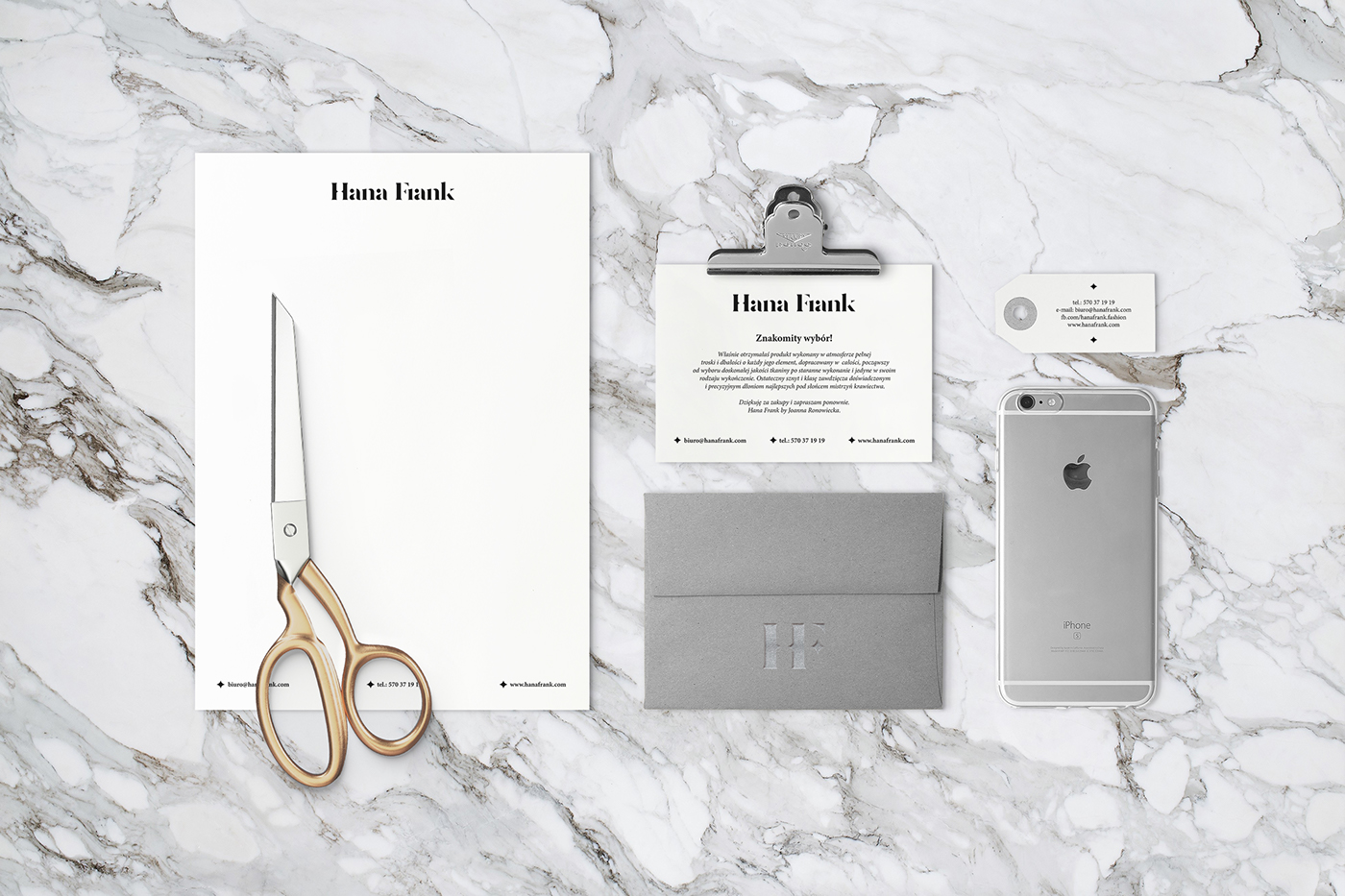
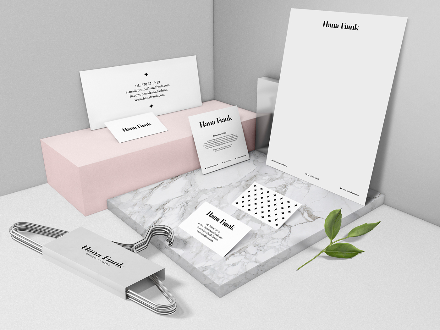
Hana Frank’s Letterhead uses a minimal design style. It uses a subdued color palette mixing neutrals and pale pink. Hana Frank is a fashion brand and the concept behind its brand identity translates the latter’s tagline “Express Yourself,” suggesting to let the clothes speak for itself. Hence, the simple branding.
Curious Space Branding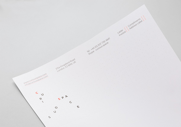
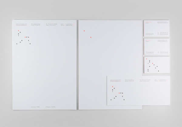
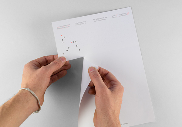
The logo identifies with an irregular placement of the letters but is contrasted well with a simple and direct layout. Avoiding any clashing of the elements and the translation tension. The letterhead design has a sufficient amount of white space, perfect to open up any professional discussions.
Poste Branding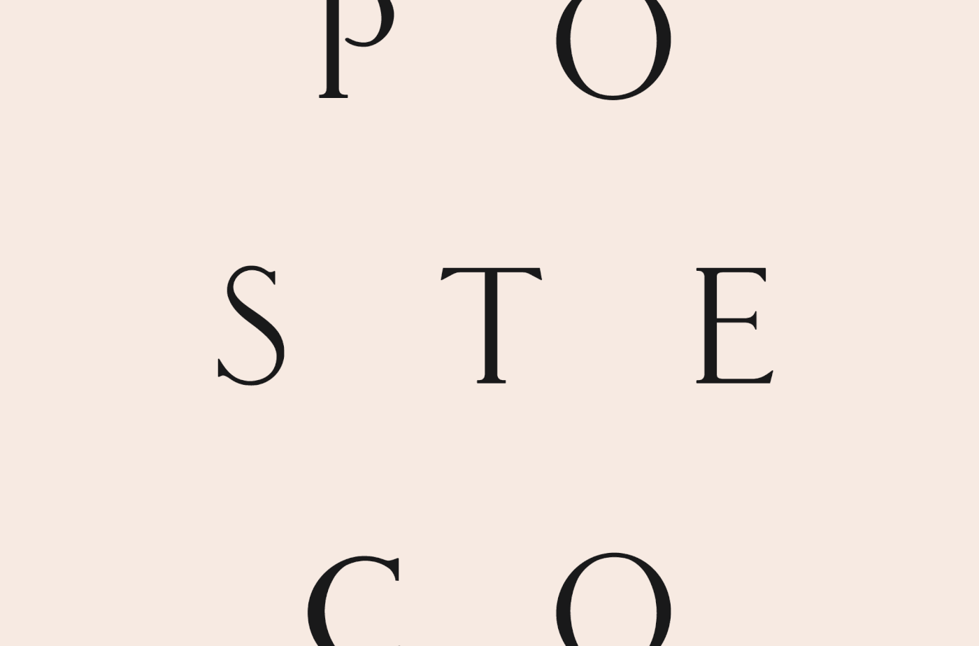
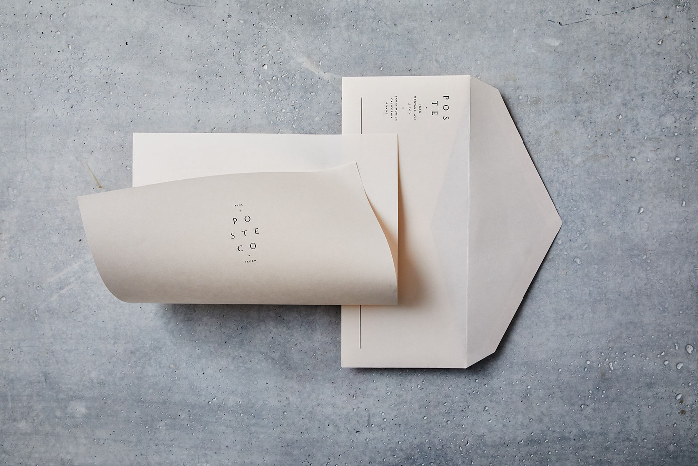
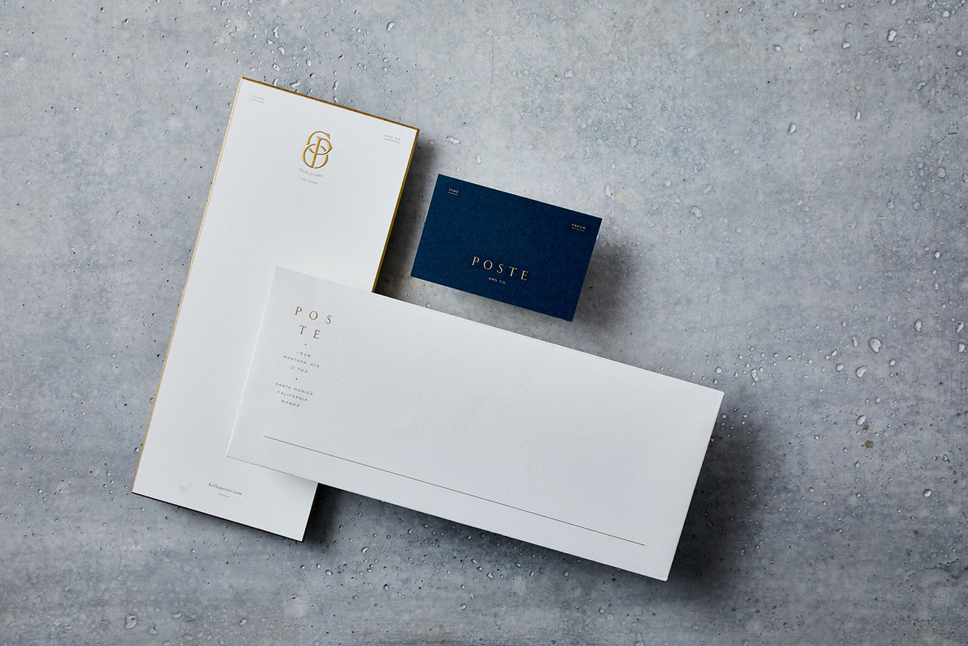
Poste letterhead design exudes a formal and delicate take on the use of type and brand application. The text elements are aligned in the center and use a fine paper material on its letterhead and envelope.
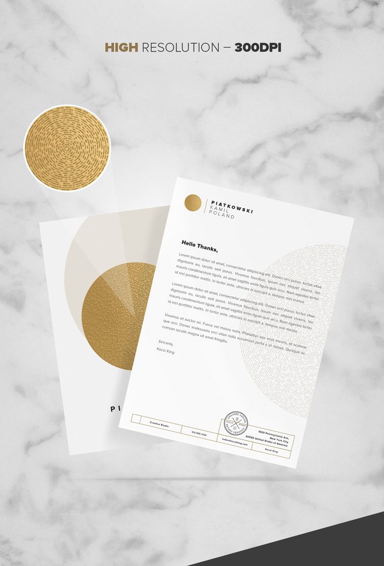
Stationary Design – A Royal Letterhead
The beauty of this letterhead design is that it translates a modern type of royalty: simple, neat and minimal. The graphic elements are well contrasted with a gold stamped texture and plain, fine text.
30 Park Place Branding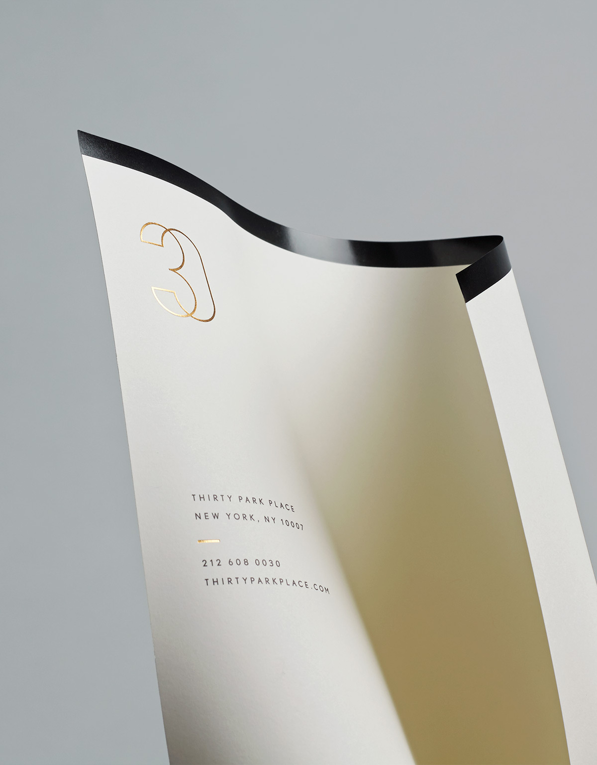
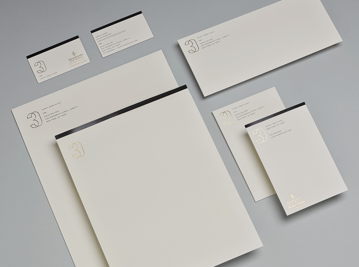
Trimmed with a glossy black strip on top paired with a soft background color and a striking gold and interlinking logo, this is a mighty fine letterhead design. All graphic and text elements are gathered together which forms a well-arranged and minimal appearance.
Letterhead and Branding Mockups
Free Stationery Mockup Set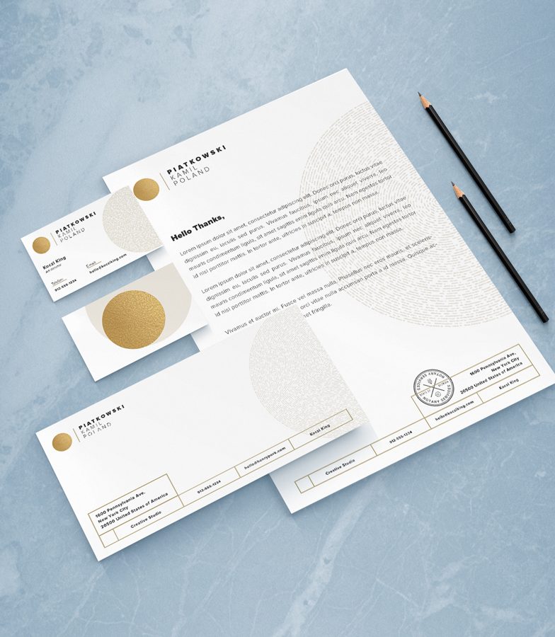
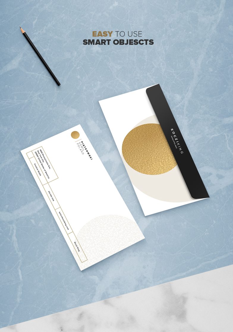

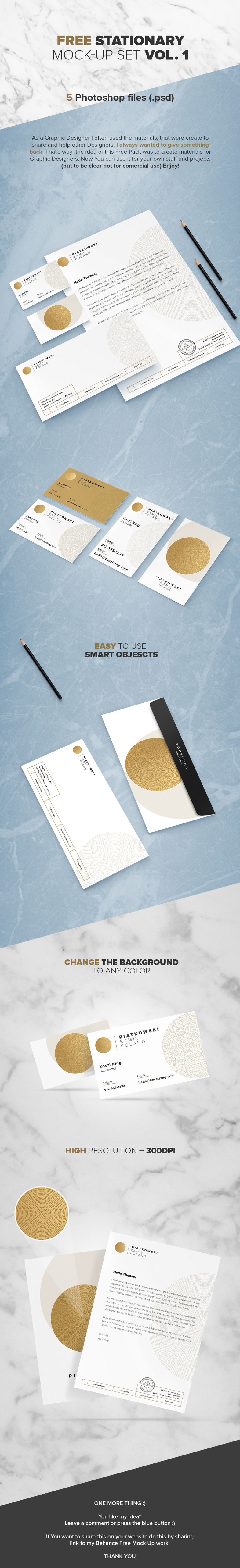

This free stationery mock-up set comes along with business card, envelope, and letterhead designs that are up for grabs. It is also provided with five Photoshop files that have varying design styles and of 300dpi high-resolution files. You can also change the background to any color to match your brand. It is best to be used for commercial purposes.
Simple & Free Stationery Mockup Set
This letterhead and business card mockup set come along in a customizable 3×2 in and 8.27×11.69 in or A4 size, respectively. You may freely customize the shadows and background to your heart’s content. This is a great pick for a strong and smooth presentation.
Retro & Minimal Stationary PSD Mockup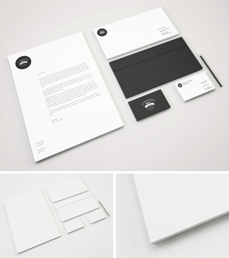
Feel free to download this PSD mockup for a great brand identity representation while incorporating a retro and minimalist design style. This PSD mockup comes along with a business card, envelope, pen and letterhead mockup. You may use this mockup for any design and branding projects.
Once you are done with your letterhead design, make sure to enclose it in an envelope to retain a neat and professional appearance. If you are looking for envelope mock-ups, look no further. We have listed a heap of free PSD envelope mockups that are up for grabs. It is of great help in terms of branding, design projects and for presentation purposes.
Related Posts
FREE 16 Credit Card Designs in PSD | AI
FREE 32 Ultimate Photoshop 3D Text Effects
FREE 23 A4 Brochure Designs in PSD | InDesign | MS Word | AI | Publisher
FREE 39 Photoshop Custom Shapes in Vector EPS
FREE 17 Photography Flyer Templates in PSD | Vector EPS
FREE 16+ Stamp Designs in PSD | AI
FREE 23 Portfolio Template Designs in PSD
FREE 19 Metallic Effects in PSD | AI
FREE 31 Best Magazine Design Templates in PDF
Color Theory To Your Brand Identity
FREE 24+ Logo Design Examples for Brand Identity
FREE 14+ Advertising Ad Banner in PSD | AI
FREE 23+ High-Resolution Blurred Background Designs in PSD | AI
FREE 8+ Cool Tattoos in PSD | AI
FREE 17+ App Login Pages in PSD | AI