
Magazines, a publication of seasonal information that houses content collected from countless individuals with the core to spark the interests of readers. As interesting as its content might be, such quality wouldn’t translate without any proper guidelines to create a cohesive overall appearance. This includes the theme and concept to incorporate, pagination, technical elements and so on.
To help you get by, down below, we have prepared the essentials needed such as design and technical elements to create a high-impact magazine. This will be helpful for design projects and may be utilized for future references. For more creative inspiration, we also gathered a heap of magazines essential to graphic designers, artists and art and design enthusiasts.
The Making of a High-impact Magazine.
Magazine publications don’t necessarily have a flexible time in terms of the jam-packed schedules and designated roles and productions. Which is why it helps to have a plan or structure for the production stages.
If you are new to the industry be it starting your own glossy or a new recruit on the publication’s workforce, let this list guide you through the processes involved and details and elements to incorporate in your magazine. You may also go through our guide on crafting a magazine cover which you may use for design projects as well as for future references.
Pre-production rituals.
Rituals could mean a religious observance but in this case, what are the things to do before jumping into the designing process of a magazine. How does a magazine publication prepare for a long run of deadlines, adjustments and post productions? To avoid any slowing down, these are the starting points to be able to be able to progress in crafting magazines.
What would be our theme this time?
First up, we have to establish what the theme would be incorporated for this season or issue. There are a variety of themes to pursue; be it fashion, design, youth, style, architecture, real estate, food, special interest, photography and so on. Starting there, create an overall concept to apply across all glossy pages of the magazines.
Visualize the concept through Mood Boards.
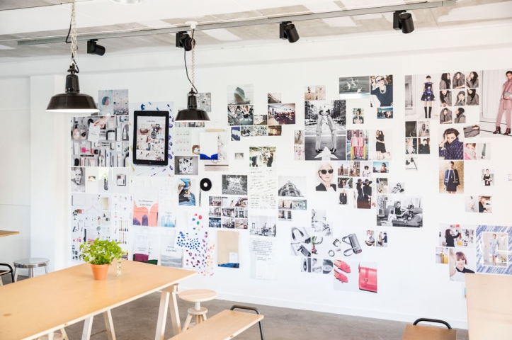
Moodboard example courtesy of Pinterest
The planning begins at this stage of the design process. Once having the final decision for the overall theme, create a mood board to come up with a fully-realized idea and visualize the concept. A mood board, in this case, contains gathered images of various styles, colors, layout and typography that best translates the theme and concept of the magazine.
This process works best if the mood board is in physical form than the medium on the flip side.
Choosing the Magazine Size.
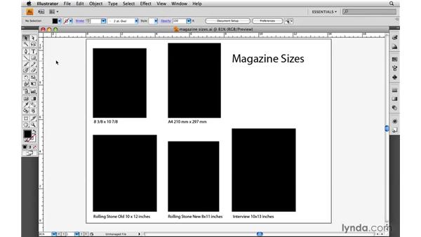
Magazine Sizes example courtesy of lynda.com
Would it be a standard size, over-sized or undersize magazine? To be more specific, the commonly used magazine page size and deemed most economical is 8 3/8″ x 10 7/8″ page size. Most press and bindery equipment is designed to produce such size which creates less paper waste.
On the flip side, it is possible to produce your magazine in an oversize or undersized page sizes. But do keep in mind that the cost per square might cost you higher than the standard page sizes.
Pages one to how many?
For your magazine, based on the production time and budget, how many pages should be allocated for advertisements and for the magazine’s content? Keep in mind that the magazine’s article should also be given limitations to its word count or at least give specific numbers of pages to fill in as to not compromise the layout of pages and the production of magazines. In some cases, increasing pages is inevitable so be prepared for any adjustments ahead.

Surf Magazine Layout example courtesy of Pinterest
Magazine Standards to Apply.
Once the theme and concept are established, you may proceed to the technical side of crafting magazines. Now let us talk about the basic standards which one should start before anything else. The basic standards include the margins, bleeds, and columns. These standards are designated for the magazine’s pages to allow layout designers to incorporate the content accordingly or at least have a starting on their layout designs.
First up, Margins.
The functions of margins are creating the text and graphics from falling off the page. The reason is that the white space gives an eye break for the reader whether the content or text is densely laid out.
Margins are a practical function in the overall appearance of a magazine. The allocated space given, allows the readers to hold the glossy without blocking the text with their fingers. As well leaving extra space so users can place notes when necessary.
In terms of binding, leave enough space for the inner margins to give way for the staples or ring binders.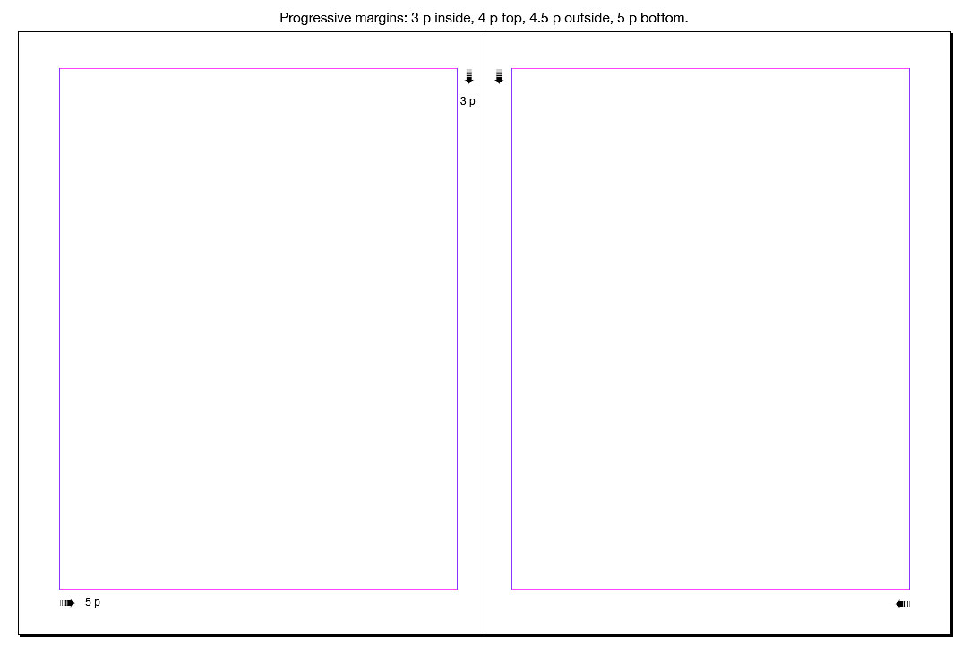
Margin example courtesy of ndsu.edu
Avoid unnecessary edges by adding bleeds.
Adding bleeds on your magazine pages is essential to avoid those white strips appearing along the edge of your paper. In some cases, white strips or edges occur as there can be movement during designing or printing.
By applying bleeds, the designated image or background color that you intend to touch the edge of your page is ensured to go to the edge of the magazine page during printing.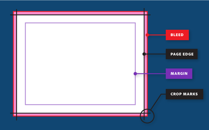
Bleeds, Page Edge, Margin, Crop Marks example courtesy of Adobe
Support your design with the use of columns.
Columns are the backbone of every good magazine layout and why? Have you noticed that the blocks of text in books are laid in a wide column? On the flip side, in some magazines or newspaper articles, blocks of texts are laid in a narrower column. Applying columns brings order and structure to written materials be it books, newspapers, brochures and in this case, magazines.
To the scenario mentioned above, it is infused with the unwritten rule that mentions to design more important topics or stories on fewer columns. On the flip side, when a block of text that is laid out in a wider column can make the article seem longer to read and appears to have more text.
While adding narrower columns are fit for less important stories which allows users to read an article or stories in a faster way but also it lets readers jump from one column to another.
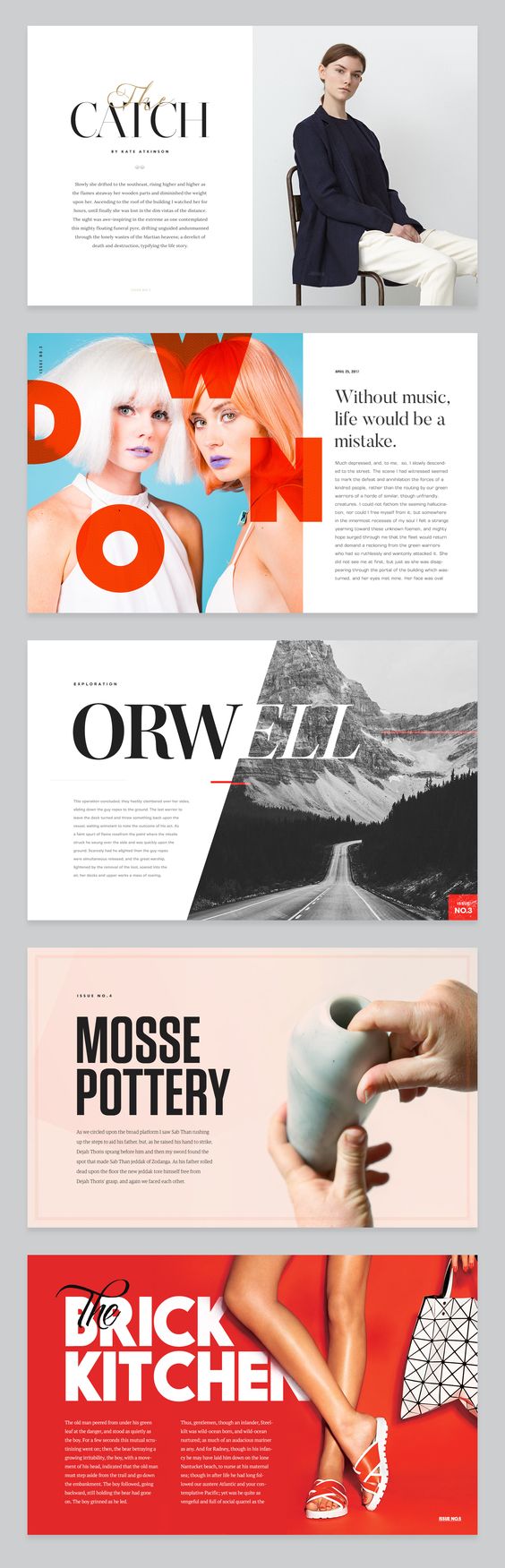
There are a variety of columns that you may support your design with. From adding one column, which is used very lately. Four columns could allow designers to layout the text and images separately or together. You may use the numbers in between even go for six, seven, nine and twelve columns. Which you may use for adding short image captions, pull quotes, additional notes and so on.
Twelve columns are rarely used since there is quite a small need for them. Though, twelve columns are used in magazine layouts since the content on such mediums contains small chunks of text as well as the use of images.
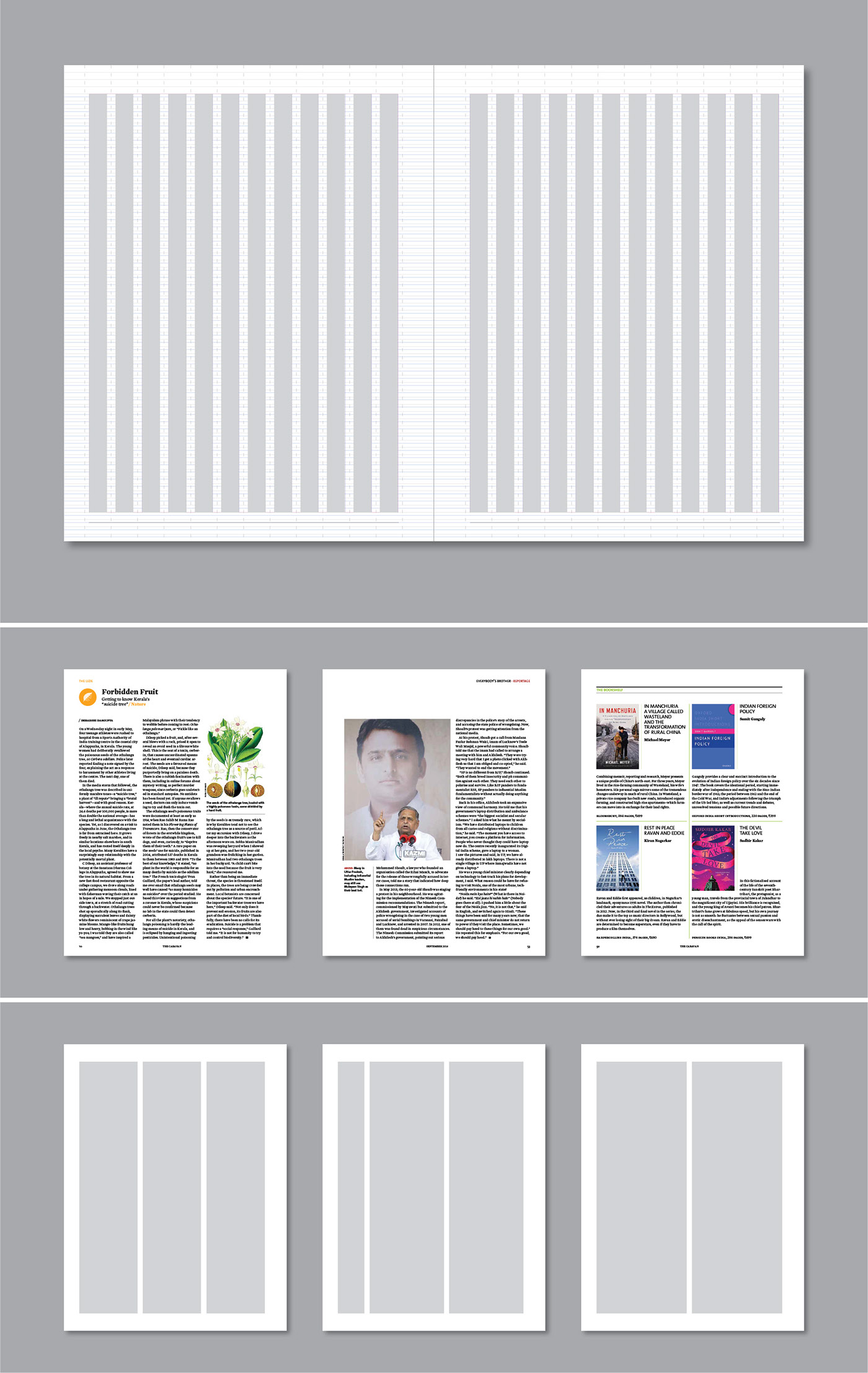
Magazine Columns example courtesy of Behance
Tell me more!
These standards are no way to constrain creativity as well as complexities of themes and concepts but it serves as a foundation of a strong magazine design. By applying such, it gives readers a great experience imprinting the inside content and gives a measured response either by loyal readership, subscription and more importantly propels the message and topics out to the readers.
Magazine Guidelines to apply.
In producing magazines on a timely basis, it involves a team of layout artists, graphic designers, creative director, writers, photographers, editors and so on. With a huge number of individuals crafting a magazine, guidelines help as a reference and overall direction to shun out any misunderstanding and misuse of design elements. More importantly, create a cohesive and well-thought out magazine. To help you get by, let us break down the content of magazine guidelines one by one.
The percentage for Images and Text.
It is best to balance out the use of images and text for the layout of your pages. As well as if it involves an article with a lengthy word count, a use of one too many images might disrupt a cohesive and appropriate layout and appearance.
If you are a visual type of magazine, then you may go and apply dominant utilization of images with less text and vice versa.
Byline.
You may set the guidelines for the byline to either incorporate just the name of the subject that is featured in the article or naming the writer of an article.
Typography.
Magazines have its level of texts which will need hierarchy and emphasis. As well as giving readers an ease while browsing through the glossy. For typographical uses, there are various typefaces or fonts to be applied for the headline, byline, and other elements.
Headline. This will serve as an introduction to the entire article or content. Make sure to select a font that is pleasing as well as practical in terms of readability and legibility without neglecting the theme and overall concept. Aside from its exterior, set a maximum and minimum size for the headline. For example:
- HEADLINE: PF Encore Sans 40pt (Minimum of 24pt)
Setting a standard for the font and its size, allows designers to adjust its layout accordingly.
Byline. Choosing the font for the byline should allow readers to distinguish the different levels of the introducing texts. Since this line emphasizes the name of the subject or the writer of an article, make sure to pair the typeface for this segment and the headline well with proper contrasts on weight, serifs or san serifs and so on.
Also, similar to the guidelines for the headline set a maximum and minimum typeface size for the byline. Which will be smaller than the allowed size for the headline. You may also add in italics and underline for this segment.
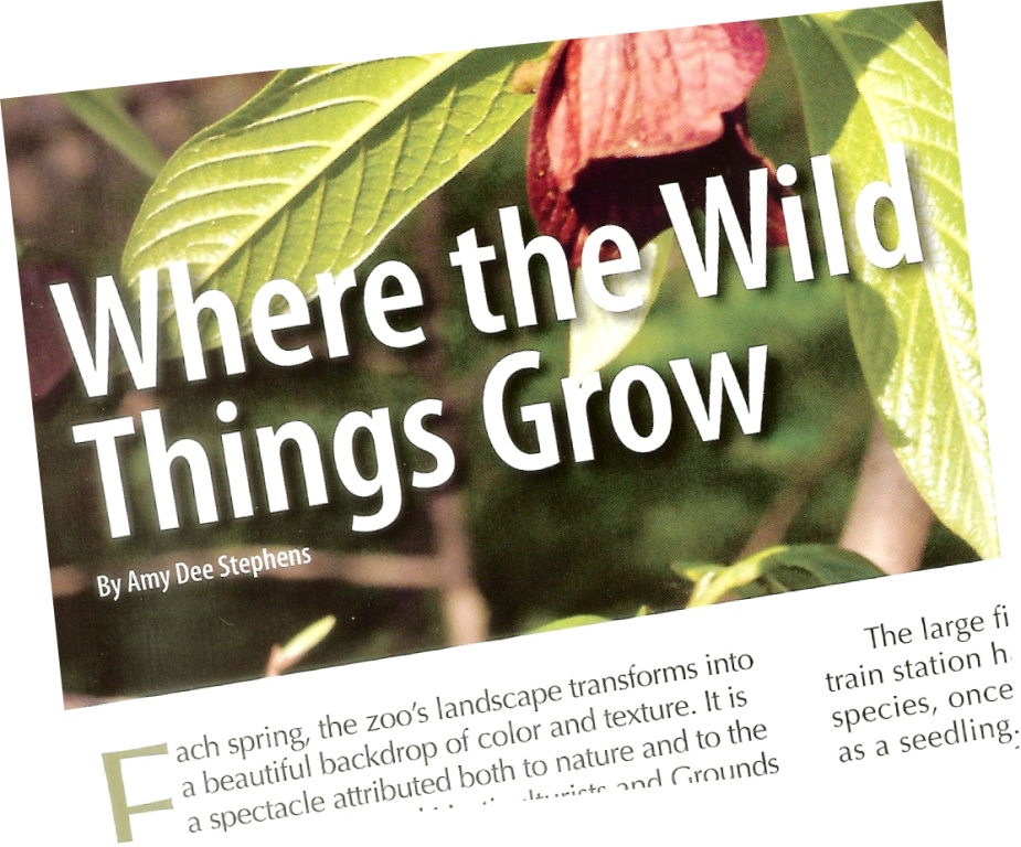
Headline and Subline example courtesy of amydeestephens
Body copy. Avoid light and fine fonts or typefaces for the body copy. This will enable readers to scan through the content.
You may also adjust the characters by its alignment, hyphenation, kerning and leading to either fit the entire words on specific numbers of pages or for readability purposes.
Pull quote. You may emphasize which typeface and colors to apply for the pull quote. As well as how you want it to be presented either in both parenthesis, quotation marks or highlighted which will depend on your creative brief and designated preference.
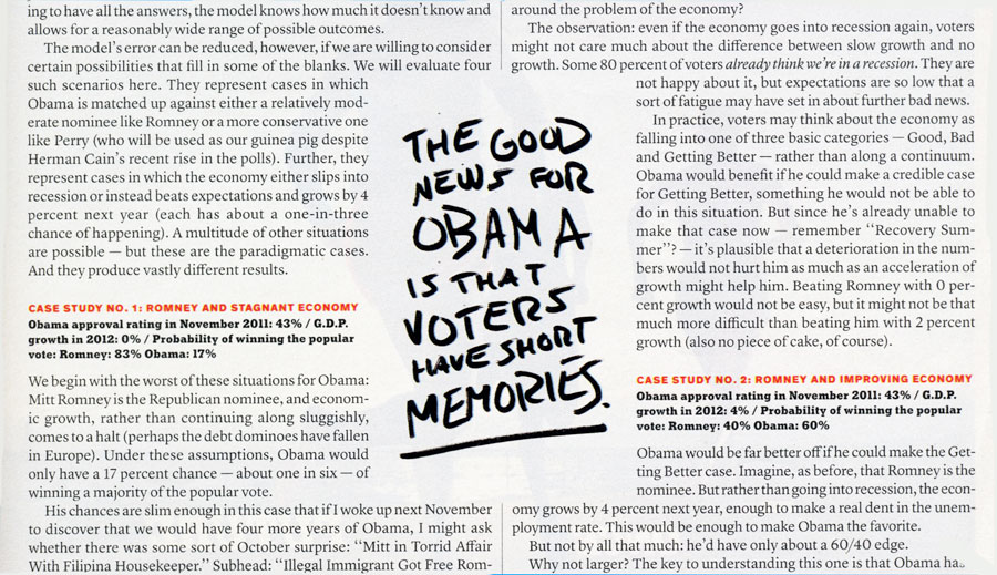
Pull Quote example courtesy of netdna-ssl.com
Hyphenation. Hyphenation serves the function of splitting a word that would extend beyond the allowed margin. You may emphasize in your magazine guidelines either or adding or excluding such function for your articles.
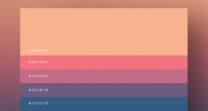
Color Palette.
Color Palette example courtesy of digitalsynopsis.com
This segment would have to depend on your theme and concept. But you do have to emphasize which color will be used for the various text be it the headline, byline, body copy and so on as well as on other magazine elements.
Colors for pagination (if necessary). Some publication put touches of the theme or concept onto the pagination in a form of flaps.
Use of colors for pull quotes. Pull quotes, as a given is the highlighted sentence in an article. By so, make sure to use colors that differentiate the text from the body copy. Also, consider a color that offers readability and avoids eye-sore colors.
Layout and design Inspiration.
Include a mood board of the inspirations that best translates the current theme and concept of the magazine. Do provide more examples to allow designers and layout artists to craft their designs and so on.
Layout and Desing inspirations example courtesy of Pinterest
Pagination.
Pagination, in this case, is the evident division of the magazine into pages.
Include mentioning how the pagination is to be incorporated in the magazine. Some magazines place such in the simplest way of placing it on the bottom sides. While magazines infuse the concept a bit on the pagination.
How to apply these technical elements?
How may you apply the technical elements such as bleeds, columns, margins, hyphenate and so on? To help you get by, you may use Adobe InDesign in crafting your magazine. Also, with the help of Illustrator, Photoshop and Lightroom for graphic elements, photo manipulation and image editing, respectively.
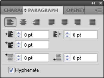
For the bleeds, margins, and columns.
Adding these basic standards begins once you start a new document. Apply the numbers according to your guidelines. For example, these are the basic standards which are used on a standard size of 8×11 magazine page:
- MARGINS: 0.5 in top to bottom, 0.8 right, and left.
BLEEDS: 0.25 in
COLUMNS: 12 columns – can be 2-3 depending on what fits
Apply the right basic standards that fit your magazine size and content inside.
New Document example courtesy of smashingmagazine.com
Adding or checking out the hyphenation.
To add or remove the use of hyphenation using Illustrator or InDesign, go to the paragraph window which could be found on the top part of the tabs. Once the window drops down, you may see options of text alignment and under it presents the hyphenation function on where you may change the hyphenation.
Hyphenation and Character Window example courtesy of amazonaws.com
Character changes.
If you happen to use Illustrator or InDesign, you may quickly change the scaling and adjust the kerning and leading with a few steps. Go to the character window where you will find the options for scaling, kerning, leading, etc.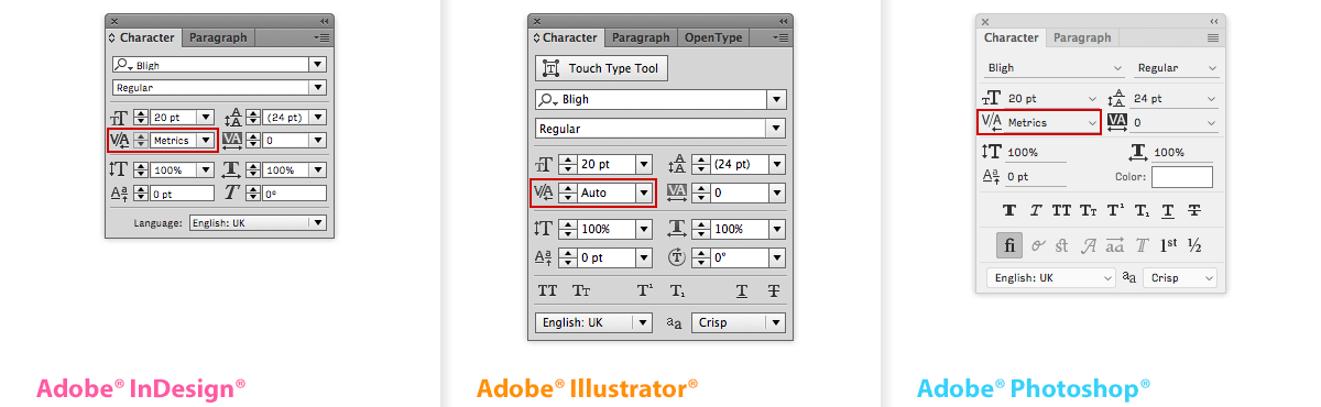
Character Windows from different Adobe Software example courtesy of FontShop
Copy pasting an article.
For some of you out there, you may quickly copy and paste words in InDesign without having to hassle on the hard way. Do create a text box and place a lengthy text inside, If it doesn’t fit, don’t fret. Once a text doesn’t fit in a certain text box, a red shape is seen in one of the sides of the text box. Click that red shape and it copies the remaining text which you may paste immediately onto another text box.

Textbox example courtesy of arch.virginia.edu
Textbox example courtesy of cloudfront.net
For the long run.
We have two more standard and guidelines we are glad enough to share and is essential in honing your magazine’s interior.
Scaling.
For the scaling of the text and typeface, never go down under 6pt. Since it will enable readers to be able to read the article with ease. In situations wherein the article couldn’t fit the allowed number of pages, changing the font size will be your last option. First, try to change the leading of the text; this is the space in between sentences. You may also change the tracking to fit it or lose more words in a sentence. Tracking is the space between each letter of a word, line or block of text.
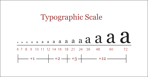
Typographic Scale example courtesy of typecast.com
Don’t leave behind the orphan and the widow.
We say don’t leave these behind since it seems like they are in terms of layout. They are considered poor typography since it leaves eye-sore as well as too much white space between paragraphs or the bottom part of a page.

Windows and Orphans example courtesy of opusdesign.us
Orphan: This appears at the beginning of a column or page.
Widow: A widow – usually one word that is left dangling at the bottom of a block of text.
To remedy both the orphans and widows, there are several options you may apply. First, turn off the hyphenation in your blocks of text which prevent division of words at the end of the line in a sentence or text.
If there is still widows or orphans after turning off the text hyphenation, try adjusting the tracking of the text to cram words to fit in a line.
Rags: This refers to the irregular or uneven vertical or right margin of a block of text. To avoid this use grids and guides to level out your margins.

Rags Textbox example courtesy of smashingmagazine.com
For the next part of our series in crafting magazines, you may go through our list of design techniques that translate creativity and proper representation of the core of a publication.
Related Posts
Tips & Tricks on Crafting High-Impact Magazines
Design: The Making of a Magazine Cover
FREE 20+ Elegant Electronics Magazine Designs
FREE 21+ Christmas Clip arts in Vector EPS | AI
FREE 14+ Christmas Backgrounds in PSD | AI | Vector EPS
FREE 20 A4 Paper Mockups in PSD | InDesign | AI
FREE 22+ Technology Brochure Templates in PSD | Vector EPS | InDesign | MS Word | Pages | Publisher | AI
FREE 22 High Quality Blue Textures for Graphic Designers in PSD | Vector EPS
FREE 21 Blue Pattern Backgrounds in PSD | AI
FREE 21 PSD Vintage Logo Designs in PSD | Vector EPS
FREE 22 White Paper Texture Designs in PSD | Vector EPS
FREE 30 Square Brochure Mockups in PSD | InDesign | AI
FREE 24 Envelope Mockups in PSD | InDesign | AI | Stationery
FREE 29+ PSD Christmas Invitation Card Designs in PSD | MS Word | AI | Apple Pages | Publisher
FREE 20 Silver Texture Designs in PSD | Vector EPS