
Magazines employ the importance of crafting an impressive front cover; that is to attract its target audience’s attention as well as to assert the content or theme of the magazine. By incorporating such goals could increase the likelihood of consumers to purchase the product. To do just that, one must consider implementing a striking front cover. With an array of themes and concepts to incorporate and that differs from season to season to conceive a unique, creative, unusual and stands out in a lineup of magazines on display.
Let us introduce to you a collection of magazines that has employed impressive design techniques that delivered the magazine’s content, creativity and more importantly demonstrated the magazine’s core. For a more extensive collection of great reads, we have gathered essential magazines that heavily focuses on arts, design, culture even the technical sides of design.
Design Techniques that created impressive and truly unique front covers.
In our heap of magazine covers down below, demonstrates fully-realized concepts and unique ideas that spoke closely about the brand’s core. Which is fitting for its readers and displays the content well. The techniques are an inclusion of the basics of color theory and design yet leveled up. We hope that this will be of great help for any design projects at hand and may be used as future references.
You may also skim through our guide on the making of a magazine cover which covers the basics such as the elements included in the front cover and both the design and technical processes that go into crafting magazines.
The use of Colors.
With a spectrum of colors, there are endless possibilities in using colors for designs, artworks, prototypes and so on. Colors definitely cause an impact in the way we associate spaces, things and even towards individuals. Colors are infused in projects be it designs for interiors, graphics, arts, branding and in this case, magazine covers. You may also go through our guide to color theory and how you may apply it to design projects and brand identity.
Merge the image and the background.
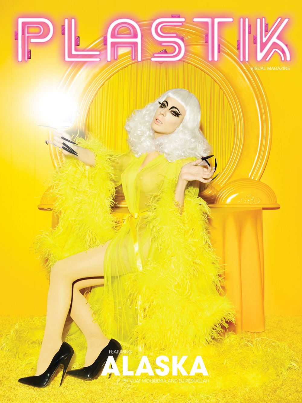
Front Cover: Alaska Thunderfuck 5000 / photo courtesy of Plastik Magazine
With a consistent color scheme utilizing shades of yellow paired with the colors white and black. This is to contrast the bright pops of color as well giving the front cover more depth and dimension.
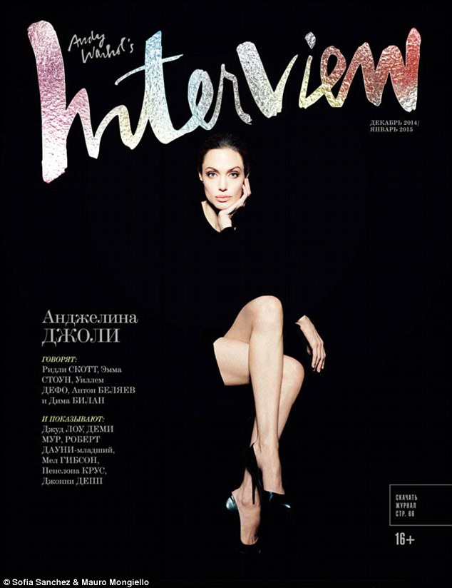
Front Cover: Angelina Jolie / photo courtesy of Pinterest
The image and background are well merged in this front cover of Interview. The subject’s clothing is indistinguishable from the background yet the pose and use of lighting adds movement and form to the subject.
Add some pop of color.
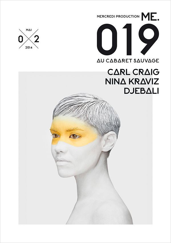
Pop of color example photo courtesy of Pinterest
The pop of bright yellow in this magazine allows viewers to direct their focus on the subject’s eyes. With the touch of color for this magazine cover gives more depth and dimension to the monochromatic setting.
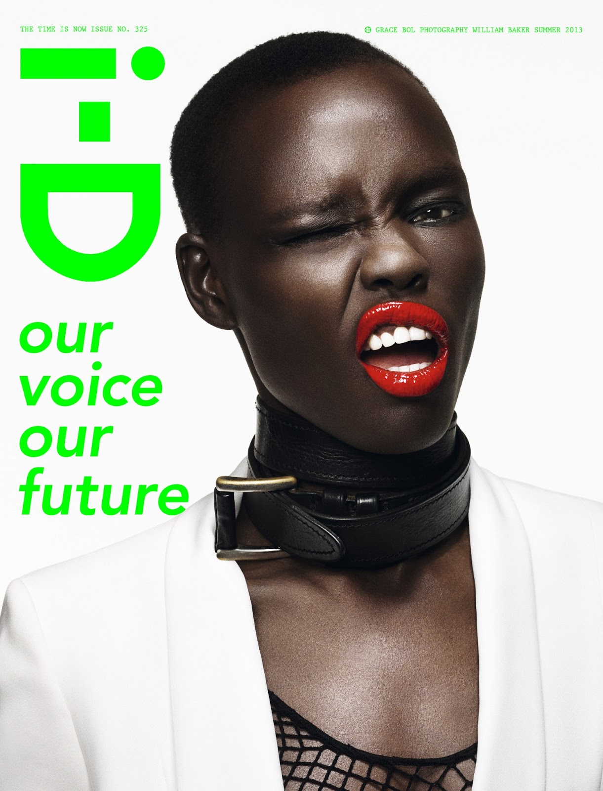
Front Cover: Grace Bol / photo courtesy of trip down memory lane.
In a black and white ensemble, a touch of red brings about personal associations to a simple use o the color scheme. Also, to note that the masthead’s color compliments well with the color red. The use of lighting provides highlight and depth to the magazine cover, not allowing the image to fall flat.
Infusing color transparency.
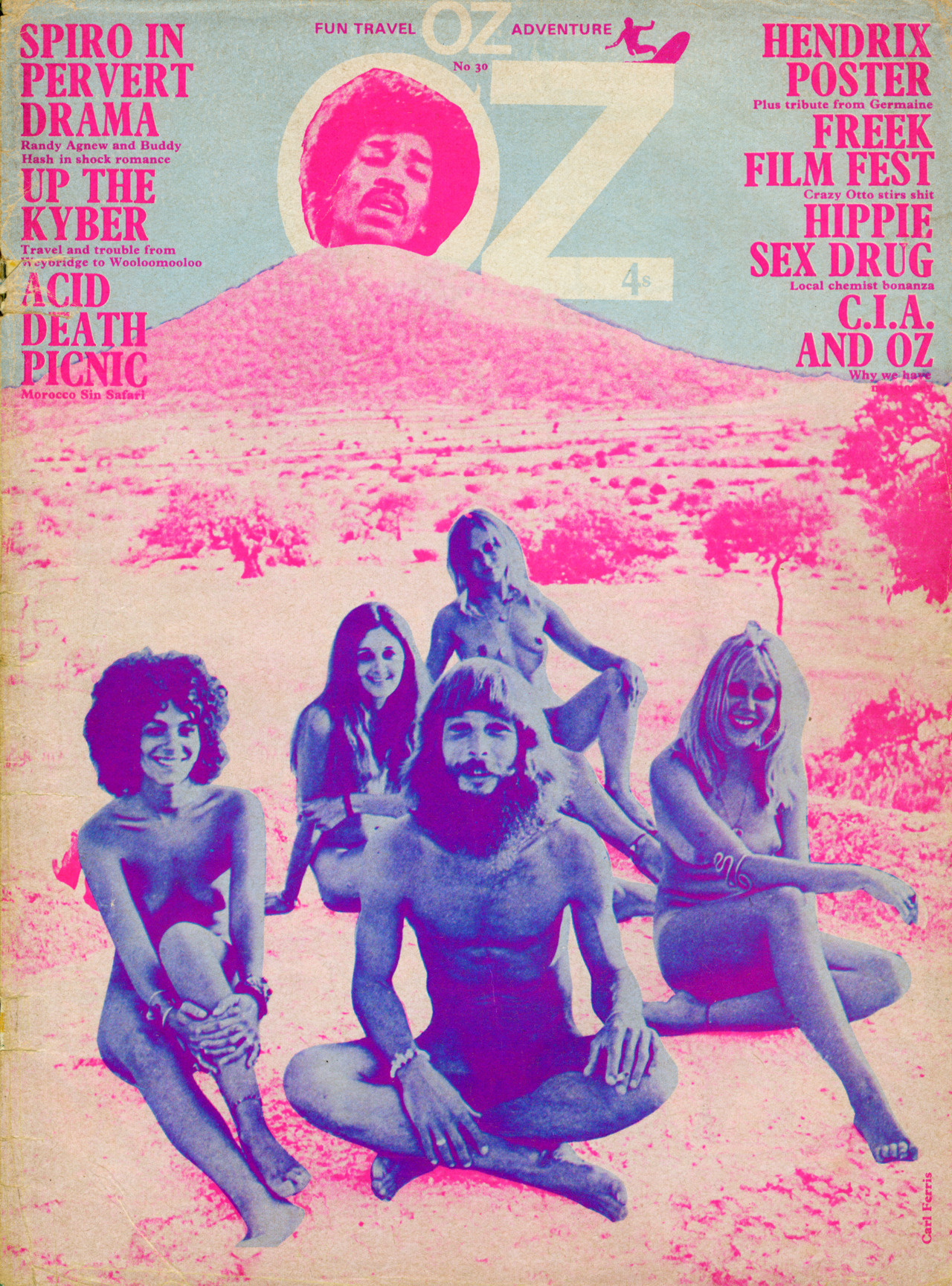
Photo courtesy of Pinterest
The color transparency added in this magazine cover is reminiscent of the hippie subculture that has elapsed throughout the decades. The colors used on this front cover compliments well with the other tones paving a way to demonstrating a soft and somewhat dreamy appearance. The composition of the elements are distributed accordingly into two sections to avoid congestion of the text and image.
The use of color theory and complementary colors.
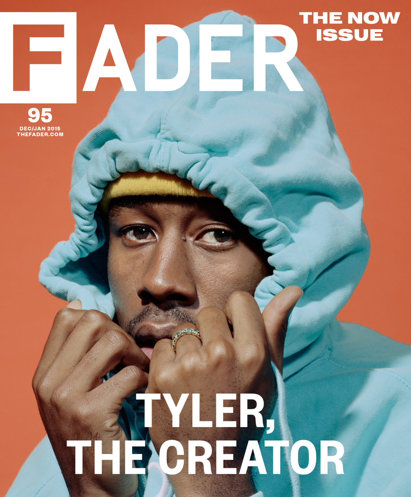
Front Cover: Tyler, The Creator / photo courtesy of The Fader
The application of subdued colors creates this visual storytelling that translates Tyler’s personality and his evident use of colors across his personal merchandize and branding collaterals. The colors blue, orange and a touch of yellow are paired well to create a soft exterior.

Front Cover: Kim Chi / photo courtesy of Reddit
Queen Magazine which features legendary drag queen, Kim Chi, demonstrates a monochromatic use of color palette by applying analogous colors yellow orange, orange, and pink. The use of texture and the color palette for this magazine cover allows the front cover to achieve dimension and layers to the image. The text as well uses the same formula with its color; black on the bottom and white for the masthead.
A spectrum of Psychedelic colors.
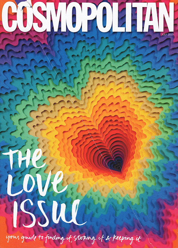
Cosmopolitan Magazine / Photo courtesy of Jen Stark
Cosmopolitan infuses an electric use of psychedelic colors that translates movement and progression. With the creative direction demonstrating such feeling of being in romantic affinity promotes the magazine’s content.
The use of Materials.
The use of materials be it paper, plastic, or physical materials can result in a striking magazine cover. In our line up of magazine covers down below, utilizes the various materials as part of their concept for their front covers.
If you are on a hunt for textures, look no further. You may check out white paper textures and a colorful set of construction paper textures.
Tear it up to create layers.
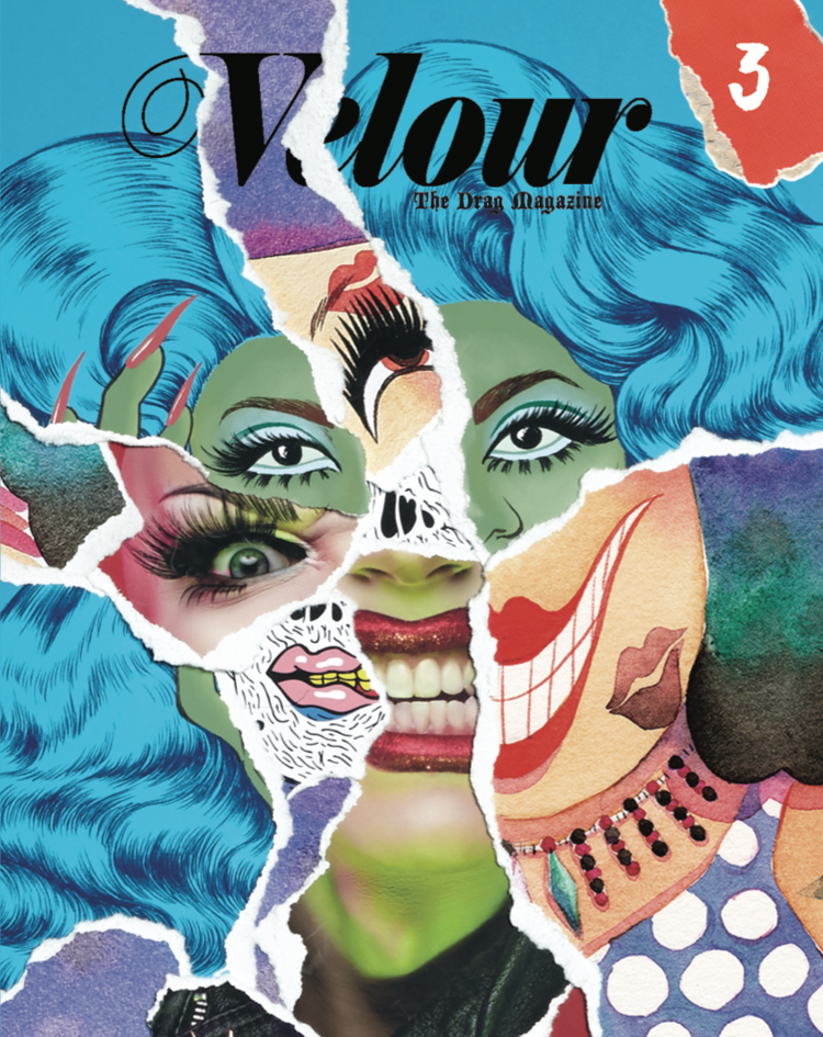
Velour: The Drag Magazine / Photo courtesy of thedragmagazine.com
Velour: The Drag Magazine utilized paper to create layers and form a collective subject. The front cover combines images from various mediums such as watercolor, digital art and photography creating a mixed media exterior. The colors mediate the cover incorporating a dominant use of receding colors with touches of advancing colors to break the commanding use of blues, violet, and green.
With the use of paper cuts.
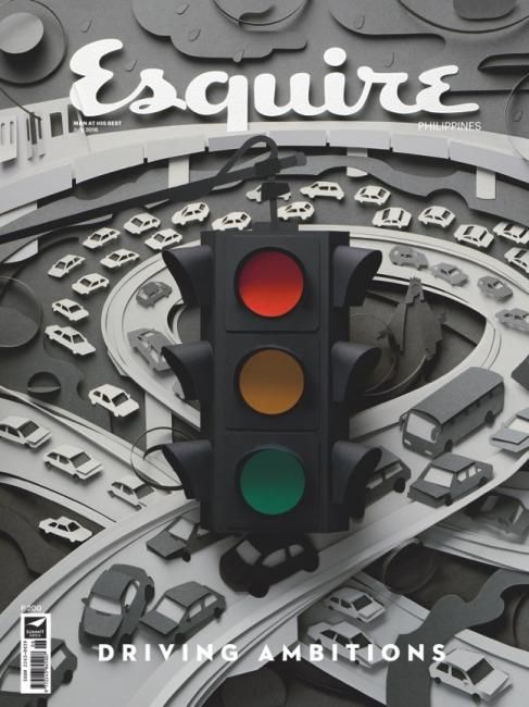
Cover Designer: John Ed De Vera / Photo courtesy of The Inspiration
The Philippine edition of Esquire, mainly a men’s magazine, incorporates the use of paper cuts to drive in an unconventional concept for the magazine cover. Not only did it offer a mesmerizing sight but it also captures the slice of life in everyday traffic in Philippine roads. With the use of monochromatic colors to translate the busy and chaotic environment as well as the emphasis on the traffic light signals the control in traffic and to proceed with caution. Even with its visual storytelling, somehow the headline “Driving Ambitions” promotes positivity to the readers.
Use transparent overlay.
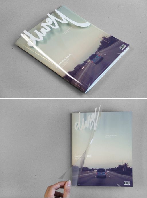
Dwell Magazine / Photo courtesy of inspiredm.com
This is one way to make use of full sized images as well use typographical elements on a separate material. With the combination of both materials and the extensive space offered by the transparent materials, allows designers to play around with the masthead as well as the composition of the design elements. Using a transparent overlay is a practical and smart move in terms of preserving the glossy and incorporating a fresh concept for the front cover.
Create illusions through the use of paper.
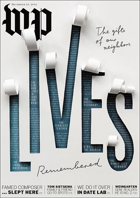
Washington Post Magazine / Photo courtesy of We Love Typography
The beauty of this cover of Washington Post Magazine is the translation of the magazine’s theme ‘Lives Remembered’. The designer, Ariane Spanier crafted an illusion that reveals a smidgen of the stories of people who passed away in 2012. Such concept of combining manual and digital works is a feat on its own.
The use of Type and Typography.
The emergence of typography has been evident in recent design projects. The qualities it offers are important or sometimes more important than color, imagery, graphics and other design elements in visually translating a brand and in this case, magazine covers. Typographical elements, depending on how they are used adds in grace and allows to convey the message.
With all its features and pros, there are cons that may also break your front cover. Such as sans of the application of hierarchy, improper use of alignment, and without any consistency in the utilization of the design elements. The proper application of its alignment, adding consistency and hierarchy allows your reader to continue reading as well as be enticed by the magazine’s front cover.
Feel free to download our heap of romantic scripts which will be perfect for design projects be it magazine design, typography, calligraphy, Calligraffiti and so on.
Apply big type
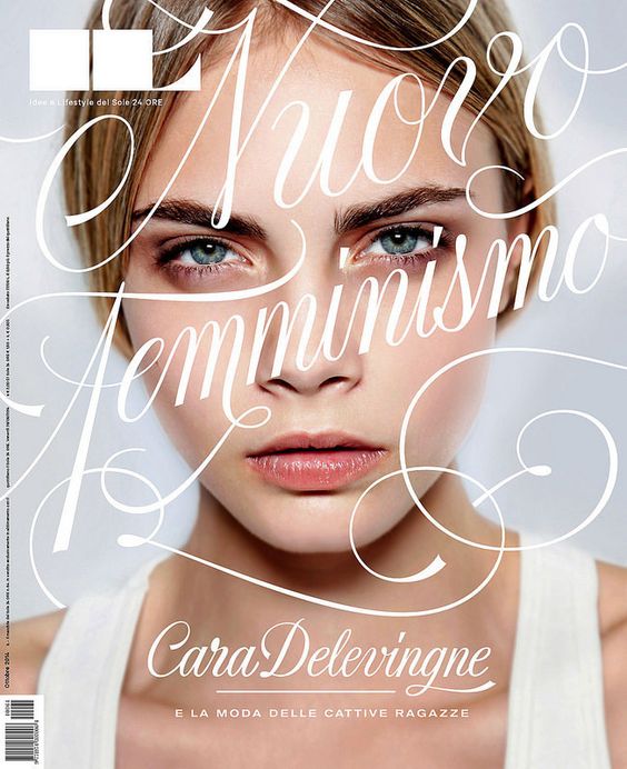
Front cover: Cara Delevigne / Photo courtesy of From UpNorth
Who says cover lines are to be set on the sides when you can give the issue title a pride of place? This is an interesting way to use typography for the magazine cover due to its use of a delicate script and the magazine’s issue title. These kinds of type are likely to be associated with femininity. In this case, it used that label and type to correlate it with feminism and strength to contrast the ideals of gender.
The placement of the issue title is setting the subject’s eyes as another element to direct viewer’s attention.
Hand-written Typography.
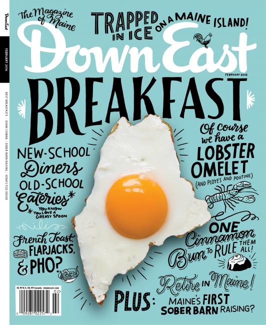
Down East Breakfast / Photo courtesy of Creative Market
As its branded, this magazine cover is dedicated to the American state of Maine. Which is evident through its use of imagery which resembles the geographical location of the state. The use of handwritten typography conveys this exciting emotion to readers also suggesting a hospitable and entertaining characteristic.
The Use of Shapes.
Circles, Squares, Hexagons, you name it! The use of shapes adds geometry as well as a touch of organic lines to finish a concept and theme. Let us introduce to you a couple of magazines that applied these design techniques which involves the use of shapes.
Incorporate transparent shapes.
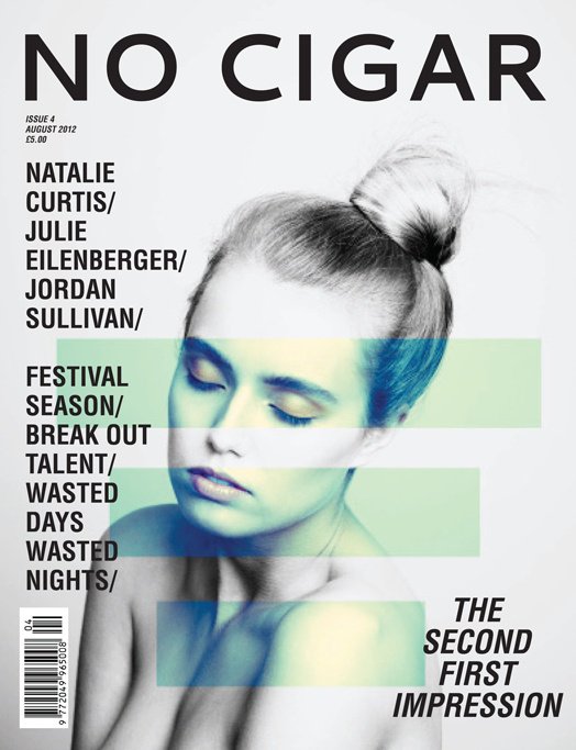
No Cigar Magazine / Photo courtesy of NEWSPAPER DESIGN
This No Cigar magazine cover gives a good contrast between the monochromatic color scheme as well as the application of the transparent shapes. Which results to different color hues once it hits the subject’s shadows. The use of transparent shapes for this magazine cover adds a dramatic flare to a contemplative setting.
Masking the shapes.
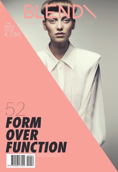
Blend Magazine / Photo courtesy of fontsinuse.com
This cover from Blend gives importance on both the image as well as the technical elements of the layout. Also, the proper use of the color scheme gives the front cover a warmer exterior despite the cover’s sharp features such as the shapes and bold use of typography.
Using Frames for the magazine cover.
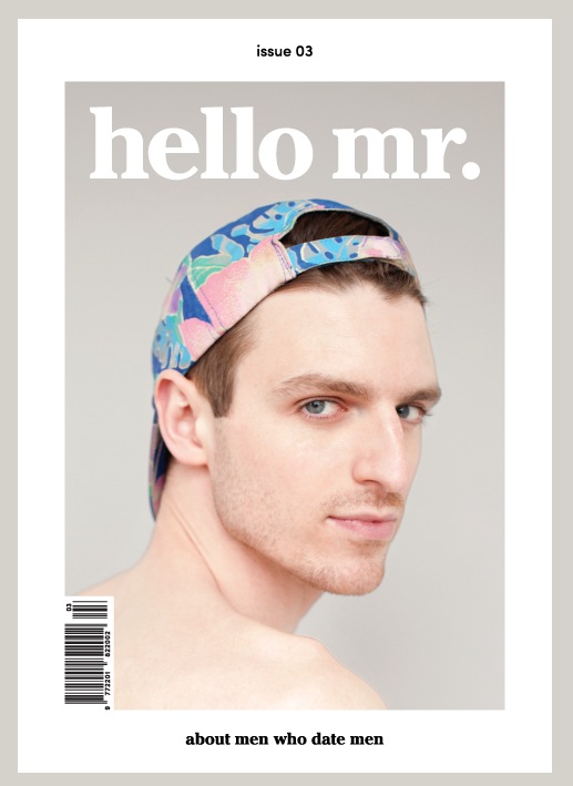
Front Cover: Milk / Photo courtesy of dragofficial
By using frames for the magazine cover, draws the attention towards the main image of the cover. Such technique is applied for this magazine namely Hello Mr. which features a legendary drag queen and figure skater, Daniel Donigan also known as Milk.
Incorporating wide frames.
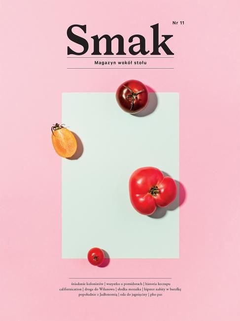
Smak Magazine / Photo courtesy of Pinterest
This cover of Smak magazine uses an extra wide frame to focus on the flat lay image of the objects. The layout used for the magazine cover utilized the elements such as masthead, lines and so on to be aligned in the center which creates this simple and minimal appearance.
Mask an image within a shape.
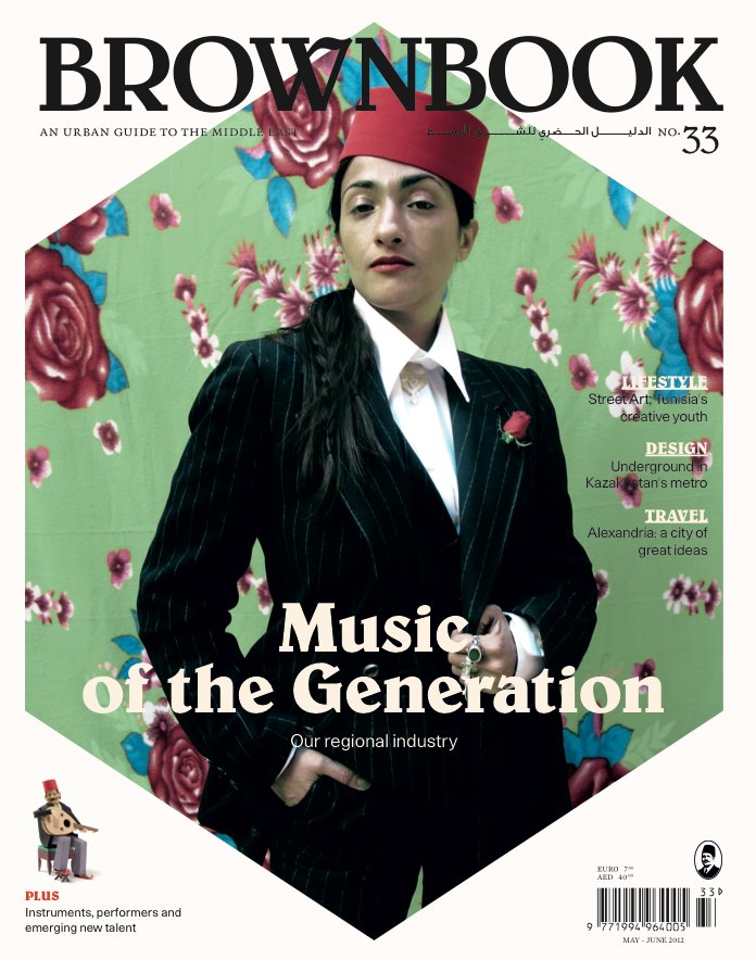
Brownbook Magazine / Photo courtesy of Pinterest
It has been a prominent feature of Brownbook magazine to set an image be it a photograph or illustration within a hexagon for their front cover. By applying this layout, it allows the masthead, dateline, website and other elements to be viewed properly on a quiet background. As well as giving emphasis to the image with no unnecessary clutter.
With the help of silhouettes.
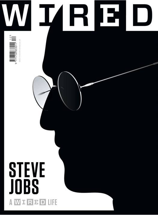
Wired Magazine / Photo courtesy of Pinterest
This front cover from Wired Magazine features both Steve Jobs as well as a clever use of silhouettes to represent the subject. It would be difficult to distinguish the silhouette itself but with the addition of the eyeglasses, one might be able to recall the image.
The Use of Images.
Images are a classic feature in magazine covers and it seems to be a main stay too! There are so much you can do with images to bring visual flavor to your front cover. Whether it is to entice readers with the cover model, apply imagery, bringing the traditional medium and so on. Find creative inspiration with our list of magazines down below which features the impressive use of imagery to create a measured response from viewers and to translate the magazine’s content to the very best.
Experiment with lighting.
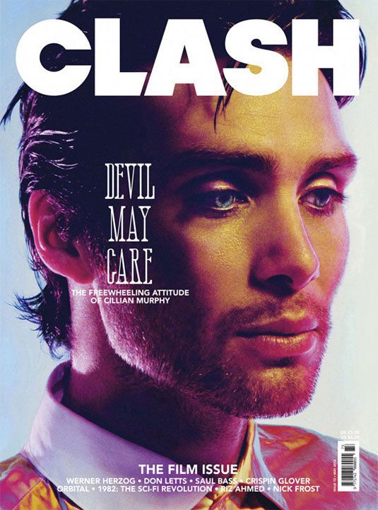
Front Cover: Cillian Murphy / Photo courtesy of Pinterest
With the use of a sunny yet bronzed lighting contrasted well with another advancing color creates this progressive color change and a subjective emotion towards the cover model. This magazine cover from Clash, gives much emphasis on the main cover line which gives you an idea of the concept for the magazine cover. Also, to note that the bright blue eyes creates a balance the strong warm lighting and this sense of gentleness.
Create Impact with Imagery.
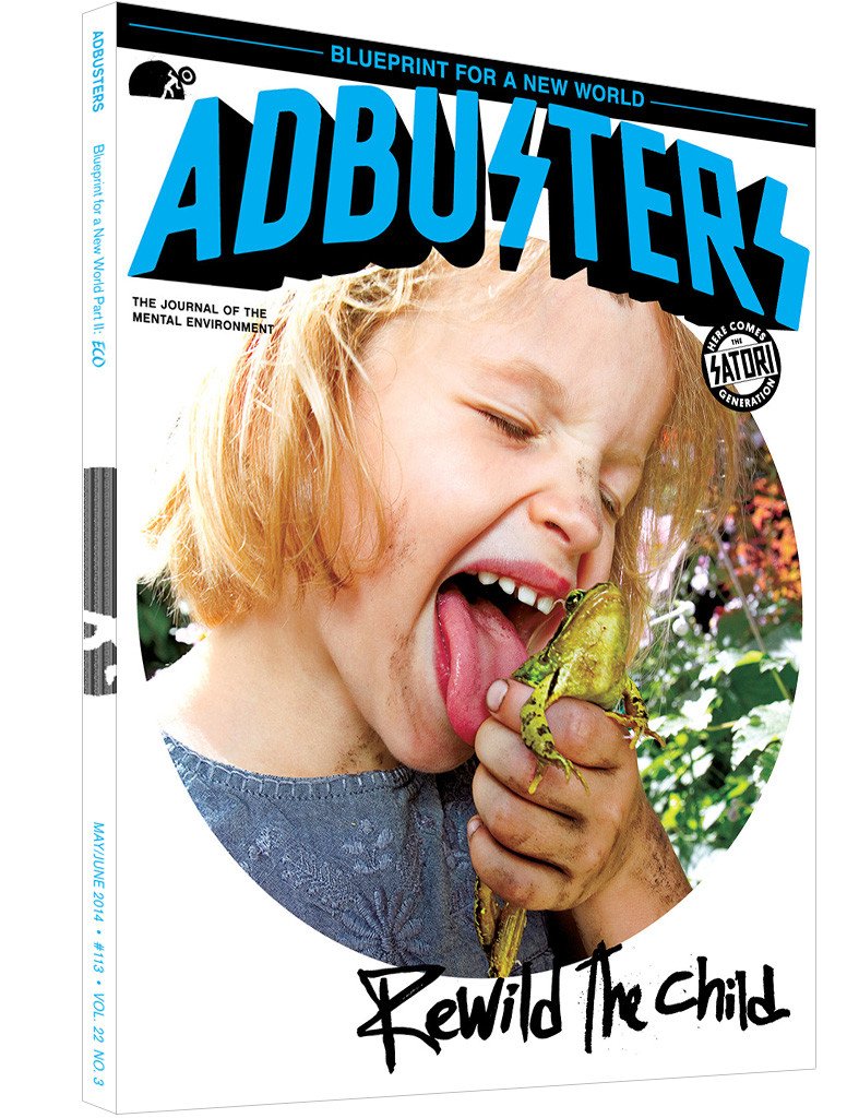
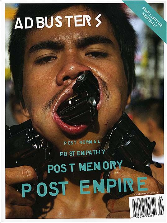
Adbusters Magazines / Photo courtesy of Adbusters
Adbusters is a bi-monthly published magazine which focuses on its topic devoted to challenging consumerism which is evident in their line up of magazine covers. Both of these front covers suggest an unconventional use of imagery yet the message is still conveyed properly.
The Use of Layout.
The use of layout is another great way to design your front cover. As there are many techniques you may seamlessly incorporate your theme and concept. Layout is more than just arrangement of elements in a page but evoking such emotion be it excitement, formality and so on.
Make use of center alignment.
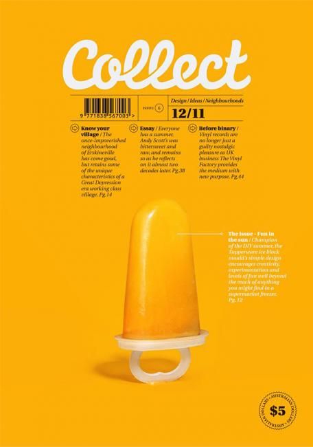
Colllect Magazine / Photo courtesy of Pinterest
This magazine cover from Collect oozes simplicity and a clutter free overall appearance. As well as all the design and technical elements are aligned on the center which allows readers to have a direction when scanning through the text and image. Despite its simplicity, the use of bright pops of color yellow correlates to the issue’s content, “Fun in the Sun.”.
Incorporate traditional tools.
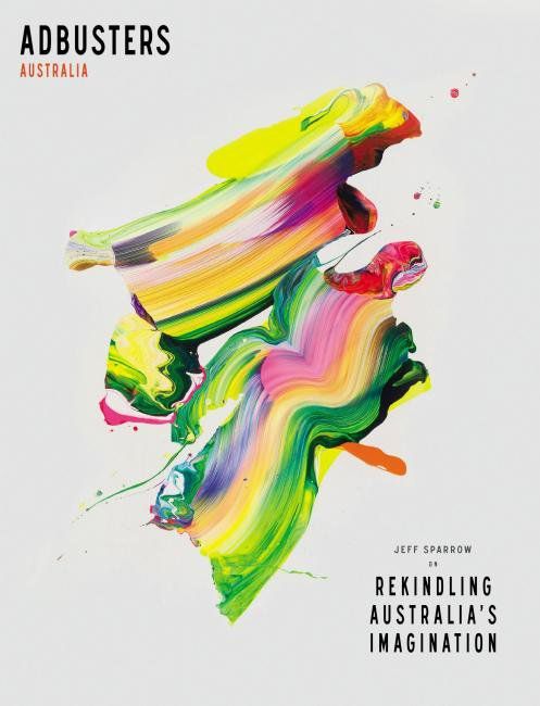
Adbusters Magazine / Photo courtesy of designschool.canva.com
While the traditional fine arts are a main stay art form but there is an emergence of the traditional art being incorporated through various digital mediums and in this case, magazine covers. If you are to consider infusing such traditional art form, you may also play with other mediums be it crayons, pastel, watercolor, pencil and so on to craft a beautiful cover.
Use flat lay for your props.
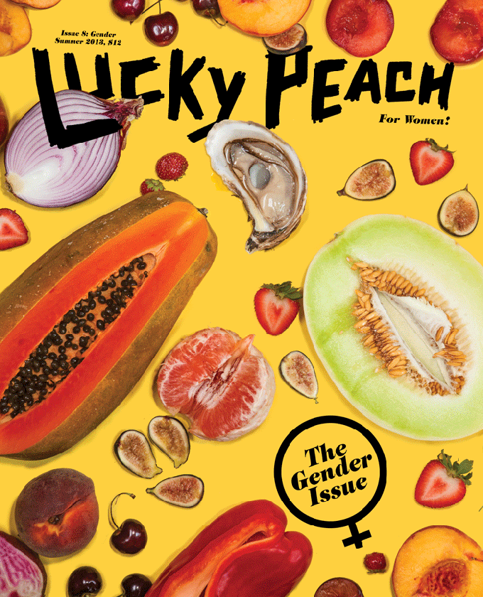
Lucky Peach Magazine / Photo courtesy of grubstreet.com
Flat lay has become prominent in terms of layout in design. Using such layout allows users to see objects in a two-dimensional exterior or sometimes semi-flat. The flat lay has been used to emulate the natural lighting and create this semi-flat appearance with the shadows resulted by light. Lucky Peach, used this design technique very well to match their concept pertaining to gender.
To wrap it all up!
The conclusion of the heap of design techniques is what made these magazines unique and striking. That is also with the comprehension of the theme and executing it to a fully-realized concept. To wrap this list up, we have more offerings we are glad to share with you. You may skim through our list of tips and tricks in crafting high-impact magazines which you may use for design projects and as future references.
Related Posts
Tips & Tricks on Crafting High-Impact Magazines
Design: The Making of a Magazine Cover
FREE 20+ Elegant Electronics Magazine Designs
FREE 21+ Christmas Clip arts in Vector EPS | AI
FREE 14+ Christmas Backgrounds in PSD | AI | Vector EPS
FREE 20 A4 Paper Mockups in PSD | InDesign | AI
FREE 22+ Technology Brochure Templates in PSD | Vector EPS | InDesign | MS Word | Pages | Publisher | AI
FREE 22 High Quality Blue Textures for Graphic Designers in PSD | Vector EPS
FREE 21 Blue Pattern Backgrounds in PSD | AI
FREE 21 PSD Vintage Logo Designs in PSD | Vector EPS
FREE 22 White Paper Texture Designs in PSD | Vector EPS
FREE 30 Square Brochure Mockups in PSD | InDesign | AI
FREE 24 Envelope Mockups in PSD | InDesign | AI | Stationery
FREE 29+ PSD Christmas Invitation Card Designs in PSD | MS Word | AI | Apple Pages | Publisher
FREE 20 Silver Texture Designs in PSD | Vector EPS